Illustrating Data Trends with a Line Graph in R Studio
I’ll Introduce the method of creating a line graph using R. I will utilize the geom_line() within ggplot().
First, let’s load the file.
library(readr)
github= "https://raw.githubusercontent.com/agronomy4future/raw_data_practice/main/chlorophyll_contents_on_leaves.csv"
dataA= data.frame(read_csv(url(github),show_col_types= FALSE))
dataA
This data pertains to the changes in chlorophyll content and leaf greenness over time (days after planting). This dataset contains information from two distinct locations (Northern, Southern) and genotypes (CV1, CV2), each with three stress treatments (Control, Stress_1, Stress_2).
table(dataA$Genotype, dataA$Location, dataA$Treatment)

, ,  = Control

                CV1 CV2
  Northern area  20  20
  Southern area  20  20

, ,  = Stress_1

                CV1 CV2
  Northern area  20  20
  Southern area  20  20

, ,  = Stress_2

                CV1 CV2
  Northern area  20  20
  Southern area  20  20
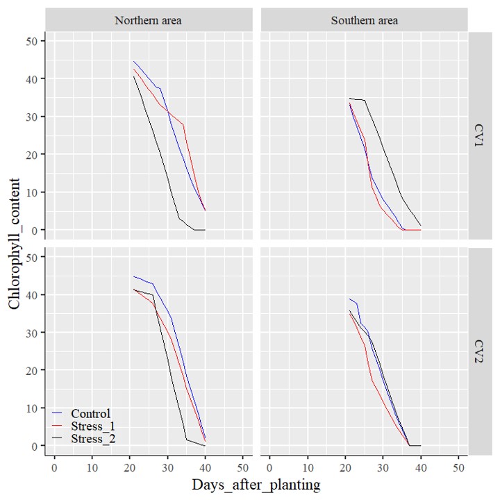
Now, I’d like to know how chlorophyll content is changed by stress treatments per genotype at each location.
First, I will divide the data into four subsets using the subset().
North_CV1_control= subset(dataA, Location=="Northern area" & Genotype=="CV1" & Treatment=="Control")
North_CV1_stress1= subset(dataA, Location=="Northern area" & Genotype=="CV1" & Treatment=="Stress_1")
North_CV1_stress2= subset(dataA, Location=="Northern area" & Genotype=="CV1" & Treatment=="Stress_2")

North_CV2_control= subset(dataA, Location=="Northern area" & Genotype=="CV2" & Treatment=="Control")
North_CV2_stress1= subset(dataA, Location=="Northern area" & Genotype=="CV2" & Treatment=="Stress_1")
North_CV2_stress2= subset(dataA, Location=="Northern area" & Genotype=="CV2" & Treatment=="Stress_2")

South_CV1_control= subset(dataA, Location=="Southern area" & Genotype=="CV1" & Treatment=="Control")
South_CV1_stress1= subset(dataA, Location=="Southern area" & Genotype=="CV1" & Treatment=="Stress_1")
South_CV1_stress2= subset(dataA, Location=="Southern area" & Genotype=="CV1" & Treatment=="Stress_2")

South_CV2_control= subset(dataA, Location=="Southern area" & Genotype=="CV2" & Treatment=="Control")
South_CV2_stress1= subset(dataA, Location=="Southern area" & Genotype=="CV2" & Treatment=="Stress_1")
South_CV2_stress2= subset(dataA, Location=="Southern area" & Genotype=="CV2" & Treatment=="Stress_2")
I have divided the data into 12 parts like above. Now, I will use ggplot() to draw line graphs.
library(ggplot2)
ggplot() +
  geom_line(data=North_CV1_control, aes(x=Days_after_planting,y=Chlorophyll_contents)) +
  geom_line(data=North_CV1_stress1, aes(x=Days_after_planting,y=Chlorophyll_contents)) +
  geom_line(data=North_CV1_stress2, aes(x=Days_after_planting,y=Chlorophyll_contents)) +
  geom_line(data=North_CV2_control, aes(x=Days_after_planting,y=Chlorophyll_contents)) +
  geom_line(data=North_CV2_stress1, aes(x=Days_after_planting,y=Chlorophyll_contents)) +
  geom_line(data=North_CV2_stress2, aes(x=Days_after_planting,y=Chlorophyll_contents)) +
  geom_line(data=South_CV1_control, aes(x=Days_after_planting,y=Chlorophyll_contents)) +
  geom_line(data=South_CV1_stress1, aes(x=Days_after_planting,y=Chlorophyll_contents)) +
  geom_line(data=South_CV1_stress2, aes(x=Days_after_planting,y=Chlorophyll_contents)) +
  geom_line(data=South_CV2_control, aes(x=Days_after_planting,y=Chlorophyll_contents)) +
  geom_line(data=South_CV2_stress1, aes(x=Days_after_planting,y=Chlorophyll_contents)) +
  geom_line(data=South_CV2_stress2, aes(x=Days_after_planting,y=Chlorophyll_contents)) +
  windows(width=8, height=8)
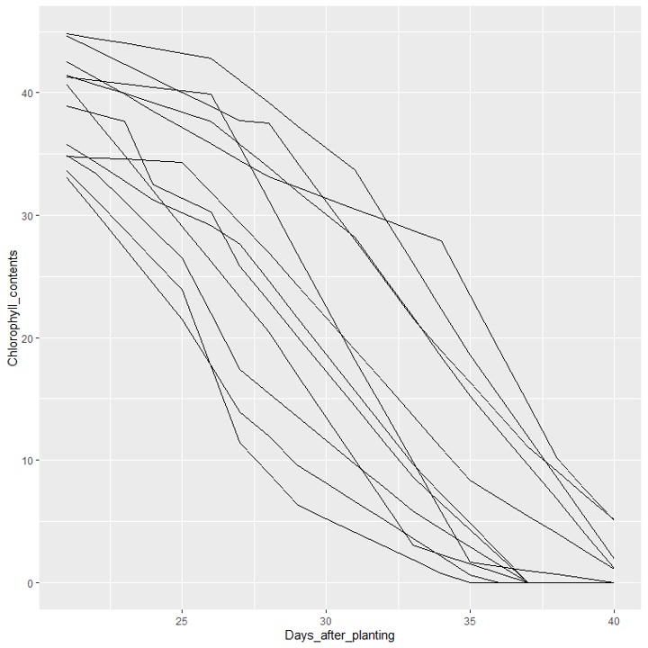
What are your thoughts on this graph? It appears overly complex and doesn’t effectively display clear patterns. Furthermore, utilizing subset() for dividing the data into 12 datasets is impractical and time-consuming. Given this situation, what alternatives do we have? I recommend implementing facet_grid().
□ Graph Partitioning Using facet_grid() in R Studio
I recommend using the following code.
library(ggplot2)
ggplot() +
  geom_line(data=dataA, aes(x=Days_after_planting, y=Chlorophyll_contents, color=Treatment)) +
  scale_color_manual(values= c("blue","red","black"))+
  facet_grid (~Genotype ~ Location) +
  scale_x_continuous(breaks=seq(0,50,10), limits = c(0,50)) +
  scale_y_continuous(breaks=seq(0,50,10), limits = c(0,50)) +
  labs(x="Days_after_planting", y="Chlorophyll_content") +
  theme_grey(base_size=18, base_family="serif")+
  theme(legend.position=c(0.09,0.08),
        legend.title=element_blank(),
        legend.key.size=unit(0.5,'cm'),
        legend.key=element_rect(color=alpha("white",.05), fill=alpha("white",.05)),
        legend.text=element_text(size=15),
        legend.background= element_rect(fill=alpha("white",.05)),
        strip.background=element_rect(color="white", size=0.5,linetype="solid"),
        axis.line=element_line(linewidth=0.5, colour="black")) +
  windows(width=8, height=8)
code summary: https://github.com/agronomy4future/r_code/blob/main/Illustrating_Data_Trends_with_a_Line_Graph_in_R_Studio.ipynb
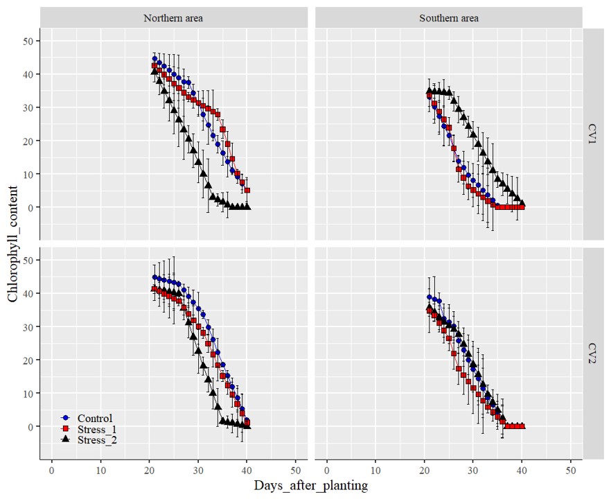
Let’s more decorate the graph. I’ll include points and standard error on each point.
library(ggplot2)
ggplot(data=dataA, aes(x=Days_after_planting, y=Chlorophyll_contents)) +
  geom_line(data=dataA, aes(x=Days_after_planting, y=Chlorophyll_contents, color=Treatment)) +
  geom_point(aes(fill=Treatment, shape=Treatment), color="black", size=3) +
  geom_errorbar(aes(ymin=Chlorophyll_contents-Chlorophyll_contents_Std_error,
                    ymax=Chlorophyll_contents+Chlorophyll_contents_Std_error),
                    position=position_dodge(0.7), width=0.5, color='Black') +
  scale_color_manual(values= c("blue","red","black"))+
  scale_fill_manual(values= c("blue","red","black"))+
  scale_shape_manual(values=c(21,22,24)) +
  facet_grid (~Genotype ~ Location) +
  scale_x_continuous(breaks=seq(0,50,10), limits = c(0,50)) +
  scale_y_continuous(breaks=c(0, 10, 20, 30, 40, 50))+
  labs(x="Days_after_planting", y="Chlorophyll_content") +
  theme_grey(base_size=18, base_family="serif")+
  theme(legend.position=c(0.09,0.08),
        legend.title=element_blank(),
        legend.key.size=unit(0.5,'cm'),
        legend.key=element_rect(color=alpha("white",.05), fill=alpha("white",.05)),
        legend.text=element_text(size=15),
        legend.background= element_rect(fill=alpha("white",.05)),
        strip.background=element_rect(color="white", size=0.5,linetype="solid"),
        axis.line=element_line(linewidth=0.5, colour="black")) +
  windows(width=11, height=9)
