Displaying Axis Values as Percentages in R Studio with Simple Code
Let’s create a simple dataset and draw a bar graph with this data
Genotype=c("A","B","C","D","E")
Responsiveness=c(0.10,0.417,0.217,0.105,0.045)
dataA=data.frame(Genotype,Responsiveness)
dataA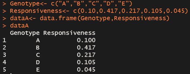
library(ggplot2)
ggplot(data=dataA, aes(x=Genotype, y=as.numeric(Responsiveness), fill=Genotype))+
  geom_bar(stat="identity",position="dodge", width=0.7, size=1) +
  scale_fill_manual(values=c("grey25","grey35","grey45","grey55","grey65")) +
  scale_y_continuous(breaks = seq(0,0.5,0.1), limits = c(0,0.5)) +
  labs(x="Genotype", y="Responsiveness") +
  theme_grey(base_size=17, base_family="serif")+
  theme(legend.position='none',
        axis.line=element_line(size=0.5, colour="black")) +
  windows(width=5.5, height=5)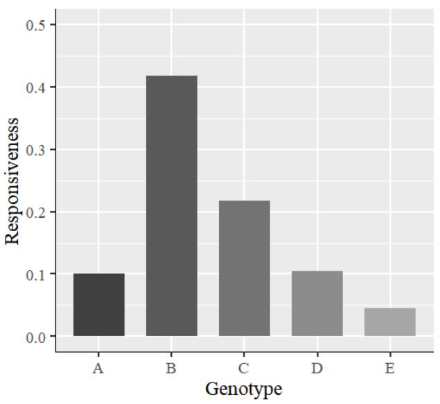
The values on the y-axis are in decimal points. I would like to display them as percentages. So, I will insert the code labels=scales::percent inside the scale_y_continuous() function. The complete code is as follows:
library(ggplot2)
ggplot(data=dataA, aes(x=Genotype, y=as.numeric(Responsiveness), fill=Genotype))+
  geom_bar(stat="identity",position="dodge", width=0.7, size=1) +
  scale_fill_manual(values=c("grey25","grey35","grey45","grey55","grey65")) +
  scale_y_continuous(breaks = seq(0,0.5,0.1), limits = c(0,0.5), labels=scales::percent)+
  labs(x="Genotype", y="Responsiveness") +
  theme_grey(base_size=17, base_family="serif")+
  theme(legend.position='none',
        axis.line=element_line(size=0.5, colour="black")) +
  windows(width=5.5, height=5)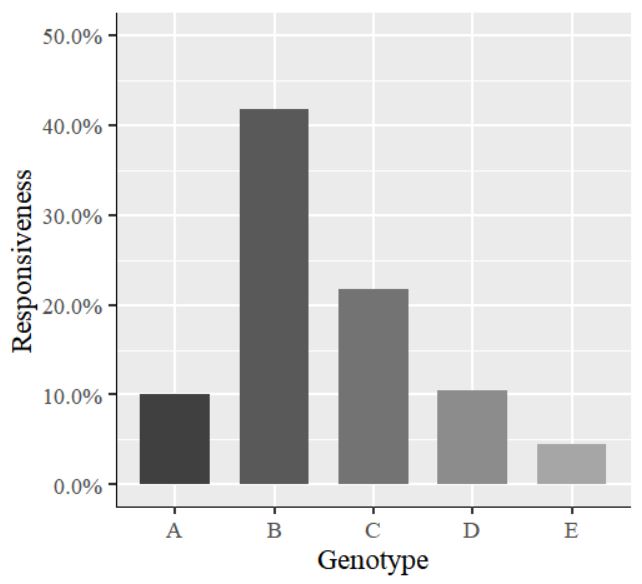
The values on the y-axis have changed to percentages.