Predicting Intermediate Data Points with Linear Interpolation in Excel and R
Today, I’ll explain the interpolation technique used to predict in-between data points. For example, when collecting field data, we might not be able to gather information every day, so we establish our own interval (e.g., weekly or bi-weekly). However, when presenting the data, it might be necessary to show it on a daily basis. As another example, consider investigating yield differences in response to varying continuous variables, such as nitrogen at levels of 0, 30, 60, 120. What if we need to present the yield difference at each single nitrogen amount anywhere from 0 to 120? How can we estimate this data? In such situations, we can utilize the interpolation formula.
Here is one example.
sulphur=c(0,5,10,12,15,20,24,26,30,35)
yield=c(4.1,6.2,7.5,8.2,8.8,9.5,10.5,10.4,10.1,10)
dataA=data.frame(sulphur,yield)

dataA
   sulphur   yield
1  0         4.1
2  5         6.2
3  10        7.5
4  12        8.2
5  15        8.8
6  20        9.5
7  24        10.5
8  26        10.4
9  30        10.1
10 35        10.0
Sulphur improves plant growth, nutrient uptake, better quality, etc., in crops, and it is commonly used as sulphate of potash (SOP) fertilizer. Let’s assume this data is final grain yield in response to different SOP amounts, and make a graph.
library(ggplot2)
library(ggpmisc)

ggplot(data=dataA, aes(x=sulphur, y=yield))+
  stat_smooth(method='lm', linetype=1, se=FALSE,
  formula=y~poly(x,2, raw=TRUE), size=0.5, color="dark red") +
  geom_point(alpha=0.5, size=4) +

  #Equation
  stat_poly_eq(aes(label= paste(..eq.label.., sep= "~~~")),
               label.x.npc=0.2, label.y.npc=0.9,
               eq.with.lhs= "italic(hat(y))~'='~", eq.x.rhs= "~italic(x)",
               coef.digits=3, formula=y ~ x, parse=TRUE, size=5)+
  # R-squared
  stat_poly_eq(aes(label=paste(..rr.label.., sep= "~~~")),
               label.x.npc=0.2, label.y.npc=0.8, rr.digits=3,
               formula=y ~ x, parse=TRUE, size=5)+

  scale_x_continuous(breaks = seq(0,35,5), limits = c(0,35)) +
  scale_y_continuous(breaks = seq(0,15,5), limits = c(0,15)) +
  labs(y="Yield (ton/ha)", x="Sulfur application (kg/ha)") +
  theme_classic(base_size=18, base_family="serif")+
  theme_grey(base_size=18, base_family="serif")+
  theme(axis.line=element_line(linewidth=0.5, colour="black"))+
  windows(width=5.5, height=5)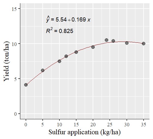
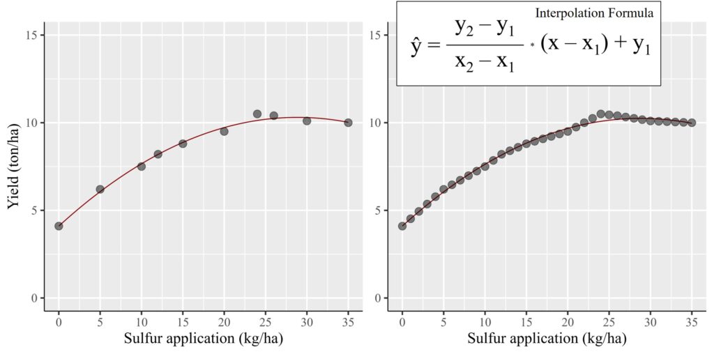
Now, I have made a quadratic regression graph like the one above. However, what if it’s necessary to show each data point at a single amount of sulfur?
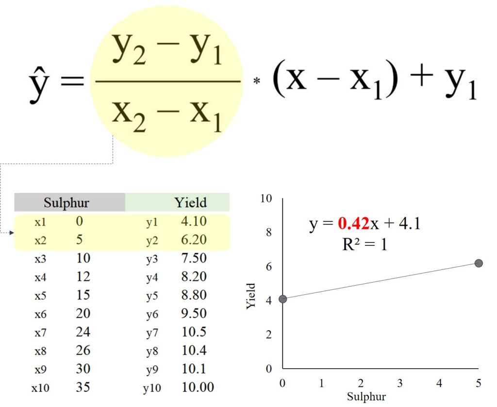
We can use the interpolation formula, and the equation is as follows:
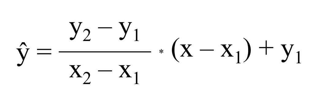
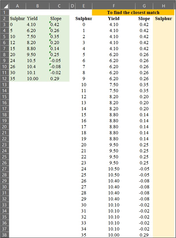
It seems tricky, but if you understand the principle, it’s a piece of a cake. Please look at the below excel data.
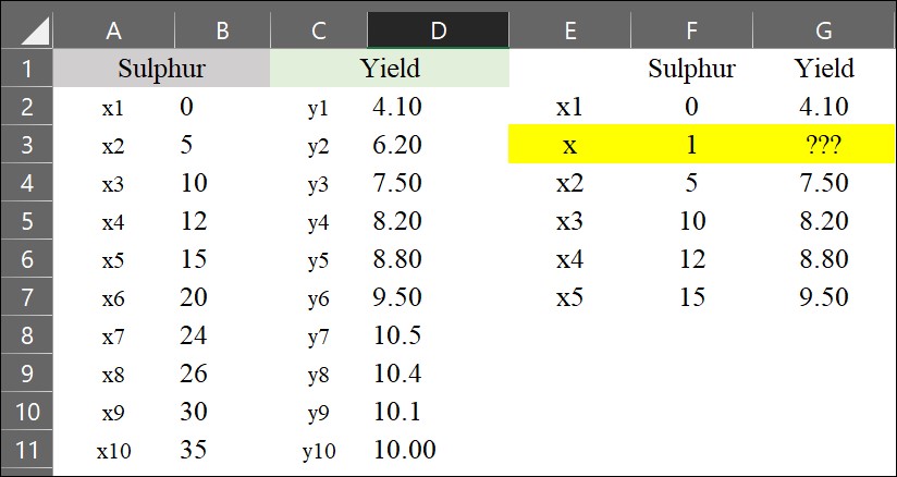
Now, I’d like to estimate the yield when the sulfur application is 1 kg/ha (represented as x). We can simply use the interpolation formula.
y= ((6.20 - 4.10) / (5 - 0)) * (1 - 0) + 4.10 = 4.52
It will be 4.52 ton/ha when sulfur application is 1 kg/ha.
However, calculating it one by one like this would be time-wasting. So, I’ll introduce the simplest way to apply the interpolation formula in Excel.
1) to calculate slope
Let’s think about the equation,
(y2 - y1) / (x2 - x1) = ((6.20 - 4.10) / (5 - 0)) = 0.42
Actually, this equation calculates the slope between two data points. So, let’s start by calculating the slope between each pair of data points using the =slope() function in Excel.
= slope (y range, x range)
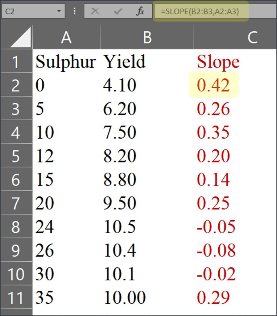
For the last data, it will be calculated as 10.00 / 35 ≈ 0.29
In this case, there is no x2 and y2, and therefore it’ll be calculated as (y2 - y1) / (x2 - x1) = ((100) / (35)) = 0.29
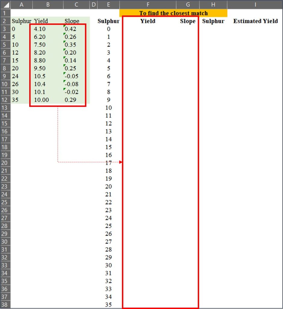
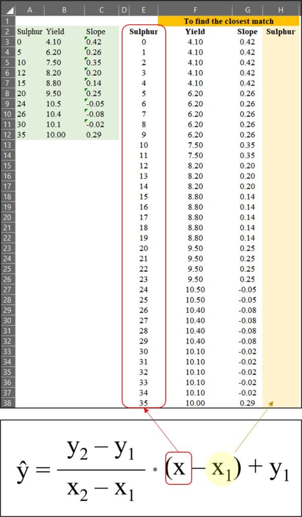
2) to find the closest match
Now, I’ve extended the data points from1 to 35, and I’ll find the closest match among these extended data points compared to the original data.
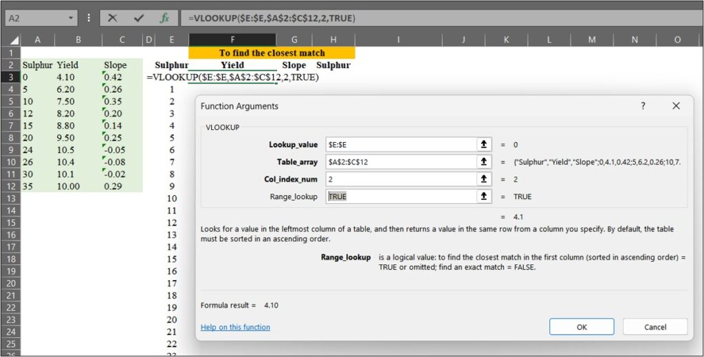
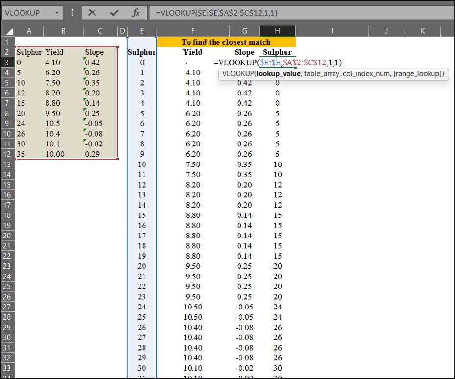
We can match the data using =VLOOKUP(), and in this case, Range_lookup will be set to TRUE (or 1). When Range_lookup is set to FALSE (or 0), it finds an exact match, whereas if set to TRUE (or 1), it finds the closest match.
Let’s use =VLOOKUP() to match yield and slope values from the original data to the extended data points.
Next, I’ll find the closest match for sulfur (in column H). This process is relevant to the equation below.
3) to calculate estimated values
Finally, I’ll calculate the estimated values using the interpolation formula.
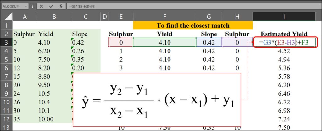
So, I calculated the estimated yield for each sulfur application from 0 to 35 as follows:
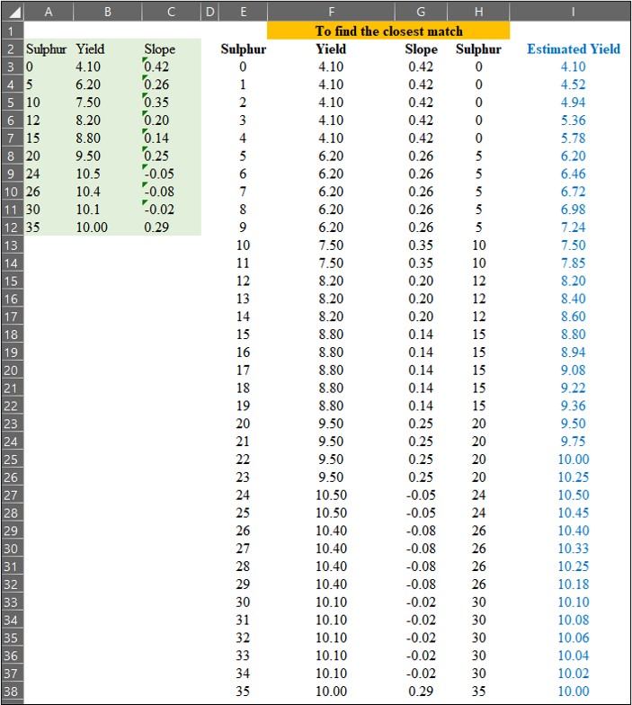
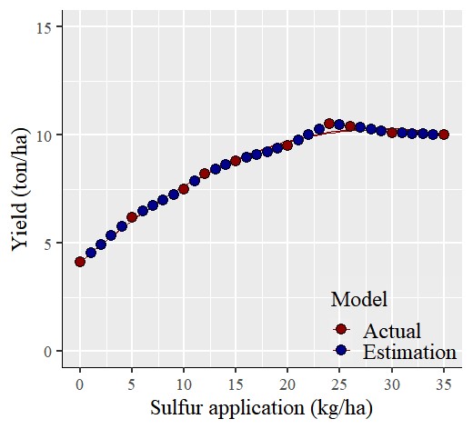
Now, I have finished calculating the estimated yield for each sulfur application. The text in red color represents actual measured data, while the text in blue represents estimated data.
     Sulphur   Yield    Slope         Estimated.Yield
1    0         4.1      0.4200000     4.100
2    1         4.1      0.4200000     4.520
3    2         4.1      0.4200000     4.940
4    3         4.1      0.4200000     5.360
5    4         4.1      0.4200000     5.780
6    5         6.2      0.2600000     6.200
7    6         6.2      0.2600000     6.460
8    7         6.2      0.2600000     6.720
9    8         6.2      0.2600000     6.980
10   9         6.2      0.2600000     7.240
11   10        7.5      0.3500000     7.500
12   11        7.5      0.3500000     7.850
13   12        8.2      0.2000000     8.200
14   13        8.2      0.2000000     8.400
15   14        8.2      0.2000000     8.600
16   15        8.8      0.1400000     8.800
17   16        8.8      0.1400000     8.940
18   17        8.8      0.1400000     9.080
19   18        8.8      0.1400000     9.220
20   19        8.8      0.1400000     9.360
21   20        9.5      0.2500000     9.500
22   21        9.5      0.2500000     9.750
23   22        9.5      0.2500000     10.000
24   23        9.5      0.2500000     10.250
25   24        10.5    -0.0500000     10.500
26   25        10.5    -0.0500000     10.450
27   26        10.4    -0.0750000     10.400
28   27        10.4    -0.0750000     10.325
29   28        10.4    -0.0750000     10.250
30   29        10.4    -0.0750000     10.175
31   30        10.1    -0.0200000     10.100
32   31        10.1    -0.0200000     10.080
33   32        10.1    -0.0200000     10.060
34   33        10.1    -0.0200000     10.040
35   34        10.1    -0.0200000     10.020
36   35        10.0     0.2857143     10.000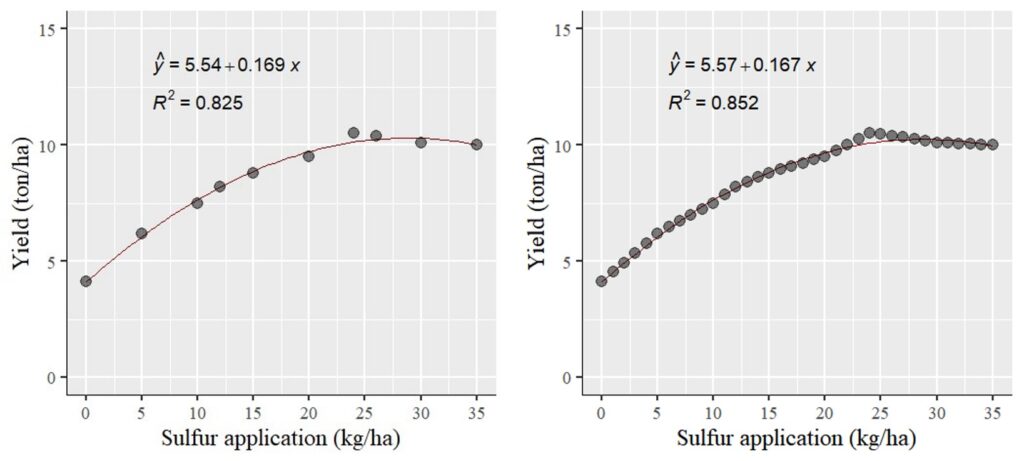
To visualize the comparison, I’ll plot two graphs: one for the actual data (left panel) and another for the estimated data (right panel). Surprisingly, the statistical outcomes (including slope and R2) remained largely consistent. This can be attributed to the fact that the estimated data falls within the range of the actual data.
This is an interpolation technique used to predict in-between data points. So, if you need to represent dependent variables in response to the entire range of independent variables, you can employ this interpolation technique.
■ How to interpolate missing values using R?
If you understand the principle, you don’t have to calculate step by step, as R provides code for interpolation.
sulphur= c(0,5,10,12,15,20,24,26,30,35)
yield= c(4.1,6.2,7.5,8.2,8.8,9.5,10.5,10.4,10.1,10)
dataA= data.frame(sulphur, yield)
# Install and load the zoo package
if(!require(zoo)) install.packages("zoo")
library(zoo)
# Create a sequence for the complete range of sulphur
full_range= seq(min(dataA$sulphur), max(dataA$sulphur))
# Interpolate the values for yield
yield_interp= na.approx(dataA$yield, x= dataA$sulphur, xout= full_range)
# Combine the results into a new data frame
df_interp= data.frame (sulphur= full_range, yield= yield_interp)
head (df_interp, 3)
sulphur yield
0 4.10
1 4.52
2 4.94
.
.
.
tail (df_interp, 3)
sulphur yield
33 10.04
34 10.02
35 10.00if(!require(ggplot2)) install.packages("ggplot2")
library(ggplot2)
if(!require(ggpmisc)) install.packages("ggpmisc")
library(ggpmisc)
ggplot(data=df_interp, aes(x=sulphur, y=yield))+
stat_smooth(method='lm', linetype=1, se=FALSE,
formula=y~poly(x,2, raw=TRUE), size=0.5, color="dark red") +
geom_point(alpha=0.5, size=4) +
#Equation
stat_poly_eq(aes(label= paste(..eq.label.., sep= "~~~")),
label.x.npc=0.2, label.y.npc=0.9,
eq.with.lhs= "italic(hat(y))~'='~", eq.x.rhs= "~italic(x)",
coef.digits=3, formula=y ~ x, parse=TRUE, size=5)+
# R-squared
stat_poly_eq(aes(label=paste(..rr.label.., sep= "~~~")),
label.x.npc=0.2, label.y.npc=0.8, rr.digits=3,
formula=y ~ x, parse=TRUE, size=5)+
scale_x_continuous(breaks = seq(0,35,5), limits = c(0,35)) +
scale_y_continuous(breaks = seq(0,15,5), limits = c(0,15)) +
labs(y="Yield (ton/ha)", x="Sulfur application (kg/ha)") +
theme_classic(base_size=18, base_family="serif")+
theme_grey(base_size=18, base_family="serif")+
theme(axis.line=element_line(linewidth=0.5, colour="black"))+
windows(width=5.5, height=5)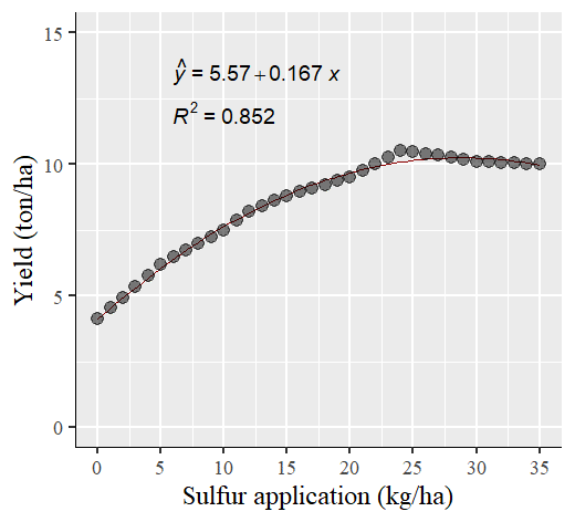
We aim to develop open-source code for agronomy (kimjk@agronomy4future.com)