Graph Partitioning Using facet_grid() in R Studio
In my previous post, I introduced how to partition graphs using facet_wrap(). Today, I’ll introduce facet_grid()
□ Graph Partitioning Using facet_wrap() in R Studio
Actually, the function is the same, but there are very subtle differences between facet_wrap() and facet_grid(). Today, I’ll explain this.
Let’s upload one data.
library(readr)
github= "https://raw.githubusercontent.com/agronomy4future/raw_data_practice/main/chlorophyll_contents_on_leaves.csv"
dataA= data.frame(read_csv(url(github),show_col_types = FALSE))
#dataA$Treatment= factor(dataA$Treatment, levels=c("Control", "Stress_1","Stress_2"))
dataA$Location[dataA$Location=="Northern area"]="Location 1"
dataA$Location[dataA$Location=="Southern area"]="Location 2"
I measured chlorophyll contents in leaves for two wheat genotypes under both stress and normal conditions. In this case, there are two factors (stress treatment and genotypes).
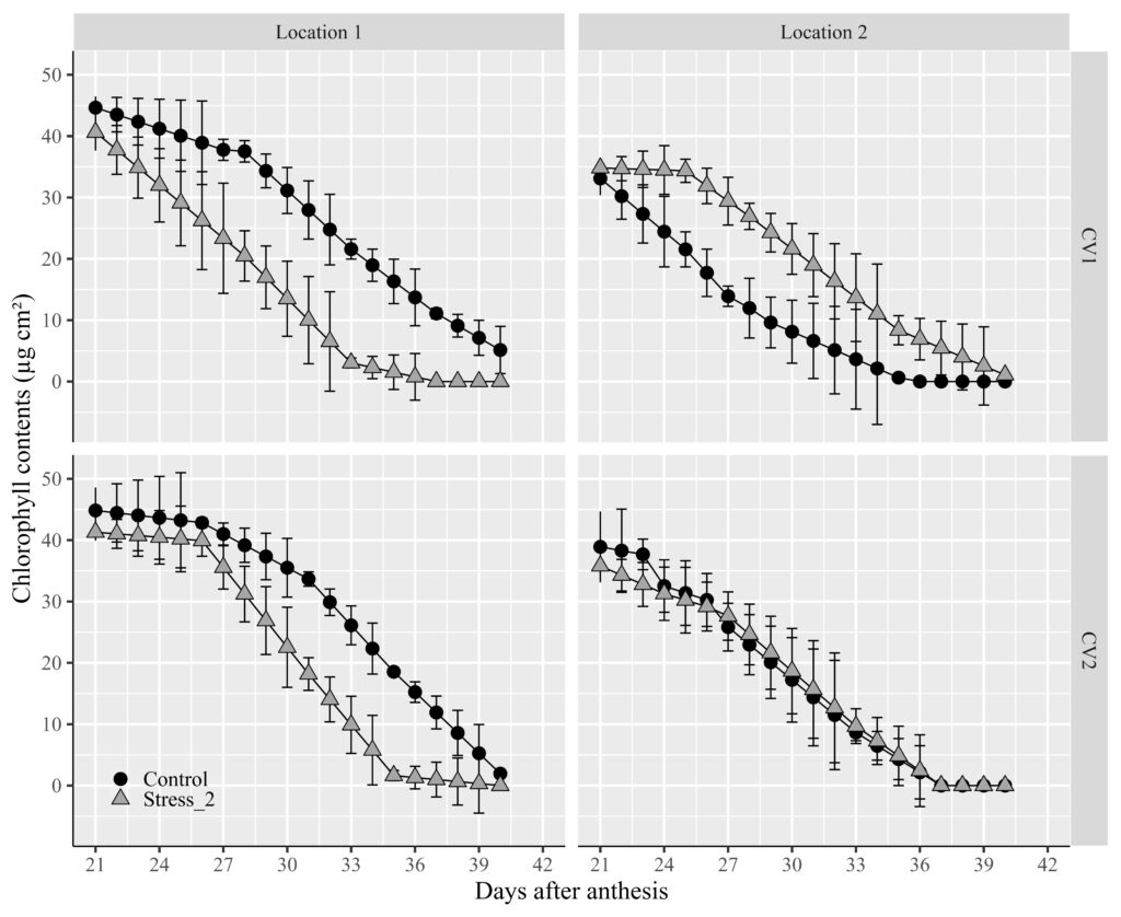
If you’ve read my previous post about facet_wrap(), you now have the ability to partition graphs by genotypes, stress conditions, or both. If you’d like to create a 2 by 2 graph partition (due to having two factors), you can use this code: facet_wrap(~Genotype ~ Location).
ggplot(data=subset(dataA, Treatment!="Stress_1"), aes(x=Days_after_planting, y=Chlorophyll_contents))+
  geom_line(aes(color=Treatment),size=0.5) +
  geom_errorbar(aes(ymin=Chlorophyll_contents-Chlorophyll_contents_Std_error,
                    ymax=Chlorophyll_contents+Chlorophyll_contents_Std_error),
                    position=position_dodge(0.7), width=0.5, color='Black') +
  geom_point(aes(fill=Treatment, shape=Treatment), color="Black", size=4) +
  scale_fill_manual(values= c ("black","grey65"), name="") +
  scale_color_manual(values=c("black","black")) +
  scale_shape_manual(values=c(21,24)) +
  scale_x_continuous(breaks = seq(21,42,3), limits = c(21,42)) +
  scale_y_continuous(breaks=c(0, 10, 20, 30, 40, 50))+
  guides(color="none") +
  guides(shape="none", fill = guide_legend(override.aes = list(shape=c(21,24)))) +
  facet_wrap (~Genotype ~ Location) +
  labs(x="Days after anthesis" , y="Chlorophyll contents (µg cm²)") +
  theme_grey(base_size=18, base_family="serif")+
  theme(legend.position=c(0.09,0.08),
        legend.title=element_blank(),
        legend.key.size=unit(0.5,'cm'),
        legend.key=element_rect(color=alpha("white",.05), fill=alpha("white",.05)),
        legend.text=element_text(size=15),
        legend.background= element_rect(fill=alpha("white",.05)),
        strip.background=element_rect(color="white", size=0.5,linetype="solid"),
        axis.line=element_line(linewidth=0.5, colour="black")) +
windows(width=11, height=9)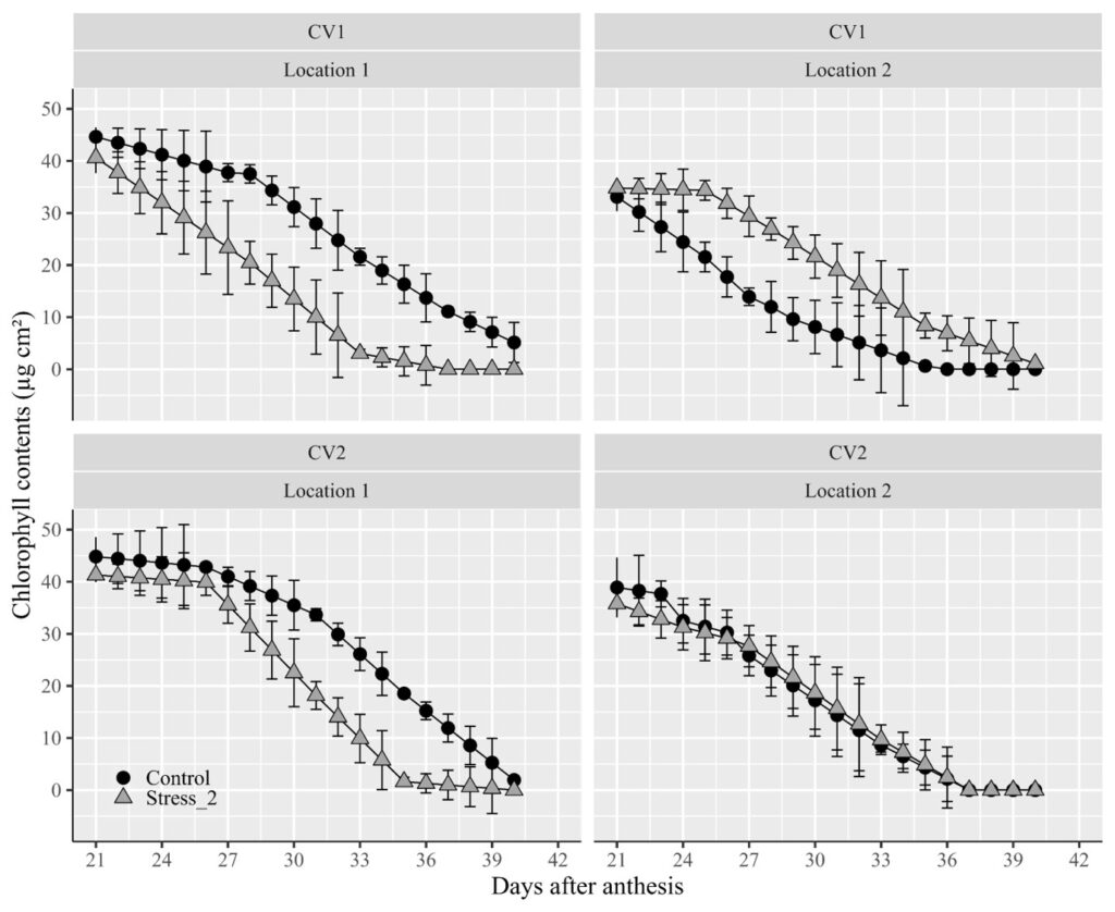
Did you notice an issue? The titles for the two factors are positioned at the top of the panel. I’d like to move the title of the genotype to the right. In this scenario, we can utilize facet_grid().
library(ggplot2)
ggplot(data=subset(dataA, Treatment!="Stress_1"), aes(x=Days_after_planting, y=Chlorophyll_contents))+
  geom_line(aes(color=Treatment),size=0.5) +
  geom_errorbar(aes(ymin=Chlorophyll_contents-Chlorophyll_contents_Std_error,
                    ymax=Chlorophyll_contents+Chlorophyll_contents_Std_error),
                    position=position_dodge(0.7), width=0.5, color='Black') +
  geom_point(aes(fill=Treatment, shape=Treatment), color="Black", size=4) +
  scale_fill_manual(values= c ("black","grey65"), name="") +
  scale_color_manual(values=c("black","black")) +
  scale_shape_manual(values=c(21,24)) +
  scale_x_continuous(breaks = seq(21,42,3), limits = c(21,42)) +
  scale_y_continuous(breaks=c(0, 10, 20, 30, 40, 50))+
  guides(color="none") +
  guides(shape="none", fill = guide_legend(override.aes = list(shape=c(21,24)))) +
  facet_grid (~Genotype ~ Location) +
  labs(x="Days after anthesis" , y="Chlorophyll contents (µg cm²)") +
  theme_grey(base_size=18, base_family="serif")+
  theme(legend.position=c(0.09,0.08),
        legend.title=element_blank(),
        legend.key.size=unit(0.5,'cm'),
        legend.key=element_rect(color=alpha("white",.05), fill=alpha("white",.05)),
        legend.text=element_text(size=15),
        legend.background= element_rect(fill=alpha("white",.05)),
        strip.background=element_rect(color="white", size=0.5,linetype="solid"),
        axis.line=element_line(linewidth=0.5, colour="black")) +
windows(width=11, height=9)