Exploring Best Linear Unbiased Estimators (BLUE) through Practical Examples in R
□ The Best Linear Unbiased Estimator (BLUE): Step-by-Step Guide using R (with AllInOne Package)
In my previous post, I explained how to use R to perform the Best Linear Unbiased Estimator (BLUE). Now, this is a practical exercise focusing on BLUE in R.
Here is one dataset.
library(readr)
github="https://raw.githubusercontent.com/agronomy4future/raw_data_practice/main/genotype_transgenic_line_with_fertilizer.csv"
dataA= data.frame(read_csv(url(github), show_col_types= FALSE))

dataA
         genotype plot resistance fertilizer   GN   AGW
1             cv1    1         no        150 1310 33.15
2             cv1    1         no          0 1168 25.07
3             cv1    1         no        200  570 36.04
4             cv2    1         no        150 1120 53.05
5             cv2    1         no          0 1230 26.71
6             cv2    1         no        200  795 37.75
7             cv3    1        yes        150 2013 27.51
8             cv3    1        yes          0 2183 24.61
9             cv3    1        yes        200 1034 36.53
10            cv4    1         no        150 2451 31.58
.
.
.
I have data on grain number (GN) and average grain weight (AGW) in winter wheat for about five genotypes and one transgenic line. The study examines the response to disease resistance (yes or no) and fertilizer application at three levels 0 kg N ha-1, 150 kg N ha-1 and 200 kg N ha-1).
First, let’s summarize data.
library(dplyr)
dataB = data.frame(dataA %>%
                   group_by(genotype, resistance, fertilizer) %>%
                   dplyr::summarize(across(c(GN, AGW),
                                     .fns= list(Mean=~mean(., na.rm= TRUE),
                                      SD= ~sd(., na.rm= TRUE),
                                      n=~length(.),
                                      se=~sd(.,na.rm= TRUE) / sqrt(length(.))))))

dataB= dataB[,-c(5,6,9,10)]

dataB
         genotype resistance fertilizer GN_Mean     GN_se AGW_Mean    AGW_se
1  Transgeic_line        yes          0 2872.50 268.22643  25.2850 1.7322360
2  Transgeic_line        yes        150 3895.50 351.74956  27.7825 1.8239032
3  Transgeic_line        yes        200 2285.50  58.41589  34.8625 1.8272902
4             cv1         no          0 1802.25 229.84320  25.1050 1.1437111
5             cv1         no        150 1902.25 215.03696  31.4900 0.5558327
6             cv1         no        200 1050.25 168.08647  37.3550 0.9006803
7             cv2         no          0 1529.00 152.99782  24.4525 1.1642907
8             cv2         no        150 1752.50 262.66408  35.0600 6.0786388
9             cv2         no        200  951.50 143.49826  36.0025 1.4648457
10            cv3        yes          0 2064.00  85.79141  21.1175 1.4288887
11            cv3        yes        150 1968.50 112.31615  25.4075 1.0330568
12            cv3        yes        200  812.25 263.48257  36.6200 0.9226682
13            cv4         no          0 2391.00 289.96207  24.6600 0.5913967
14            cv4         no        150 2082.25 153.83832  30.1225 0.9788971
15            cv4         no        200 1277.00 164.44807  33.8650 0.9269799
16            cv5         no          0 1593.00 153.43294  23.2125 0.7888745
17            cv5         no        150 1875.25  92.15148  30.3475 0.7051285
18            cv5         no        200  975.75  50.51629  34.9950 1.0727263
Then, I’ll create a graph, but before creating a graph, let’s rename some variables.
library (stringr)
dataB$genotype= str_replace_all (dataB$genotype, 'Transgeic_line','TL')
dataB$fertilizer <- str_replace_all(dataB$fertilizer, '\\b0\\b', '0 kg/ha')
dataB$fertilizer= str_replace_all (dataB$fertilizer, '150','150 kg/ha')
dataB$fertilizer= str_replace_all (dataB$fertilizer, '200','200 kg/ha')
and let’s create a graph.
FIG1=ggplot(data=dataB, aes(x=genotype, y=GN_Mean, fill=resistance))+
  geom_bar(stat="identity",position="dodge", width= 0.7, size=1) +
  scale_fill_manual(values=c("grey75","cadetblue"))+
  geom_errorbar(aes(ymin=GN_Mean-GN_se, ymax=GN_Mean+GN_se),
                position=position_dodge(0.9), width=0.5) +
  scale_y_continuous(breaks=seq(0,5000,1000), limits = c(0,5000)) +
  facet_wrap (~ fertilizer, scales="free_y") +
  labs(x="Genotype", y="Grain number") +
  theme_classic(base_size=18, base_family="serif")+
  theme(legend.position="bottom",
        legend.title=element_text(family="serif", face="plain",
                                  size=13, color= "Black"),
        legend.key=element_rect(color="white", fill="white"),
        legend.text=element_text(family="serif", face="plain",
                                 size=13, color= "Black"),
        legend.background=element_rect(fill="white"),
        axis.line=element_line(linewidth=0.5, colour="black"),
        strip.background=element_rect(color="white",
                             linewidth=0.5, linetype="solid"))
FIG1 + windows (width=12, height=5)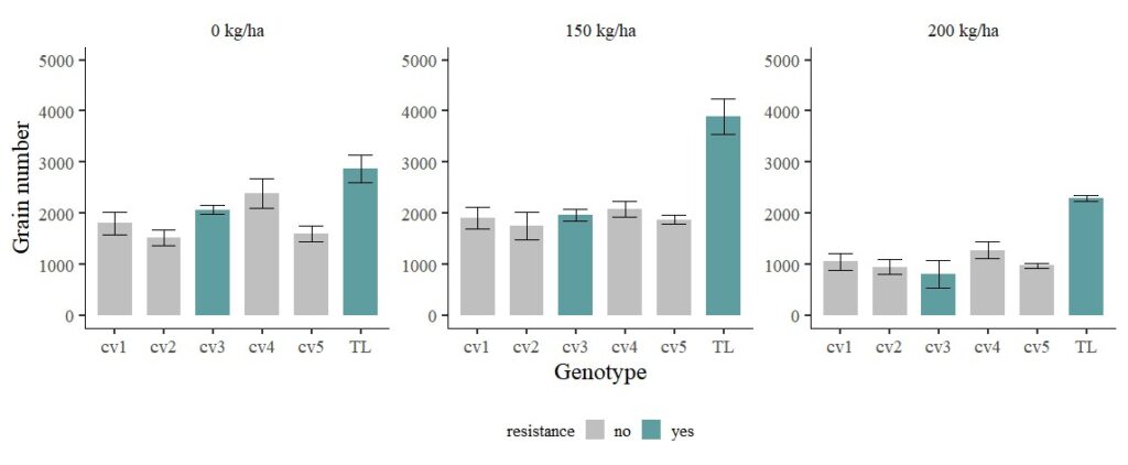
Now, transgenic line (TL) shows much greater grain number. I’ll exclude transgenic line (TL).
FIG1=ggplot(data=subset(dataB, genotype!="TL"), aes(x=genotype, y=GN_Mean, fill=resistance))+
  geom_bar(stat="identity",position="dodge", width= 0.7, size=1) +
  scale_fill_manual(values=c("grey75","cadetblue"))+
  geom_errorbar(aes(ymin=GN_Mean-GN_se, ymax=GN_Mean+GN_se),
                position=position_dodge(0.9), width=0.5) +
  scale_y_continuous(breaks=seq(0,3500,500), limits = c(0,3500)) +
  facet_wrap (~ fertilizer, scales="free_y") +
  labs(x="Genotype", y="Grain number") +
  theme_classic(base_size=18, base_family="serif")+
  theme(legend.position="bottom",
        legend.title=element_text(family="serif", face="plain",
                                  size=13, color= "Black"),
        legend.key=element_rect(color="white", fill="white"),
        legend.text=element_text(family="serif", face="plain",
                                 size=13, color= "Black"),
        legend.background=element_rect(fill="white"),
        axis.line=element_line(linewidth=0.5, colour="black"),
        strip.background=element_rect(color="white",
                                      linewidth=0.5,linetype="solid"))
FIG1 + windows (width=12, height=5)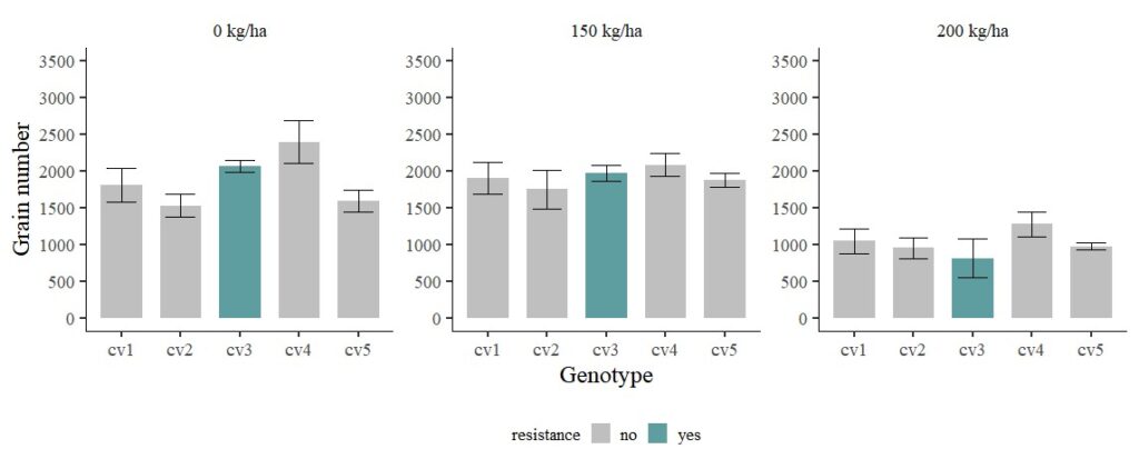
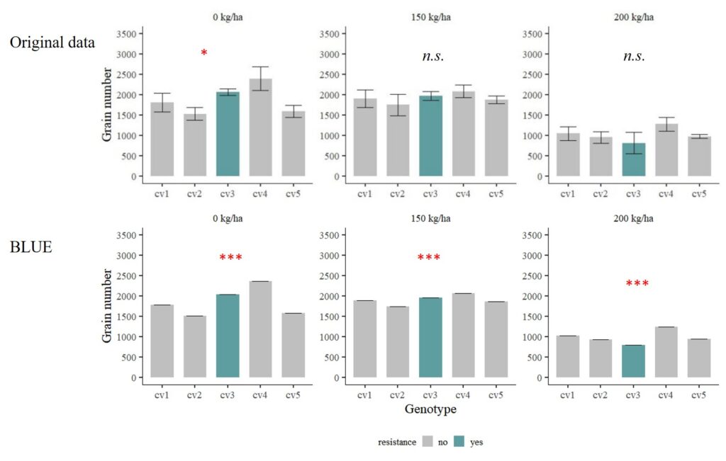
When running statistical analyses, only 0 kg/ha shows significant differences among genotypes, while there is no difference under both 150 kg/ha and 200 kg/ha. While the observed mean values appear distinct, the presence of a substantial standard error, indicative of significant data variability, leads to a situation where the statistical analysis fails to detect a significant difference in means.
In statistical terms, the standard error is a measure of how much the sample mean is expected to vary from the true population mean. When the standard error is large, it means that there is a considerable amount of variability in the data, making it more challenging to detect a true difference in means. If the standard error is large, it may result in a larger standard deviation of the sample mean and a wider confidence interval, which in turn can lead to a p-value that is not significant. It’s essential to consider both the mean difference and the standard error when interpreting statistical results. If the standard error is large, it may indicate that the observed mean difference is not likely to be statistically significant. In such cases, researchers might focus on understanding and interpreting the variability in the data and consider collecting more data to reduce the standard error and improve the precision of the estimates.
To address the challenge posed by high data variability and the resulting lack of statistical significance in mean differences, one effective approach is to employ the Best Linear Unbiased Estimator (BLUE) or Best Linear Unbiased Predictor (BLUP). These methods offer a robust means of adjusting for errors in statistical estimates. BLUE and BLUP take into account both the mean differences and the underlying variability, providing more stable and unbiased estimates, especially in situations where data variability is pronounced. By incorporating these estimators, researchers can obtain more reliable and precise insights, enhancing the interpretability and robustness of their statistical analyses.
□ The Best Linear Unbiased Estimator (BLUE): Step-by-Step Guide using R (with AllInOne Package)
I’ll use this code.
library(lme4)
library(Matrix)

dataA= subset(dataA, genotype!="Transgeic_line")

BLUE_0_kg_ha=lmer(GN ~ 0 + (1|genotype), data=subset(dataA, fertilizer=="0"))
BLUE_150_kg_ha=lmer(GN ~ 0 + (1|genotype), data=subset(dataA, fertilizer=="150"))
BLUE_200_kg_ha=lmer(GN ~ 0 + (1|genotype), data=subset(dataA, fertilizer=="200"))
In the provided code, I formulated distinct linear mixed-effects models within each fertilizer treatment using lmer(GN ~ 0 + (1|genotype) for “0,” “150,” and “200” kg/ha treatments. In each instance, I established a fixed intercept (0) and incorporated a random intercept for the variable genotype. The designation “Best Linear Unbiased Estimator (BLUE)” commonly refers to the fixed effects within the context of linear mixed-effects models. Here, the fixed intercept term in each model operates as a manifestation of BLUE, representing an estimate that minimizes the sum of squared differences between predicted and observed values.
To provide a bit more context:
- Best: The fixed effects are chosen to minimize the sum of squared differences between the predicted values and the observed values.
- Linear: The model is linear in terms of parameters, meaning it is a linear combination of the predictor variables and their coefficients.
- Unbiased: The estimates are unbiased, meaning on average, they are equal to the true values in the population.
- Estimator: This refers to the coefficients (fixed effects) in the model.
It is crucial to note that the (1|genotype) term introduces a random intercept for the variable genotype, allowing for variability in intercepts across different levels of the genotype variable. This incorporation of a random effect aligns with the broader framework of estimating best linear unbiased predictors (BLUPs) within a mixed-effects model. The utilization of these models is particularly valuable for addressing data variability and deriving unbiased estimates of fixed effects tailored to each fertilizer treatment.
The next step is to integrate the predicted values generated by the Best Linear Unbiased Estimators (BLUE) into the original dataset. To commence this procedure, we first calculate these predicted values.
BLUE_0= predict (BLUE_0_kg_ha)
BLUE_150= predict (BLUE_150_kg_ha)
BLUE_200=predict (BLUE_200_kg_ha)
This step holds particular importance, signifying that when considering genotype as a random effect, the estimations encapsulate values strategically chosen to minimize the collective sum of squared differences between the expected and observed values. This refined adjustment facilitates a more nuanced comprehension of the inherent variability in the data, thereby elevating the precision and reliability of our statistical estimates.
Let’s add each predicted values to the original data set.
dataA$predicted_0 <- NA
dataA$predicted_0[dataA$fertilizer==0] <- BLUE_0

dataA$predicted_150 <- NA
dataA$predicted_150[dataA$fertilizer==150] <- BLUE_150

dataA$predicted_200 <- NA
dataA$predicted_200[dataA$fertilizer==200] <- BLUE_200

library(dplyr)
dataB= dataA %>%
  mutate(BLUE_GN= coalesce(predicted_0, predicted_150, predicted_200))

dataB= dataB[,-c(7,8,9)]

dataB
   genotype plot resistance fertilizer   GN   AGW   BLUE_GN
1       cv1    1         no        150 1310 33.15 1885.7234
2       cv1    1         no          0 1168 25.07 1783.2109
3       cv1    1         no        200  570 36.04 1020.6757
4       cv2    1         no        150 1120 53.05 1737.2744
5       cv2    1         no          0 1230 26.71 1512.8475
6       cv2    1         no        200  795 37.75  924.7064
7       cv3    1        yes        150 2013 27.51 1951.3979
8       cv3    1        yes          0 2183 24.61 2042.1957
9       cv3    1        yes        200 1034 36.53  789.3776
10      cv4    1         no        150 2451 31.58 2064.1596
.
.
.
Now I have added the predicted values to the original dataset. Let’s summarize the data.
library(dplyr)
dataC = data.frame(dataB %>%
                   group_by(genotype, resistance, fertilizer) %>%
                   dplyr::summarize(across(c(GN, BLUE_GN),
                             .fns= list(Mean=~mean(., na.rm= TRUE),
                               SD= ~sd(., na.rm= TRUE),
                                n=~length(.),
                                se=~sd(.,na.rm= TRUE)/sqrt(length(.))))))

dataC= dataC[,-c(5,6,9,10)]

dataC
   genotype resistance fertilizer GN_Mean     GN_se BLUE_GN_Mean BLUE_GN_se
1       cv1         no          0 1802.25 229.84320    1783.2109          0
2       cv1         no        150 1902.25 215.03696    1885.7234          0
3       cv1         no        200 1050.25 168.08647    1020.6757          0
4       cv2         no          0 1529.00 152.99782    1512.8475          0
5       cv2         no        150 1752.50 262.66408    1737.2744          0
6       cv2         no        200  951.50 143.49826     924.7064          0
7       cv3        yes          0 2064.00  85.79141    2042.1957          0
8       cv3        yes        150 1968.50 112.31615    1951.3979          0
9       cv3        yes        200  812.25 263.48257     789.3776          0
10      cv4         no          0 2391.00 289.96207    2365.7413          0
.
.
.
library (stringr)
dataC$fertilizer= str_replace_all(dataC$fertilizer, '\\b0\\b', '0 kg/ha')
dataC$fertilizer= str_replace_all (dataC$fertilizer, '150','150 kg/ha')
dataC$fertilizer= str_replace_all (dataC$fertilizer, '200','200 kg/ha')
library (ggplot2)
FIG1=ggplot(data=dataC, aes(x=genotype, y=BLUE_GN_Mean, fill=resistance))+
geom_bar(stat="identity",position="dodge", width= 0.7, size=1) +
scale_fill_manual(values=c("grey75","cadetblue"))+
geom_errorbar(aes(ymin=BLUE_GN_Mean-BLUE_GN_se, ymax=BLUE_GN_Mean+BLUE_GN_se),
position=position_dodge(0.9), width=0.5) +
scale_y_continuous(breaks=seq(0,3500,500), limits = c(0,3500)) +
facet_wrap (~ fertilizer, scales="free_y") +
labs(x="Genotype", y="Grain number") +
theme_classic(base_size=18, base_family="serif")+
theme(legend.position="bottom",
legend.title=element_text(family="serif", face="plain",
size=13, color= "Black"),
legend.key=element_rect(color="white", fill="white"),
legend.text=element_text(family="serif", face="plain",
size=13, color= "Black"),
legend.background=element_rect(fill="white"),
axis.line=element_line(linewidth=0.5, colour="black"),
strip.background=element_rect(color="white",
linewidth=0.5,linetype="solid"))
FIG1 + windows(width=12, height=5)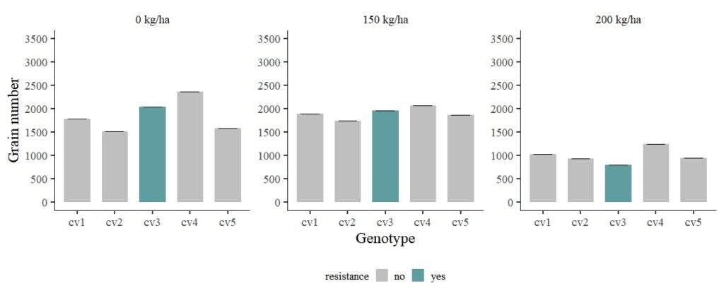
Now, the errors were adjusted by BLUE.
Let’s consider another scenario: cv1 and cv2 are genotypes highly susceptible to disease, while cv4 and cv5 are genotypes less susceptible to disease.
dataB$traits= ifelse(dataB$genotype=="cv1"|dataB$genotype=="cv2", "high susceptible",
              ifelse(dataB$genotype=="cv4"|dataB$genotype=="cv5", "less susceptible", "resistance"))

dataB
   genotype plot resistance fertilizer   GN   AGW   BLUE_GN           traits
1       cv1    1         no        150 1310 33.15 1885.7234 high susceptible
2       cv1    1         no          0 1168 25.07 1783.2109 high susceptible
3       cv1    1         no        200  570 36.04 1020.6757 high susceptible
4       cv2    1         no        150 1120 53.05 1737.2744 high susceptible
5       cv2    1         no          0 1230 26.71 1512.8475 high susceptible
6       cv2    1         no        200  795 37.75  924.7064 high susceptible
7       cv3    1        yes        150 2013 27.51 1951.3979       resistance
8       cv3    1        yes          0 2183 24.61 2042.1957       resistance
9       cv3    1        yes        200 1034 36.53  789.3776       resistance
10      cv4    1         no        150 2451 31.58 2064.1596 less susceptible
.
.
.
library(dplyr)
dataC = data.frame(dataB %>%
group_by(traits, resistance, fertilizer) %>%
dplyr::summarize(across(c(GN, BLUE_GN),
.fns= list(Mean=~mean(., na.rm= TRUE),
SD= ~sd(., na.rm= TRUE),
n=~length(.),
se=~sd(.,na.rm= TRUE)/sqrt(length(.))))))
dataC= dataC[,-c(5,6,9,10)]
library (stringr)
dataC$fertilizer= str_replace_all(dataC$fertilizer, '\\b0\\b', '0 kg/ha')
dataC$fertilizer= str_replace_all (dataC$fertilizer, '150','150 kg/ha')
dataC$fertilizer= str_replace_all (dataC$fertilizer, '200','200 kg/ha')
library (ggplot2)
FIG1=ggplot(data=dataC, aes(x=traits, y=BLUE_GN_Mean, fill=resistance))+
geom_bar(stat="identity",position="dodge", width= 0.7, size=1) +
scale_fill_manual(values=c("grey75","cadetblue"))+
geom_errorbar(aes(ymin=BLUE_GN_Mean-BLUE_GN_se, ymax=BLUE_GN_Mean+BLUE_GN_se),
position=position_dodge(0.9), width=0.5) +
scale_y_continuous(breaks=seq(0,3500,500), limits = c(0,3500)) +
facet_wrap (~ fertilizer, scales="free_y") +
labs(x="Genotype", y="Grain number") +
theme_classic(base_size=18, base_family="serif")+
theme(legend.position="bottom",
legend.title=element_text(family="serif", face="plain",
size=13, color= "Black"),
legend.key=element_rect(color="white", fill="white"),
legend.text=element_text(family="serif", face="plain",
size=13, color= "Black"),
legend.background=element_rect(fill="white"),
axis.line=element_line(linewidth=0.5, colour="black"),
strip.background=element_rect(color="white",
linewidth=0.5,linetype="solid"))
FIG1 + windows(width=12, height=5)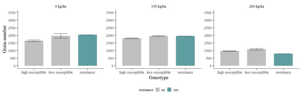
full code; https://github.com/agronomy4future/r_code/blob/main/BLUE_practice

library(readr)
library(lme4)
library(Matrix)
library(dplyr)
library (stringr)

github="https://raw.githubusercontent.com/agronomy4future/raw_data_practice/main/genotype_transgenic_line_with_fertilizer.csv"
dataA= data.frame(read_csv(url(github), show_col_types= FALSE))
dataA= subset(dataA, genotype!="Transgeic_line")

BLUE_0_kg_ha=lmer(GN ~ 0 + (1|genotype), data=subset(dataA, fertilizer=="0"))
BLUE_150_kg_ha=lmer(GN ~ 0 + (1|genotype), data=subset(dataA, fertilizer=="150"))
BLUE_200_kg_ha=lmer(GN ~ 0 + (1|genotype), data=subset(dataA, fertilizer=="200"))

BLUE_0= predict (BLUE_0_kg_ha)
BLUE_150= predict (BLUE_150_kg_ha)
BLUE_200=predict (BLUE_200_kg_ha)

dataA$predicted_0 <- NA
dataA$predicted_0[dataA$fertilizer==0] <- BLUE_0
dataA$predicted_150 <- NA
dataA$predicted_150[dataA$fertilizer==150] <- BLUE_150
dataA$predicted_200 <- NA
dataA$predicted_200[dataA$fertilizer==200] <- BLUE_200

dataB= dataA %>%
  mutate(BLUE_GN= coalesce(predicted_0, predicted_150, predicted_200))
dataB= dataB[,-c(7,8,9)]

dataB$traits= ifelse(dataB$genotype=="cv1"|dataB$genotype=="cv2", "+ susceptible",
                     ifelse(dataB$genotype=="cv4"|dataB$genotype=="cv5", "- susceptible", "resistance"))

dataC = data.frame(dataB %>%
                     group_by(traits, resistance, fertilizer) %>%
                     dplyr::summarize(across(c(GN, BLUE_GN),
                                             .fns= list(Mean=~mean(., na.rm= TRUE),
                                                        SD= ~sd(., na.rm= TRUE),
                                                        n=~length(.),
                                                        se=~sd(.,na.rm= TRUE)/sqrt(length(.))))))


dataC$fertilizer= str_replace_all(dataC$fertilizer, '\\b0\\b', '0 kg/ha')
dataC$fertilizer= str_replace_all (dataC$fertilizer, '150','150 kg/ha')
dataC$fertilizer= str_replace_all (dataC$fertilizer, '200','200 kg/ha')

library (ggplot2)
FIG1=ggplot(data=dataC, aes(x=traits, y=BLUE_GN_Mean, fill=resistance))+
  geom_bar(stat="identity",position="dodge", width= 0.7, size=1) +
  scale_fill_manual(values=c("grey75","cadetblue"))+
  geom_errorbar(aes(ymin=BLUE_GN_Mean-BLUE_GN_se, ymax=BLUE_GN_Mean+BLUE_GN_se),
                position=position_dodge(0.9), width=0.5) +
  scale_y_continuous(breaks=seq(0,3500,500), limits = c(0,3500)) +
  facet_wrap (~ fertilizer, scales="free_y") +
  labs(x="Genotype", y="Grain number") +
  theme_classic(base_size=18, base_family="serif")+
  theme(legend.position="bottom",
        legend.title=element_text(family="serif", face="plain",
                                  size=13, color= "Black"),
        legend.key=element_rect(color="white", fill="white"),
        legend.text=element_text(family="serif", face="plain",
                                 size=13, color= "Black"),
        legend.background=element_rect(fill="white"),
        axis.line=element_line(linewidth=0.5, colour="black"),
        strip.background=element_rect(color="white",
                                      linewidth=0.5,linetype="solid"))
FIG1 + windows(width=13, height=5)