Modifying Graph Axis Style using ggplot in R Studio
This is a method for adjusting the axis formatting of a graph drawn using ggplot() in R Studio. I will create a simple dataset as shown below.
genotype= c("A","B","C")
treatment= c("tr1", "tr2")
yield= c(-0.124, -0.083, -0.07, 0.130, 0.216, 0.182)
dataA= data.frame (genotype, treatment, yield)
dataA

  genotype treatment      y
1        A       tr1 -0.124
2        B       tr2 -0.083
3        C       tr1 -0.070
4        A       tr2  0.130
5        B       tr1  0.216
6        C       tr2  0.182
Next, I will use this data to create a bar graph.
library(ggplot2)
ggplot (data=dataA, aes(x=genotype, y=yield, fill=treatment)) +
  geom_bar (stat="identity", position= position_dodge(0.9)) +
  scale_fill_manual("Treatment", values= c("tr1"="darkred", "tr2"="cadetblue")) +
  geom_hline(yintercept=0, linetype="dashed", linewidth=1, color="red") +
  labs(x="Genotype", y="Yield") +
  theme_classic(base_size=18, base_family="serif") +
  theme(legend.position="right",
        legend.title=element_text(family="serif", face="plain",
                                 size=18, color= "black"),
        legend.key=element_rect(color="white", fill="white"),
        legend.text=element_text(family="serif", face="plain",
                                 size=18, color= "black"),
        legend.background=element_rect(fill="white"),
        axis.line=element_line(linewidth=0.5, colour="black"))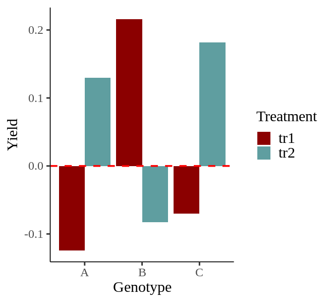
I have created the bar graph as shown above. Now, let’s proceed to adjust the axis formatting of the graph.
1) Setting Axis Range
I will adjust the range of the y-axis values. I want to set the range from -1 to 1 with increments of 0.2. I will use the code scale_y_continuous().
library(ggplot2)
ggplot (data=dataA, aes(x=genotype, y=yield, fill=treatment)) +
  geom_bar (stat="identity", position= position_dodge(0.9)) +
  scale_fill_manual("Treatment", values= c("tr1"="darkred", "tr2"="cadetblue")) +
  geom_hline(yintercept=0, linetype="dashed", linewidth=1, color="red") +
  scale_y_continuous(breaks= seq(-1, 1, 0.2), limits= c(-1, 1)) +
  labs(x="Genotype", y="Yield") +
  theme_classic(base_size=18, base_family="serif") +
  theme(legend.position="right",
        legend.title=element_text(family="serif", face="plain",
                                 size=18, color= "black"),
        legend.key=element_rect(color="white", fill="white"),
        legend.text=element_text(family="serif", face="plain",
                                 size=18, color= "black"),
        legend.background=element_rect(fill="white"),
        axis.line=element_line(linewidth=0.5, colour="black"))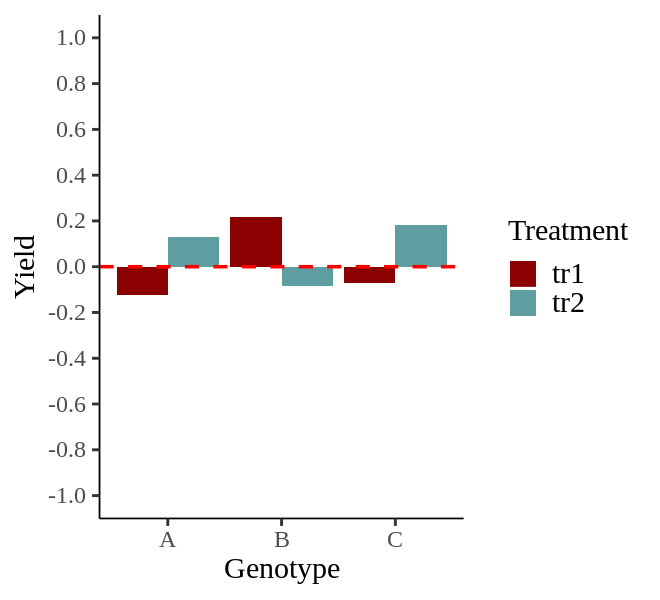
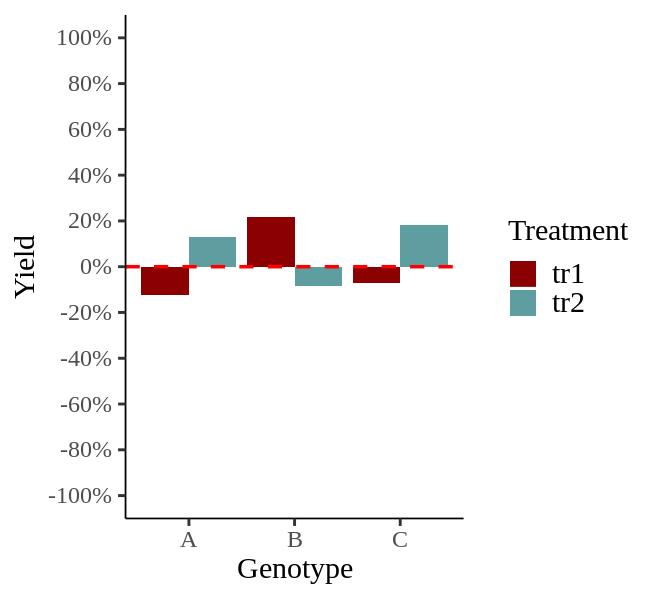
2) Setting The Axis Units to %
I would like to set the unit of the y-axis values to %. I will include labels= scales::percent in scale_y_continuous().
library(ggplot2)
ggplot (data=dataA, aes(x=genotype, y=yield, fill=treatment)) +
  geom_bar (stat="identity", position= position_dodge(0.9)) +
  scale_fill_manual("Treatment", values= c("tr1"="darkred", "tr2"="cadetblue")) +
  geom_hline(yintercept=0, linetype="dashed", linewidth=1, color="red") +
  scale_y_continuous(breaks= seq(-1, 1, 0.2), limits= c(-1, 1), labels= scales::percent) +
  labs(x="Genotype", y="Yield") +
  theme_classic(base_size=18, base_family="serif") +
  theme(legend.position="right",
        legend.title=element_text(family="serif", face="plain",
                                 size=18, color= "black"),
        legend.key=element_rect(color="white", fill="white"),
        legend.text=element_text(family="serif", face="plain",
                                 size=18, color= "black"),
        legend.background=element_rect(fill="white"),
        axis.line=element_line(linewidth=0.5, colour="black"))
3) Changing Axis Title Names
Now, I would like to change the x-axis name to “Cultivar” and the y-axis name to “Responsiveness.” Inside labs(), I will input the axis names I want to change.
library(ggplot2)
ggplot (data=dataA, aes(x=genotype, y=yield, fill=treatment)) +
  geom_bar (stat="identity", position= position_dodge(0.9)) +
  scale_fill_manual("Treatment", values= c("tr1"="darkred", "tr2"="cadetblue")) +
  geom_hline(yintercept=0, linetype="dashed", linewidth=1, color="red") +
  scale_y_continuous(breaks= seq(-1, 1, 0.2), limits= c(-1, 1), labels= scales::percent) +
  labs(x="Cultivar", y="Responsiveness") +
  theme_classic(base_size=18, base_family="serif") +
  theme(legend.position="right",
        legend.title=element_text(family="serif", face="plain",
                                 size=18, color= "black"),
        legend.key=element_rect(color="white", fill="white"),
        legend.text=element_text(family="serif", face="plain",
                                 size=18, color= "black"),
        legend.background=element_rect(fill="white"),
        axis.line=element_line(linewidth=0.5, colour="black"))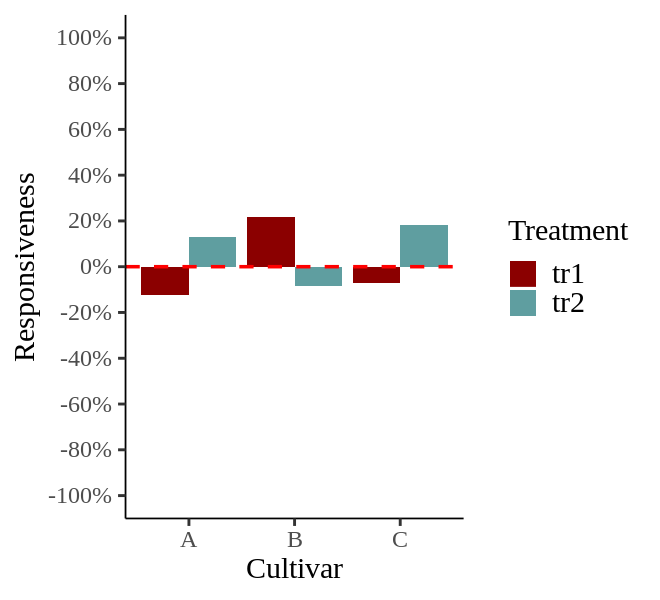
4) Changing Axis Title Font Size/Color
Now, I would like to change the font size and color of these modified axis titles.
library(ggplot2)
ggplot (data=dataA, aes(x=genotype, y=yield, fill=treatment)) +
  geom_bar (stat="identity", position= position_dodge(0.9)) +
  scale_fill_manual("Treatment", values= c("tr1"="darkred", "tr2"="cadetblue")) +
  geom_hline(yintercept=0, linetype="dashed", linewidth=1, color="red") +
  scale_y_continuous(breaks= seq(-1, 1, 0.2), limits= c(-1, 1), labels= scales::percent) +
  labs(x="Cultivar", y="Responsiveness") +
  theme_classic(base_size=18, base_family="serif") +
  theme(axis.title.x= element_text (size=18, color="blue"),
        axis.title.y= element_text (size=18, color="blue"),
        legend.position="right",
        legend.title=element_text(family="serif", face="plain",
                                 size=18, color= "black"),
        legend.key=element_rect(color="white", fill="white"),
        legend.text=element_text(family="serif", face="plain",
                                 size=18, color= "black"),
        legend.background=element_rect(fill="white"),
        axis.line=element_line(linewidth=0.5, colour="black"))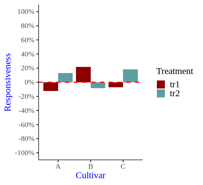
5) Changing Axis Text Font Size/Color
Now, I’d like to change the axis text. I will increase the size slightly and set the color to red.
library(ggplot2)
ggplot (data=dataA, aes(x=genotype, y=yield, fill=treatment)) +
  geom_bar (stat="identity", position= position_dodge(0.9)) +
  scale_fill_manual("Treatment", values= c("tr1"="darkred", "tr2"="cadetblue")) +
  geom_hline(yintercept=0, linetype="dashed", linewidth=1, color="red") +
  scale_y_continuous(breaks= seq(-1, 1, 0.2), limits= c(-1, 1), labels= scales::percent) +
  labs(x="Cultivar", y="Responsiveness") +
  theme_classic(base_size=18, base_family="serif") +
  theme(axis.title.x= element_text (size=18, color="blue"),
        axis.title.y= element_text (size=18, color="blue"),
        axis.text.x= element_text (size=18, color="red"),
        axis.text.y= element_text (size=18, color="red"),
        legend.position="right",
        legend.title=element_text(family="serif", face="plain",
                                 size=18, color= "black"),
        legend.key=element_rect(color="white", fill="white"),
        legend.text=element_text(family="serif", face="plain",
                                 size=18, color= "black"),
        legend.background=element_rect(fill="white"),
        axis.line=element_line(linewidth=0.5, colour="black"))
6) Changing Axis Title and Text Font Type
I will change the font type of the graph’s title and text.
library(ggplot2)
ggplot (data=dataA, aes(x=genotype, y=yield, fill=treatment)) +
  geom_bar (stat="identity", position= position_dodge(0.9)) +
  scale_fill_manual("Treatment", values= c("tr1"="darkred", "tr2"="cadetblue")) +
  geom_hline(yintercept=0, linetype="dashed", linewidth=1, color="red") +
  scale_y_continuous(breaks= seq(-1, 1, 0.2), limits= c(-1, 1), labels= scales::percent) +
  labs(x="Cultivar", y="Responsiveness") +
  theme_classic(base_size=18, base_family="serif") +
  theme(axis.title.x= element_text (family="serif", size=18, color="blue"),
        axis.title.y= element_text (family="serif", size=18, color="blue"),
        axis.text.x= element_text (family="serif", size=18, color="red"),
        axis.text.y= element_text (family="serif", size=18, color="red"),
        legend.position="right",
        legend.title=element_text(family="serif", face="plain",
                                 size=18, color= "black"),
        legend.key=element_rect(color="white", fill="white"),
        legend.text=element_text(family="serif", face="plain",
                                 size=18, color= "black"),
        legend.background=element_rect(fill="white"),
        axis.line=element_line(linewidth=0.5, colour="black"))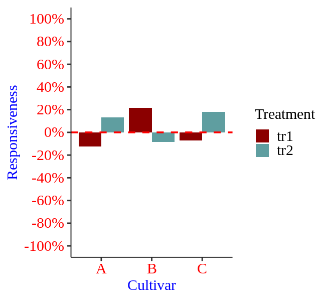
Code summary
https://github.com/agronomy4future/r_code/blob/main/Modifying_Graph_Axis_Style_using_ggplot_in_R_Studio.ipynb