In R, Drawing Lines with Different X-axis Starting Positions
In R, I want to draw a line in a graph, and first, I’ll create the data.
library(ggplot2)
library(dplyr)

treatment=rep(c("Cultivar A", "Cultivar B", "Cultivar C", "Cultivar D", "Cultivar E"), each=3)
rep=rep(c("I", "II", "III"), time=5)
yield=c(10, 11, 21, 13, 23, 23, 13, 13, 5, 33, 21, 13, 42, 12, 13)
dataA=data.frame(treatment, rep, yield)

summary=dataA %>%
        group_by(treatment) %>%
        summarize(across(c(yield),
                   .fns= list(
                    Mean= ~mean(., na.rm=TRUE),
                    SD= ~sd(., na.rm=TRUE),
                    n= ~length(.),
                    se= ~sd(., na.rm=TRUE) / sqrt(length(.))
                   ))) %>%
ungroup()

   treatment yield_Mean  yield_SD yield_n yield_se
1 Cultivar A   14.00000  6.082763       3 3.511885
2 Cultivar B   19.66667  5.773503       3 3.333333
3 Cultivar C   10.33333  4.618802       3 2.666667
4 Cultivar D   22.33333 10.066446       3 5.811865
5 Cultivar E   22.33333 17.039171       3 9.837570
Next, I’ll create a bar graph.
ggplot(data= summary, aes(x=treatment, y=yield_Mean)) +
  geom_bar(stat="identity", position="dodge", width=0.7, size=1,
           fill="grey50", color="grey15") +
  geom_errorbar(aes(ymin= yield_Mean-yield_se, ymax=yield_Mean+yield_se),
                position=position_dodge(0.9), width=0.5) +
  scale_y_continuous(breaks=seq(0, 50, 10), limits=c(0, 50)) +
  labs(x="Cultivar", y="Yield") +
  theme_classic(base_size=18, base_family="serif") +
  windows(width=5.5, height=5)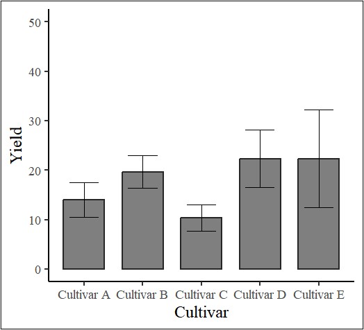
In this graph, I want to draw a horizontal line. The code to draw lines is introduced in the post below.
□ Drawing Lines in ggplot()
I added a horizontal line to represent the mean yield of all cultivars.
ggplot(data=summary, aes(x=treatment, y=yield_Mean)) +
  geom_bar(stat="identity", position="dodge", width=0.7, size=1,
           fill="grey50", color="grey15") +
  geom_errorbar(aes(ymin=yield_Mean-yield_se, ymax=yield_Mean+yield_se),
                position=position_dodge(0.9), width=0.5) +
  geom_hline(yintercept=mean(summary$yield_Mean), linetype="dotted", color="blue") +
  scale_y_continuous(breaks=seq(0, 50, 10), limits=c(0, 50)) +
  labs(x="Cultivar", y="Yield") +
  theme_classic(base_size=18, base_family="serif") +
  windows(width=5.5, height=5)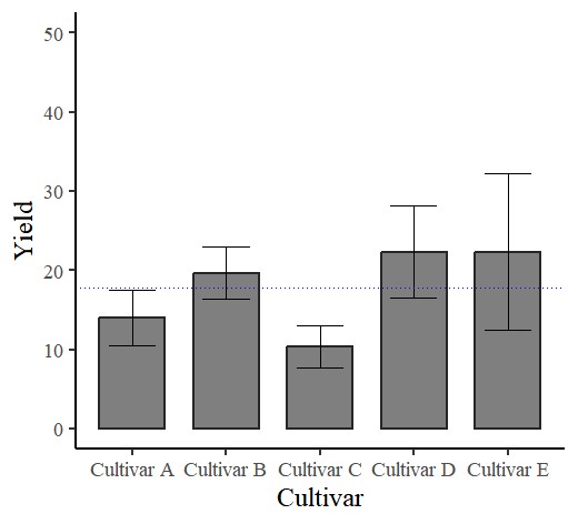
Next, I would like to draw a horizontal line starting from Cultivar B. How can this be achieved? I’ll add geom_segment().
ggplot(data=summary, aes(x=treatment, y=yield_Mean)) +
  geom_bar(stat="identity", position="dodge", width=0.7, size=1,
           fill="grey50", color="grey15") +
  geom_errorbar(aes(ymin=yield_Mean-yield_se, ymax=yield_Mean+yield_se),
                position=position_dodge(0.9), width=0.5) +

  geom_segment(aes(x=1.5,
                   y=mean(na.rm=TRUE, mean(yield_Mean)),
                   xend=max(as.numeric(factor(treatment))),
                   yend=mean(na.rm=TRUE, mean(yield_Mean))),
                   linetype="dashed", color="grey25", size=0.5) +

  scale_y_continuous(breaks=seq(0, 50, 10), limits=c(0, 50)) +
  labs(x="Cultivar", y="Yield") +
  theme_classic(base_size=18, base_family="serif") +
  windows(width=5.5, height=5)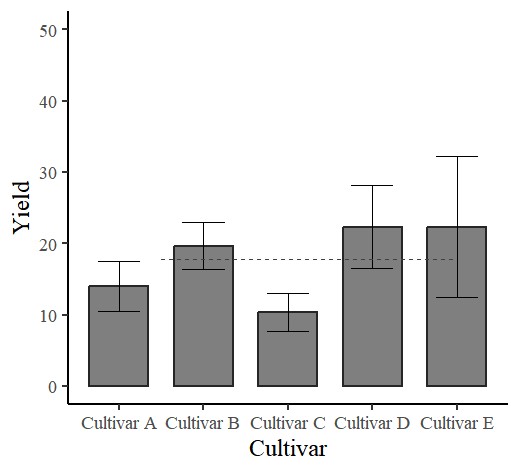
Code summary
https://github.com/agronomy4future/r_code/blob/main/In_R%2C_Drawing_Lines_with_Different_X_axis_Starting_Positions.ipynb
© 2022 – 2023 https://agronomy4future.com