Generating Graphs and Summarizing Data Tables in Data Analyst By ChatGPT (feat. texting to coding)
If you update to ChatGPT Plus version, we can access Data Analyst, and “you can create graphs by texting instead of coding“.
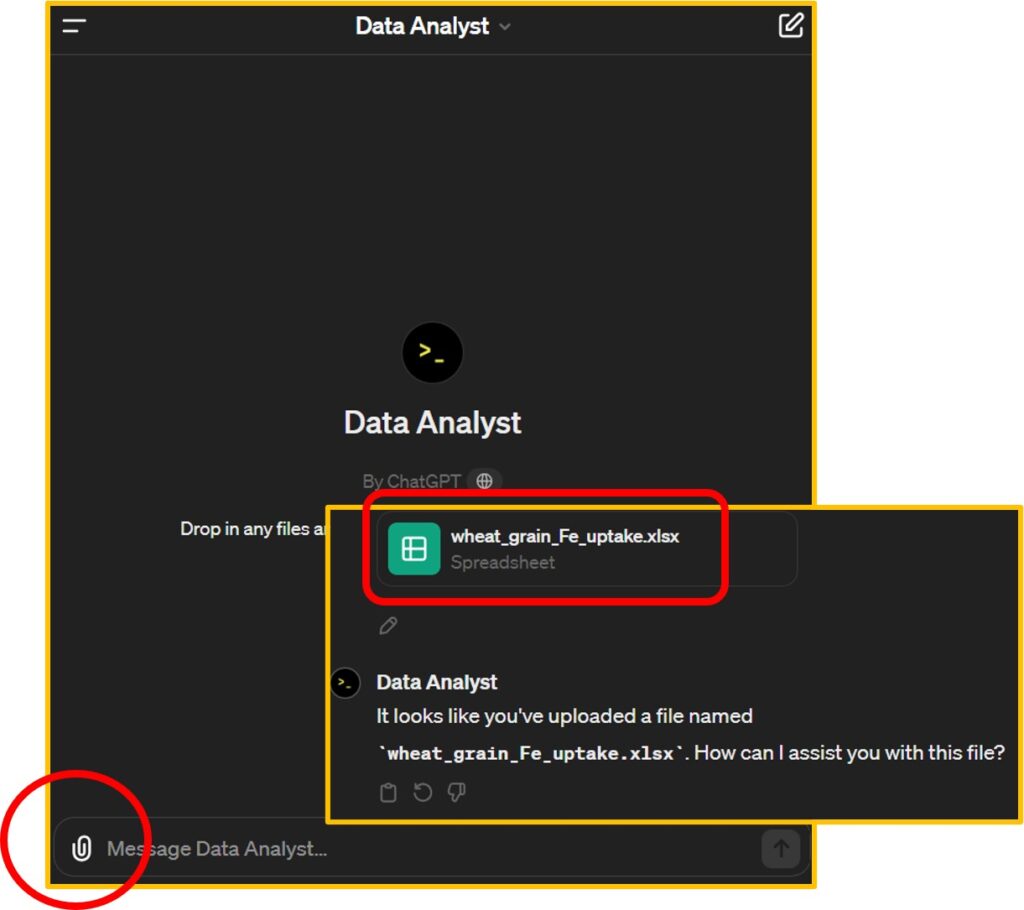
Let’s upload a dataset into Data Analyst. This dataset contains data about Fe uptake on wheat grains. If you run the following R code, you can download the data from my GitHub.
library(readr)
github="https://raw.githubusercontent.com/agronomy4future/raw_data_practice/main/wheat_grain_Fe_uptake.csv"
dataA= data.frame(read_csv(url(github), show_col_types=FALSE))

library(writexl)
write_xlsx (dataA,"C:/Users/Desktop/wheat_grain_Fe_uptake.xlsx")
After downloading the data, let’s proceed to Data Analyst, click the upload button, and upload the data file.
ChatGPT - Data Analyst
Starting now, I’ll be texting to summarize data tables and create graphs. First, I’d like to request the creation of a mean summarized data table with standard error. Data Analyst not only provides the data table but also offers Python code related to this dataset, which adds to its amazing capabilities.
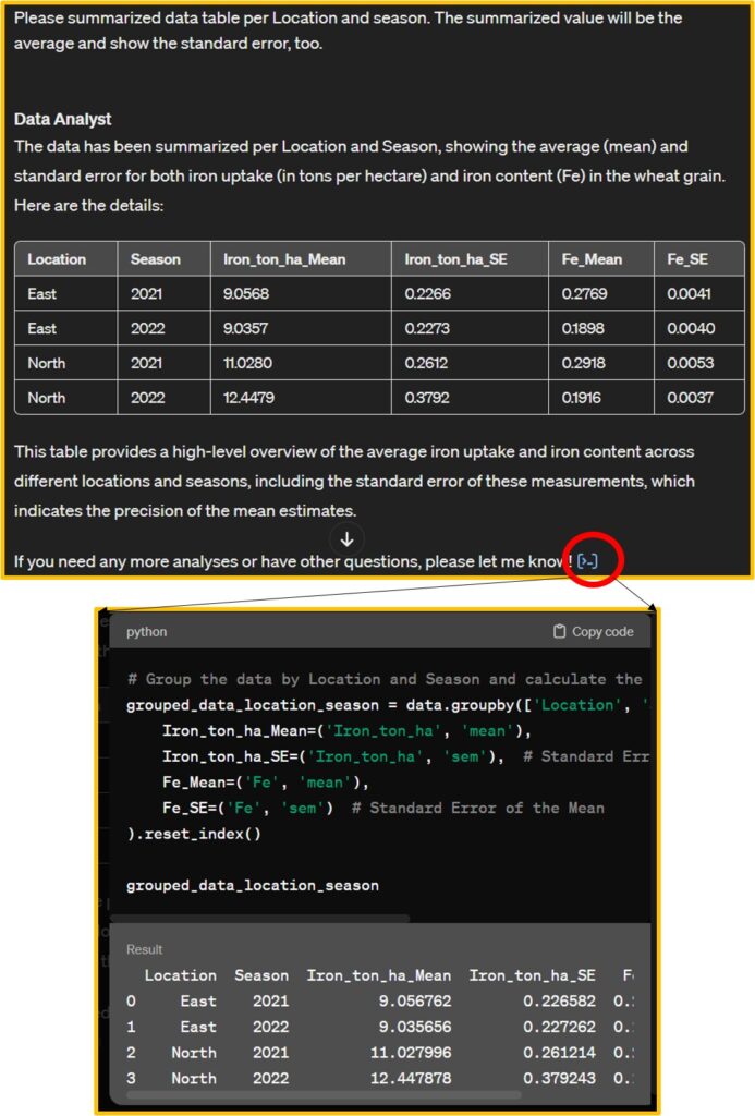
# Group the data by Location and Season and calculate the mean and standard error for Iron_ton_ha and Fe
grouped_data_location_season = data.groupby(['Location', 'Season']).agg(
    Iron_ton_ha_Mean=('Iron_ton_ha', 'mean'),
    Iron_ton_ha_SE=('Iron_ton_ha', 'sem'),  # Standard Error of the Mean
    Fe_Mean=('Fe', 'mean'),
    Fe_SE=('Fe', 'sem')  # Standard Error of the Mean
).reset_index()
I’ll copy this code in my Google Colab and run this code to check this code is correct.
import pandas as pd
import requests
from io import StringIO

github="https://raw.githubusercontent.com/agronomy4future/raw_data_practice/main/wheat_grain_Fe_uptake.csv"
response=requests.get(github)
dataA=pd.read_csv(StringIO(response.text))

grouped_data_location_season = dataA.groupby(['Location', 'Season']).agg(
    Iron_ton_ha_Mean=('Iron_ton_ha', 'mean'),
    Iron_ton_ha_SE=('Iron_ton_ha', 'sem'),  # Standard Error of the Mean
    Fe_Mean=('Fe', 'mean'),
    Fe_SE=('Fe', 'sem')  # Standard Error of the Mean
).reset_index()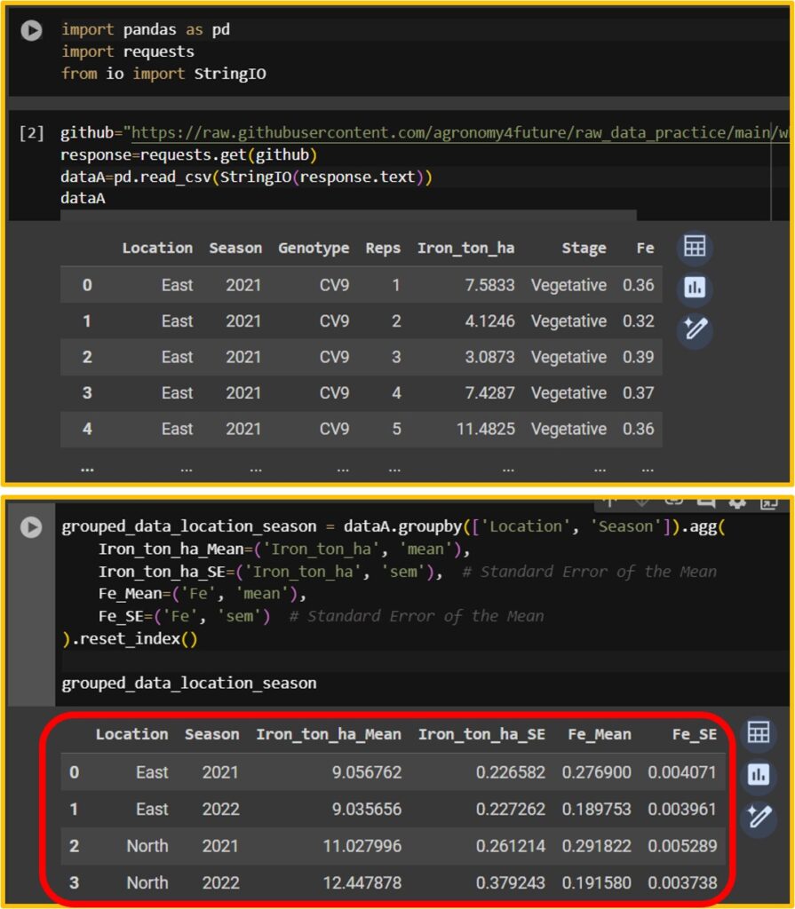
When I run the code Data Analyst provides, I can obtain the same data table.
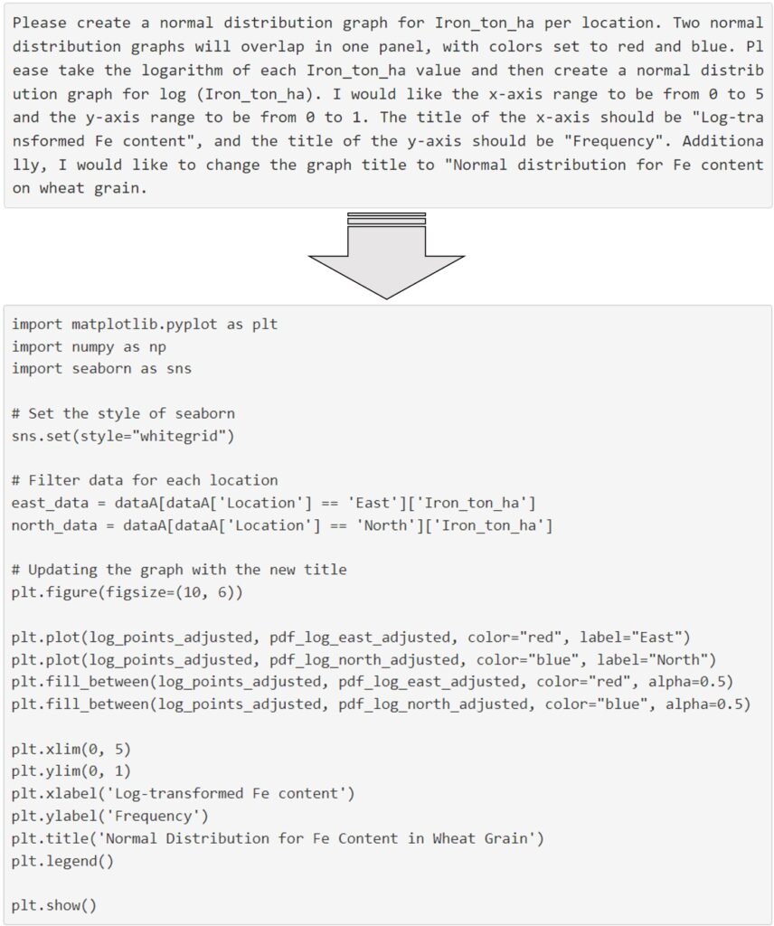
Next, I’ll proceed to create a graph. I requested Data Analyst to generate a normal distribution graph.
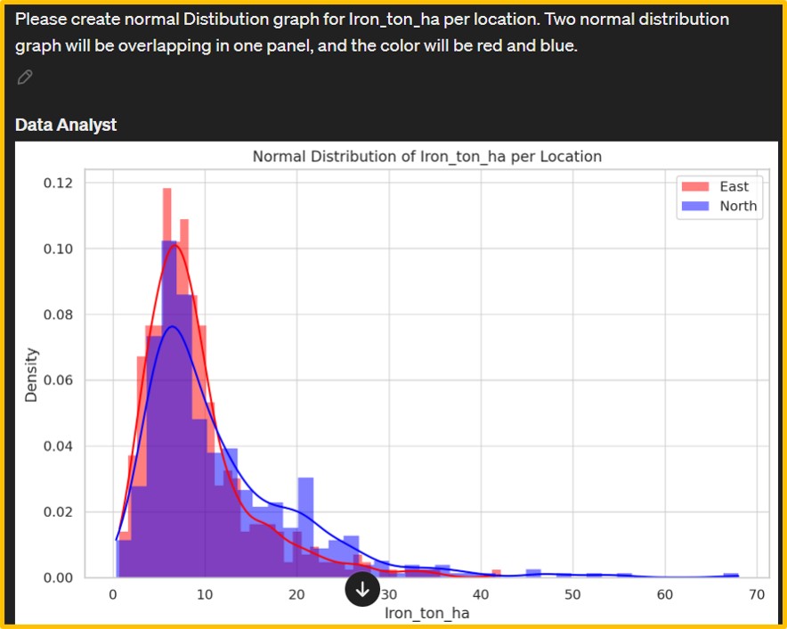
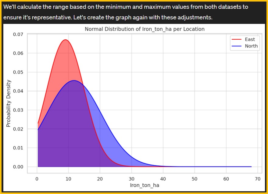
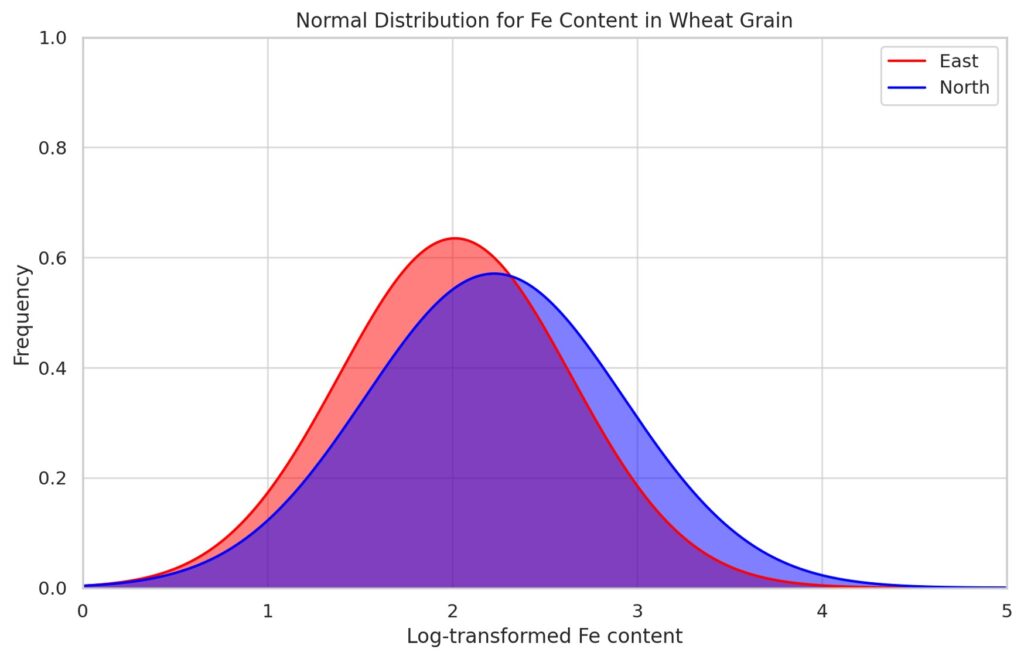
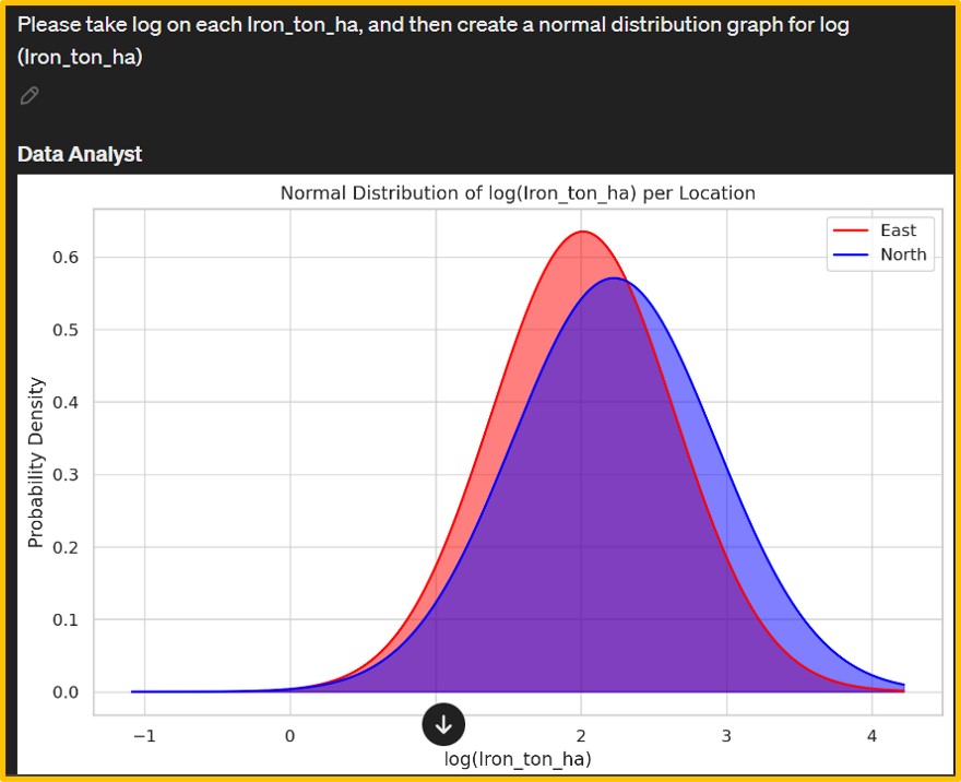
However, the initial output was a density graph (left figure). Consequently, I provided additional details about the desired normal distribution graph, leading Data Analyst to generate a new graph (right figure). The iron content data on wheat grains appears to deviate from normality. Hence, I requested Data Analyst to apply a logarithmic transformation to the iron content and then generate a normal distribution graph.
Afterward, I adjusted the range and titles of the x and y axes to enhance clarity and relevance. Data Analyst also provide Python code.
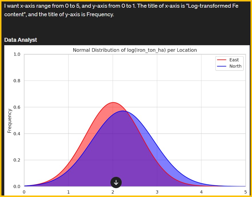
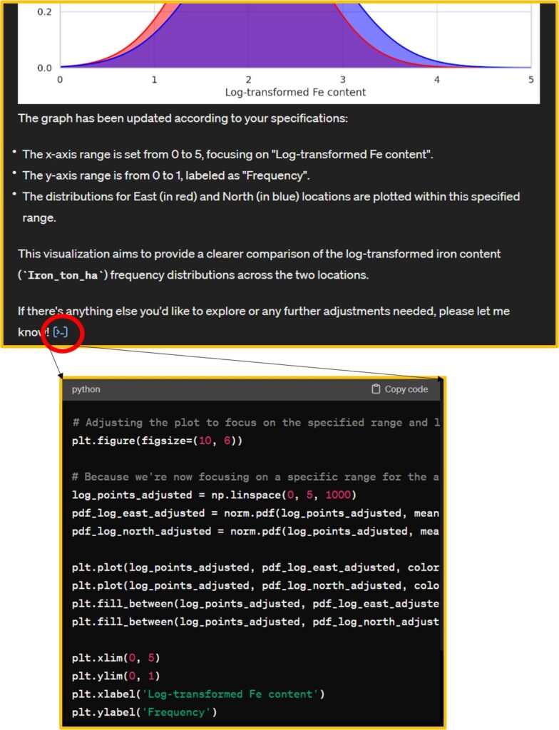
import matplotlib.pyplot as plt
import numpy as np
import seaborn as sns
# Set the style of seaborn
sns.set(style="whitegrid")
# Filter data for each location
east_data = dataA[dataA['Location'] == 'East']['Iron_ton_ha']
north_data = dataA[dataA['Location'] == 'North']['Iron_ton_ha']
# Updating the graph with the new title
plt.figure(figsize=(10, 6))
plt.plot(log_points_adjusted, pdf_log_east_adjusted, color="red", label="East")
plt.plot(log_points_adjusted, pdf_log_north_adjusted, color="blue", label="North")
plt.fill_between(log_points_adjusted, pdf_log_east_adjusted, color="red", alpha=0.5)
plt.fill_between(log_points_adjusted, pdf_log_north_adjusted, color="blue", alpha=0.5)
plt.xlim(0, 5)
plt.ylim(0, 1)
plt.xlabel('Log-transformed Fe content')
plt.ylabel('Frequency')
plt.title('Normal Distribution for Fe Content in Wheat Grain')
plt.legend()
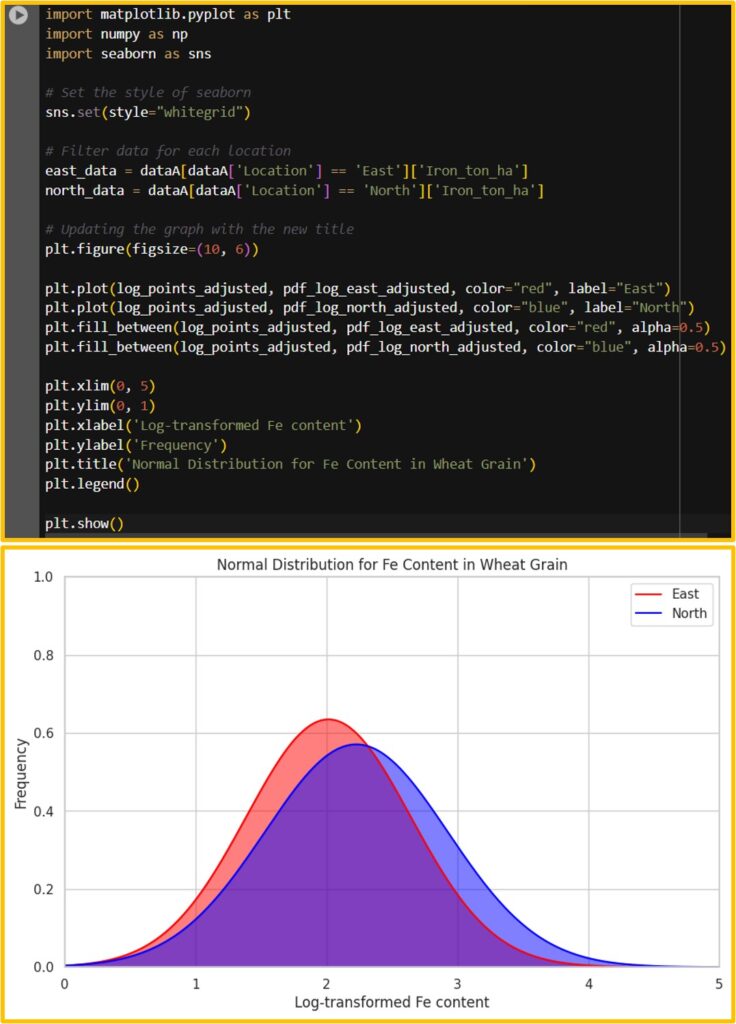
plt.show()I’ll run this code in Google Colab. We can obtain the same graph.
This is a new paradigm shift because texting could be directly converted into coding. The paragraph below is what I typed in Data Analyst, and based on this text, ChatGPT converted it into code.
full code: https://github.com/agronomy4future/python_code/blob/main/Generating_Graphs_and_Summarizing_Data_Tables.ipynb