How to add separate text to panels divided by facet_wrap() in R?
□ Graph Partitioning Using facet_wrap() in R Studio
□ How to customize the title format in facet_wrap()?
In my previous posts, I introduced how to divide panels in one figure using facet_wrap(). Today, I’ll introduce how to add separate text to panels.
First, let’s make sure we have the required packages installed.
library(dplyr)
library(tidyr)
library(ggplot2)
I’ll create a dataset as shown below:
Nitrogen= c(rep("N0", 5), rep("N1", 5))
Cultivar_1= c(50,49,48,47,46,60,62,63,64,62)
Cultivar_2= c(55,57,56,55,54,65,66,67,64,63)
Cultivar_3= c(60,62,63,65,59,60,59,57,56,58)
dataA= data.frame(Nitrogen, Cultivar_1, Cultivar_2, Cultivar_3)

dataA
   Nitrogen Cultivar_1 Cultivar_2 Cultivar_3
1        N0         50         55         60
2        N0         49         57         62
3        N0         48         56         63
4        N0         47         55         65
5        N0         46         54         59
6        N1         60         65         60
7        N1         62         66         59
8        N1         63         67         57
9        N1         64         64         56
10       N1         62         63         58
Next, I’ll reshape the dataset into columns to facilitate data analysis.
df= data.frame(
               dataA %>%
               pivot_longer(
               cols=c(Cultivar_1, Cultivar_2, Cultivar_3),
               names_to="Genotype", values_to="Yield")
               )

df
Nitrogen	Genotype	Yield
N0	        Cultivar_1	50
N0	        Cultivar_2	55
N0	        Cultivar_3	60
N0	        Cultivar_1	49
N0	        Cultivar_2	57
N0	        Cultivar_3	62
.
.
.
And then, I’ll summarize this data using descriptive statistics.
dataB= data.frame(df %>%
  group_by(Genotype, Nitrogen) %>%
  dplyr::summarize(across(c(Yield),
                          .fns = list(Mean = mean,
                                      SD = sd,
                                      n = length,
                                      se = ~ sd(.)/sqrt(length(.))))))
dataB
Genotype	Nitrogen	Yield_Mean	Yield_SD	Yield_n	Yield_se
Cultivar_1	N0	48.0	1.581139	5	0.7071068
Cultivar_1	N1	62.2	1.483240	5	0.6633250
Cultivar_2	N0	55.4	1.140175	5	0.5099020
Cultivar_2	N1	65.0	1.581139	5	0.7071068
Cultivar_3	N0	61.8	2.387467	5	1.0677078
Cultivar_3	N1	58.0	1.581139	5	0.7071068
Finally, I’ll create a graph to visualize the summarized data.
ggplot (data=dataB, aes(x=Genotype, y=Yield_Mean, fill=Nitrogen)) +
  geom_bar(stat="identity",position="dodge") +
  geom_errorbar(aes(ymin= Yield_Mean-Yield_se, ymax= Yield_Mean+Yield_se),
                position=position_dodge(0.9), width=0.2) +
  scale_fill_manual(values= c("Gray","Dark green")) +
  scale_y_continuous(breaks= seq(0, 100, 20), limits= c(0, 100))+
  facet_wrap(~Nitrogen) +
  labs(x="Cultivar", y="Yield") +
  theme_classic(base_size=18, base_family="serif")+
  theme(legend.position='none',
        legend.title=element_blank(),
        legend.key=element_rect(color="white", fill="white"),
        legend.text=element_text(family="serif", face="plain",
                                 size=15, color= "Black"),
        legend.background=element_rect(fill="white"),
        axis.line=element_line(linewidth=0.5, colour="black"),
        strip.background=element_rect(color="white",
                                      linewidth=0.5,linetype="solid"))
In this graph, I want to indicate statistical significance with asterisks (***) in each panel. First, I’ll add asterisks in the N0 panel.
ggplot (data=dataB, aes(x=Genotype, y=Yield_Mean, fill=Nitrogen)) +
  geom_bar(stat="identity",position="dodge") +
  geom_errorbar(aes(ymin= Yield_Mean-Yield_se, ymax= Yield_Mean+Yield_se),
                position=position_dodge(0.9), width=0.2) +
  scale_fill_manual(values= c("Gray","Dark green")) +
  ###
  geom_text(aes(family="serif",fontface=6), x=1.5, y=80, label="***", size=7, col="red") +
  ###
  scale_y_continuous(breaks= seq(0, 100, 20), limits= c(0, 100))+
  facet_wrap(~Nitrogen) +
  annotate("segment", x=1.5, xend=2.5, y=Inf,yend=Inf, color="black", lwd=1)+
  labs(x="Cultivar", y="Yield") +
  theme_classic(base_size=18, base_family="serif")+
  theme(legend.position='none',
        legend.title=element_blank(),
        legend.key=element_rect(color="white", fill="white"),
        legend.text=element_text(family="serif", face="plain",
                                 size=15, color= "Black"),
        legend.background=element_rect(fill="white"),
        axis.line=element_line(linewidth=0.5, colour="black"),
        strip.background=element_rect(color="white",
                                      linewidth=0.5,linetype="solid"))
The problem is that *** is added to both panels. I want a different symbol for each panel.
to create data table to insert text to specific panel
I’ll create a data table.
text1= data.frame(Nitrogen="N0", STAT= "***", Genotype="Cultivar_2", Yield=70)

text1
Nitrogen	STAT	Genotype	Yield
N0	        ***	Cultivar_2	70
I’ll add this data table to the geom_text().
geom_text(data=text1, aes(family="serif", x=Genotype, y=Yield, label=STAT), size=5, color="red")Let’s create a graph again, this time to visualize the data.
ggplot (data=dataB, aes(x=Genotype, y=Yield_Mean, fill=Nitrogen)) +
  geom_bar(stat="identity",position="dodge") +
  geom_errorbar(aes(ymin= Yield_Mean-Yield_se, ymax= Yield_Mean+Yield_se),
                position=position_dodge(0.9), width=0.2) +
  scale_fill_manual(values= c("Gray","Dark green")) +
  ###
  geom_text(data=text1, aes(family="serif", x=Genotype, y=Yield, label=STAT), size=5, color="red") +
  ###
  scale_y_continuous(breaks= seq(0, 100, 20), limits= c(0, 100))+
  facet_wrap(~Nitrogen) +
  annotate("segment", x=1.5, xend=2.5, y=Inf,yend=Inf, color="black", lwd=1)+
  labs(x="Cultivar", y="Yield") +
  theme_classic(base_size=18, base_family="serif")+
  theme(legend.position='none',
        legend.title=element_blank(),
        legend.key=element_rect(color="white", fill="white"),
        legend.text=element_text(family="serif", face="plain",
                                 size=15, color= "Black"),
        legend.background=element_rect(fill="white"),
        axis.line=element_line(linewidth=0.5, colour="black"),
        strip.background=element_rect(color="white",
                                      linewidth=0.5,linetype="solid"))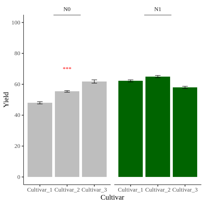
I’ll create another data table to add text in the second panel.
text2= data.frame(Nitrogen="N1", STAT= "**", Genotype="Cultivar_1", Yield=80)
geom_text(data=text2, aes(family="serif", x=Genotype, y=Yield, label=STAT), size=5, color="red")

##
ggplot (data=dataB, aes(x=Genotype, y=Yield_Mean, fill=Nitrogen)) +
  geom_bar(stat="identity",position="dodge") +
  geom_errorbar(aes(ymin= Yield_Mean-Yield_se, ymax= Yield_Mean+Yield_se),
                position=position_dodge(0.9), width=0.2) +
  scale_fill_manual(values= c("Gray","Dark green")) +
  ###
  geom_text(data=text1, aes(family="serif", x=Genotype, y=Yield, label=STAT), size=5, color="red") +
  geom_text(data=text2, aes(family="serif", x=Genotype, y=Yield, label=STAT), size=5, color="red") +
  ###
  scale_y_continuous(breaks= seq(0, 100, 20), limits= c(0, 100))+
  facet_wrap(~Nitrogen) +
  annotate("segment", x=1.5, xend=2.5, y=Inf,yend=Inf, color="black", lwd=1)+
  labs(x="Cultivar", y="Yield") +
  theme_classic(base_size=18, base_family="serif")+
  theme(legend.position='none',
        legend.title=element_blank(),
        legend.key=element_rect(color="white", fill="white"),
        legend.text=element_text(family="serif", face="plain",
                                 size=15, color= "Black"),
        legend.background=element_rect(fill="white"),
        axis.line=element_line(linewidth=0.5, colour="black"),
        strip.background=element_rect(color="white",
                                      linewidth=0.5,linetype="solid"))
Now, different asterisks (***) are indicated in each panel.
full code: https://github.com/agronomy4future/r_code/blob/main/How_to_add_separate_text_to_panels_divided_by_facet_wrap()_in_R.ipynb