A Practical Guide to Data Normalization using Z-Tests in Python
Today, I’ll introduce one method for data normalization, utilizing the biomass with N and P uptake data available on my GitHub.
import pandas as pd
import requests
from io import StringIO

github="https://raw.githubusercontent.com/agronomy4future/raw_data_practice/main/biomass_N_P.csv"
response=requests.get(github)
df=pd.read_csv(StringIO(response.text))

df.head(5)
  season cultivar treatment rep biomass nitrogen phosphorus
1   2022      cv1        N0   1    9.16     1.23       0.41
2   2022      cv1        N0   2   13.06     1.49       0.45
3   2022      cv1        N0   3    8.40     1.18       0.31
4   2022      cv1        N0   4   11.97     1.42       0.48
5   2022      cv1        N1   1   24.90     1.77       0.49
.
.
.
I also aim to create regression graphs illustrating the relationship between biomass and either nitrogen or phosphorus. First, I’ll generate a regression graph for biomass with either nitrogen or phosphorus to observe the data patterns.
df1 = df.melt(id_vars=['season', 'cultivar', 'treatment', 'rep', 'biomass'],
              var_name='nutrient',
              value_name='uptake',
              value_vars=['nitrogen', 'phosphorus'])

df1.head(5)
season	cultivar treatment rep	biomass  nutrient  uptake
2022	cv1	 N0	   1	9.16	 nitrogen  1.23
2022	cv1	 N0	   2	13.06	 nitrogen  1.49
2022	cv1	 N0	   3	8.40	 nitrogen  1.18
2022	cv1	 N0	   4	11.97	 nitrogen  1.42
2022	cv1	 N1	   1	24.90	 nitrogen  1.77
.
.
.
import matplotlib.pyplot as plt
import seaborn as sns
# Set the style without grid
sns.set_style("white")
# Plot
plt.figure(figsize=(5.5, 5))
sns.scatterplot(
data=df1,
x='biomass',
y='uptake',
hue='nutrient',
style='nutrient',
palette={'nitrogen':'darkred', 'phosphorus':'orange'},
markers={'nitrogen':'o', 'phosphorus':'o'},
s=100,
edgecolor="black"
)
# Set axis limits and ticks
plt.xlim(0, 80)
plt.ylim(0, 5)
plt.xticks(range(0, 81, 10))
plt.yticks(range(0, 6, 1))
# Set axis labels
plt.xlabel('Biomass', fontsize=18)
plt.ylabel('Plant N or P uptake (%)', fontsize=18)
# Set legend
legend = plt.legend(title=None, loc='upper right', fontsize=15, frameon=False)
# Set font properties
plt.rcParams["font.family"] = "serif"
plt.rcParams["font.size"] = 15
# Show plot
plt.show()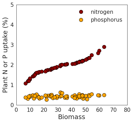
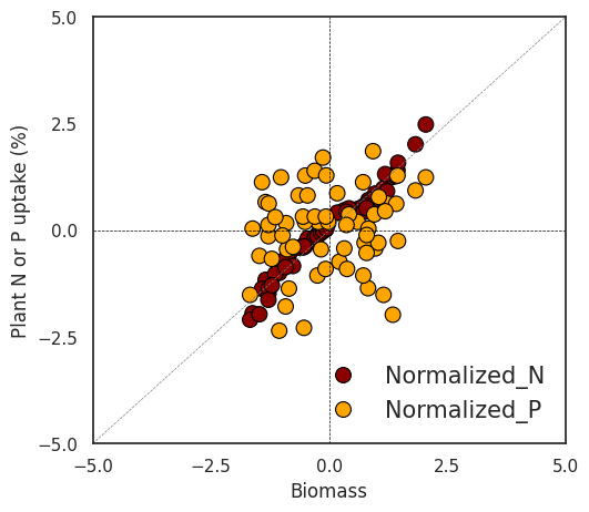
I notice a clear pattern between biomass and nitrogen. However, when combining nitrogen and phosphorus in the same panel due to their different data ranges, the trend between biomass and phosphorus becomes less distinct. In this situation, data normalization would solve this problem.
For data normalization, I’ll use Z-test. This method is also known as standardization, it scales the data to have a mean of 0 and a standard deviation of 1.

where 𝜇 is the mean and 𝜎 is the standard deviation of the data. This method is suitable when the data follows a Gaussian distribution.
For normalization, I plan to group the data by ‘season’ and ‘cultivar’. In Excel, I’ll utilize the Subtotal function to create these groups. Once grouped according to different ‘season’ and ‘cultivar’, I’ll proceed to normalize the data within each group. This will allow me to observe the data patterns across different nitrogen levels (N0 to N4).
Z-Score Normalization using Python code
import pandas as pd
import requests
from io import StringIO

github="https://raw.githubusercontent.com/agronomy4future/raw_data_practice/main/biomass_N_P.csv"
response=requests.get(github)
df=pd.read_csv(StringIO(response.text))

df.head(5)
  season cultivar treatment rep biomass nitrogen phosphorus
1   2022      cv1        N0   1    9.16     1.23       0.41
2   2022      cv1        N0   2   13.06     1.49       0.45
3   2022      cv1        N0   3    8.40     1.18       0.31
4   2022      cv1        N0   4   11.97     1.42       0.48
5   2022      cv1        N1   1   24.90     1.77       0.49
.
.
.

grouped = df.groupby(['season', 'cultivar'])
df['Normalized_biomass']=grouped['biomass'].transform(lambda x:(x-x.mean())/x.std())
df['Normalized_N']=grouped['nitrogen'].transform(lambda x: (x-x.mean()) / x.std())
df['Normalized_P']=grouped['phosphorus'].transform(lambda x: (x-x.mean()) / x.std())

Z_Score_Normalization=df.drop(df.columns[[4,5,6]], axis=1)

Z_Score_Normalization.head(5)
season cultivar treatment rep Normalized_biomass Normalized_N	Normalized_P
2022	cv1	N0	  1   -1.618759	         -1.945912      0.038826
2022	cv1	N0	  2   -1.342918	         -1.161514      0.660042
2022	cv1	N0	  3   -1.672512	         -2.096758      -1.514214
2022	cv1	N0	  4   -1.420012	         -1.372698      1.125954
2022	cv1	N1	  1   -0.505495	         -0.316776      1.281258
.
.
.
Z_Score_Normalization1 = df.melt(id_vars=['season', 'cultivar', 'treatment', 'rep', 'biomass'],
              var_name='nutrient',
              value_name='uptake',
              value_vars=["Normalized_N", "Normalized_P"])

Z_Score_Normalization1.head(5)
season	cultivar treatment rep	biomass	nutrient      uptake
2022	cv1	 N0	   1	9.16	Normalized_N  -1.945912
2022	cv1	 N0	   2	13.06	Normalized_N  -1.161514
2022	cv1	 N0	   3	8.40	Normalized_N  -2.096758
2022	cv1	 N0	   4	11.97	Normalized_N  -1.372698
2022	cv1	 N1	   1	24.90	Normalized_N  -0.316776
.
.
.
import pandas as pd
import numpy as np
import matplotlib.pyplot as plt
import seaborn as sns
# Create the plot
plt.figure(figsize=(5.5, 5))
sns.set(style="white")
# Create scatterplot
sns.scatterplot(
data=Z_Score_Normalization1,
x='Normalized_biomass',
y='uptake',
hue='nutrient',
style='nutrient',
palette={'Normalized_N': 'darkred', 'Normalized_P': 'orange'},
markers={'Normalized_N': 'o', 'Normalized_P': 'o'},
s=100,
edgecolor="black"
)
# Add lines
plt.axhline(0, linestyle='--', color='black', linewidth=0.5)
plt.axvline(0, linestyle='--', color='black', linewidth=0.5)
plt.plot(np.linspace(-5, 5, 100), np.linspace(-5, 5, 100), linestyle='--', color='grey', linewidth=0.5) # y=x line
# Set limits and ticks
plt.xlim(-5, 5)
plt.ylim(-5, 5)
plt.xticks(np.arange(-5, 5.1, 2.5))
plt.yticks(np.arange(-5, 5.1, 2.5))
# Set labels and title
plt.xlabel('Biomass')
plt.ylabel('Plant N or P uptake (%)')
# Customize legend
legend = plt.legend(title=None, loc='lower right', fontsize=15, frameon=False)
# Apply classic theme with specific font
sns.set_theme(style="white", rc={"font.family": "serif", "font.serif": ["Times", "Palatino", "serif"]})
plt.show()