What is Probability Density Function (PDF) and Cumulative Distribution Function (CDF): How to calculate using Excel and R ?
When we analyze data, we may need to show graphs depicting normal distributions. These graphs differ from density graphs as they convey various concepts that simple bar graphs cannot. While it is easy to draw these graphs in Excel, understanding the underlying concepts is crucial. In this article, I will explain what the Probability Density Function (PDF) is, and I will show how we can calculate it in both Excel and R.
Here is a dataset of 1,000 individual wheat grain weights for the CV1 and CV2 genotypes that I measured.
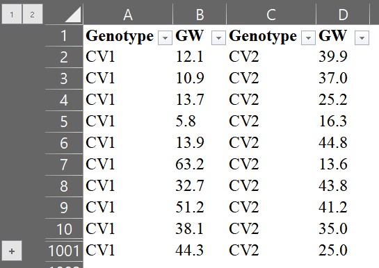
You can download above data in Kaggle
https://www.kaggle.com/datasets/agronomy4future/wheat-grain-weight-at-two-genotypes
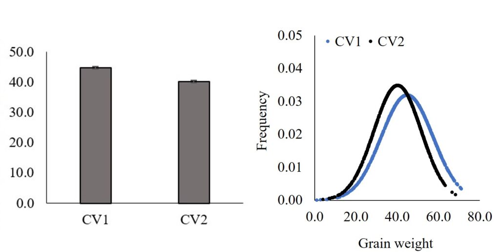
We can display the results by calculating the average grain weight and adding the standard error (standard deviation / √n), then representing them in a bar graph.
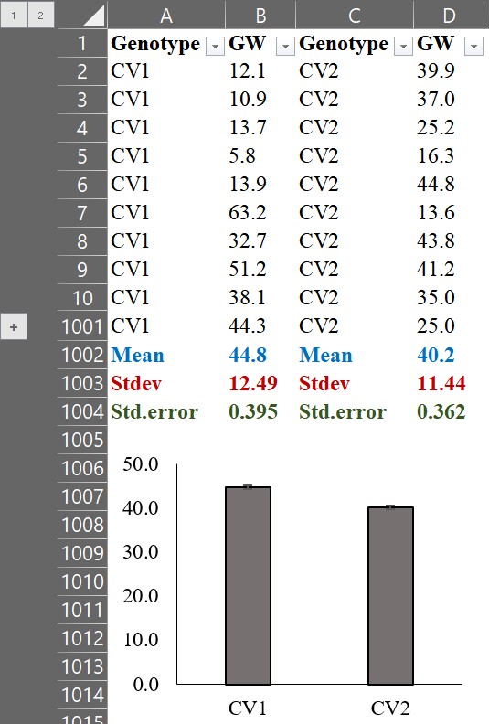
We can observe that the average grain weight in CV1 is greater than that in CV2. However, simply comparing the averages does not provide any information on how CV1 is greater than CV2. By calculating the Probability Density Function (PDF), we can visualize the distribution of grain weight for each genotype, and this would provide us with more insight into the data.
1. What is Probability Density Function (PDF)
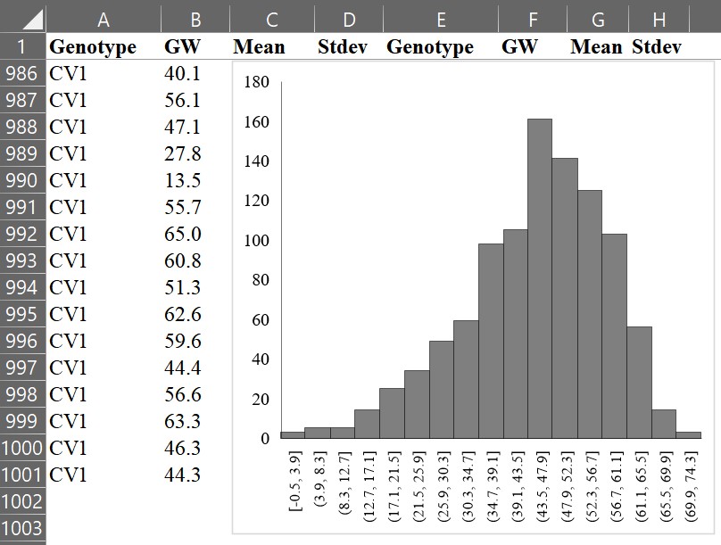
First, let’s create a histogram graph. For example, select all grain weight data (B column), and choose “Histogram.”
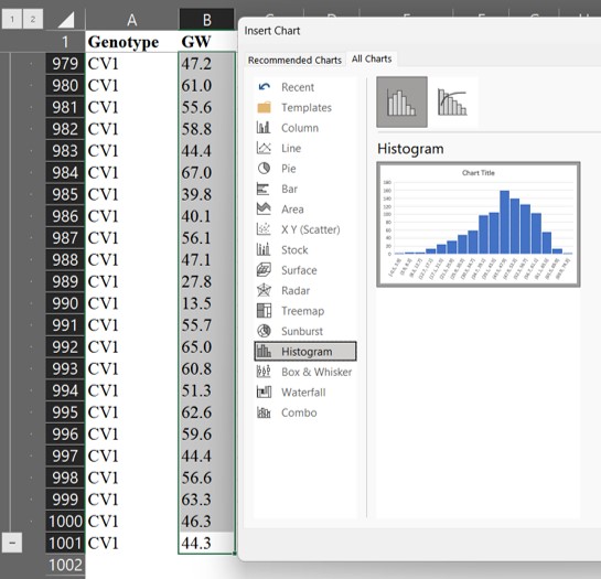
Then, we can obtain the following graph.
If we draw a line connecting the tops of each bar, it would look like the following.
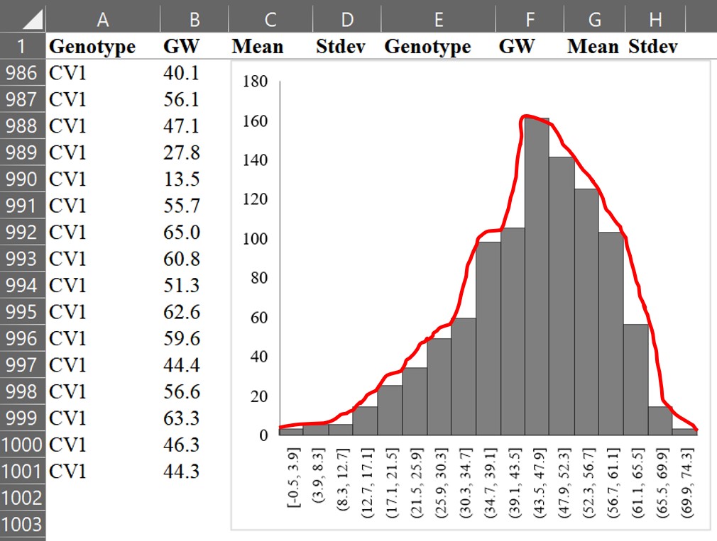
Now, let’s draw the line as a curve using a mathematical formula. This curve is called a normal distribution or Gaussian distribution, which is a type of continuous probability distribution.
The main characteristics of a normal distribution are
1. The shape of the bell curve is symmetrical, with the highest probability at the mean.
2. The area under the curve is equal to 1.
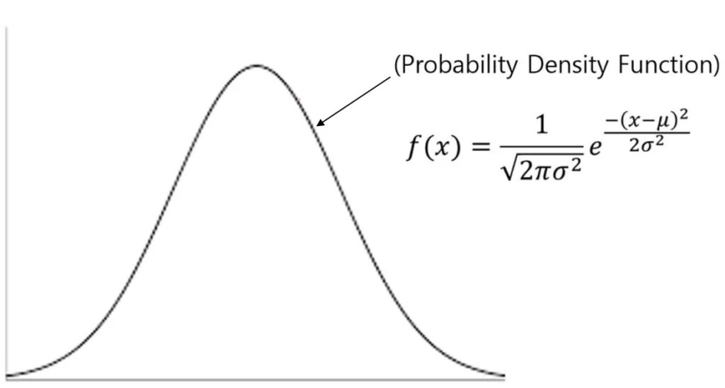
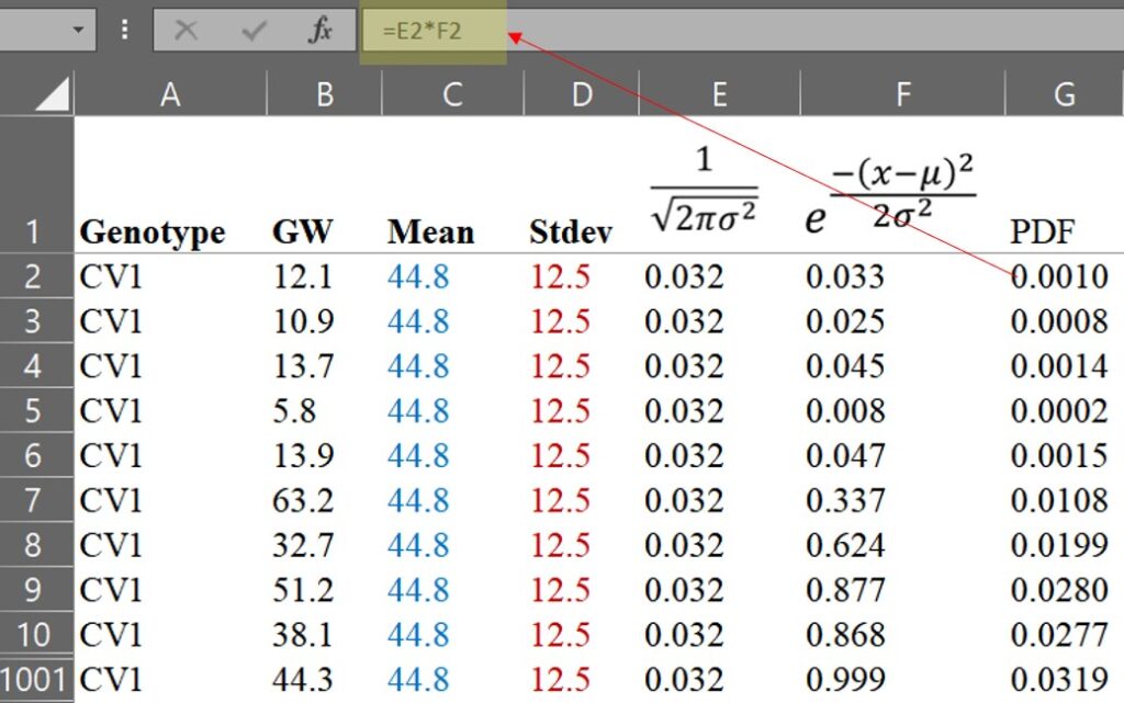
3. As the curve moves away from the mean, it gets closer to the x-axis but never intersects it. In other words, the probability never reaches 0.The formula for the Probability Density Function (PDF) is as follows:

It may seem tricky, but it’s actually quite simple.
x is each observational value
µ is average
σ is standard deviation, and therefore σ2 is variance
π is pie which is 3.14159...
e is Euler's number
If we practice calculating the PDF by hand, we will realize that it is not difficult. Let’s calculate step by step using the formula.
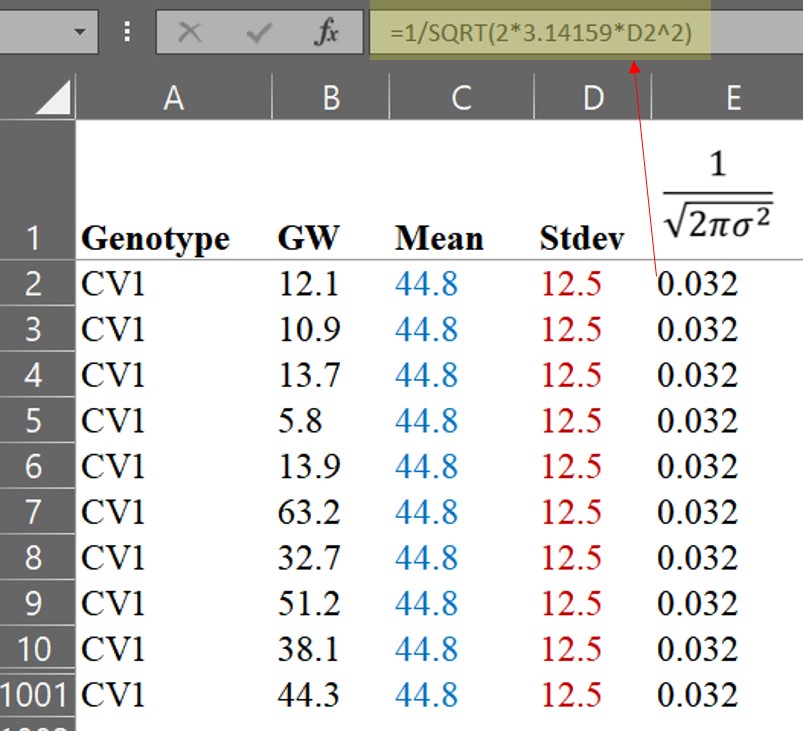
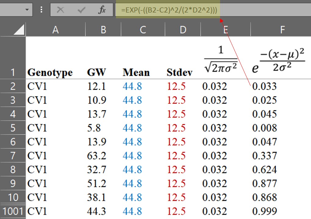
We can then calculate the PDF.
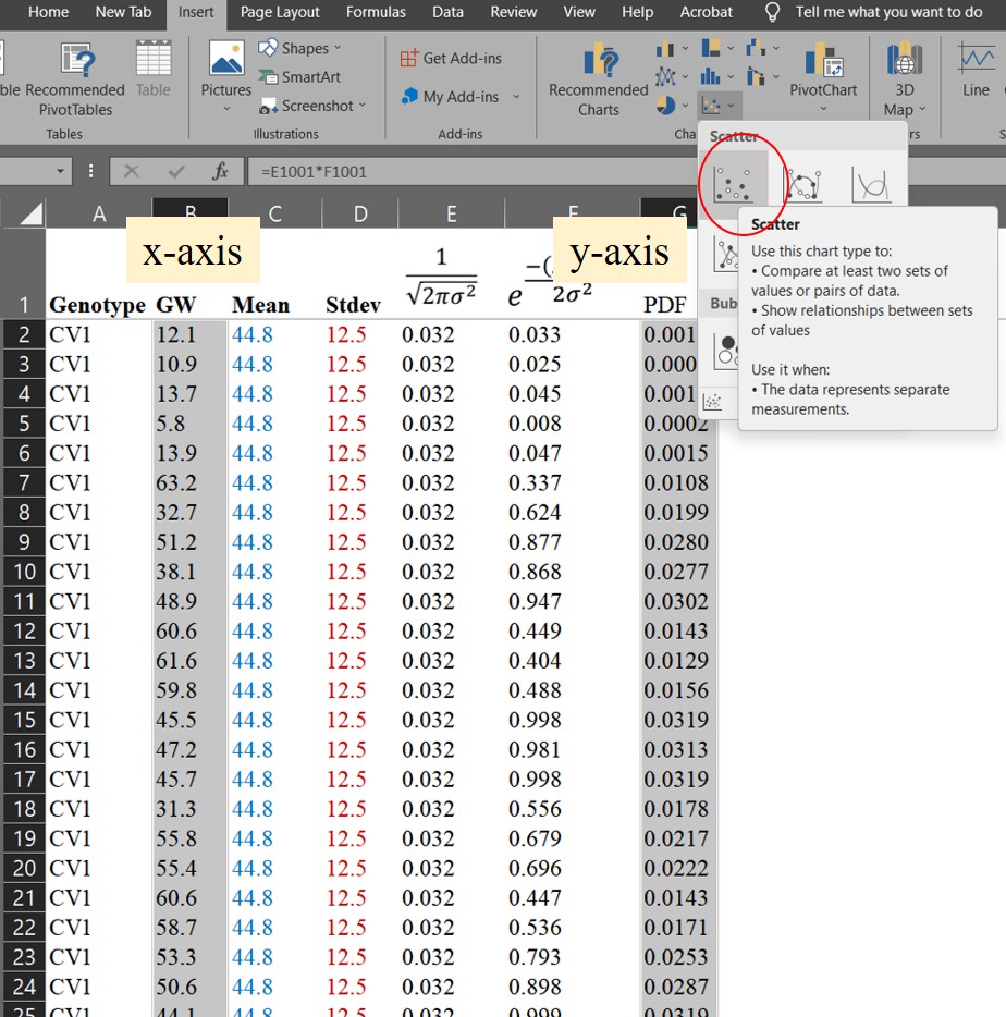
Now that we have calculated the Probability Density Function (PDF), we can draw a normal distribution graph. We can set up the GW column as the x-axis and the PDF column as the y-axis, and then select the scatter graph in Excel.

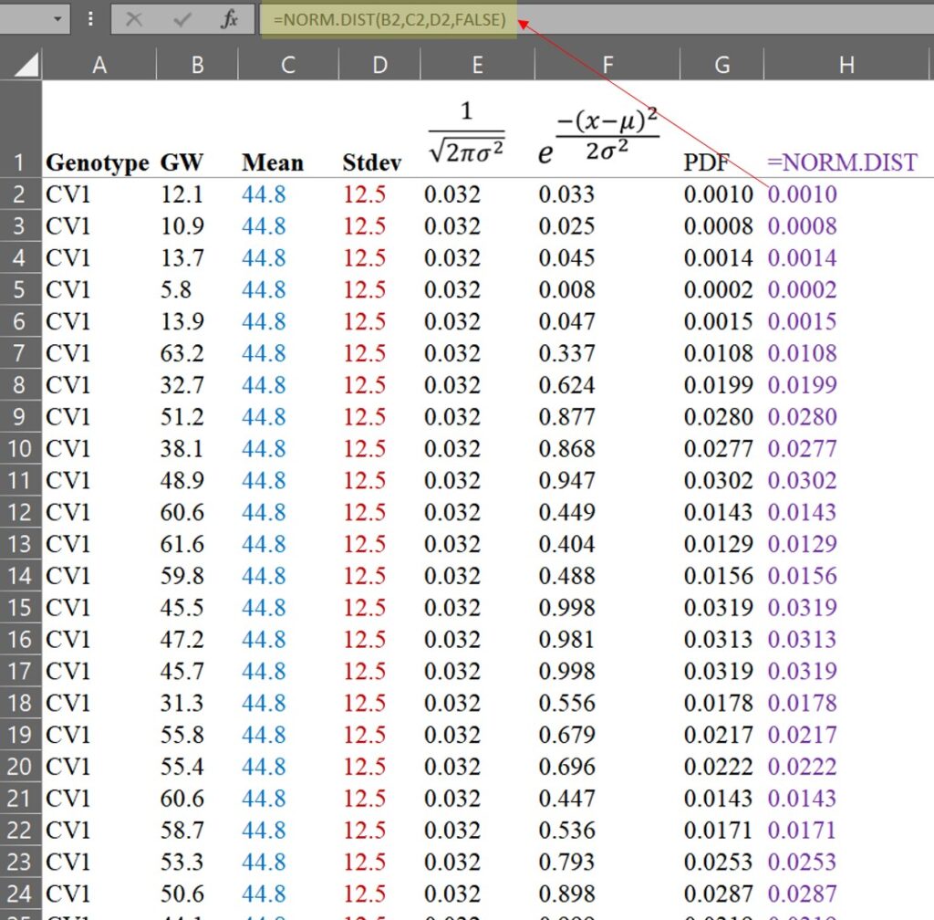
We have drawn a normal distribution graph for CV1. Luckily, Excel provides a function to perform this process. Let’s calculate the PDF using this function.
=NORM.DIST(x, mean, stdev, FALSE)
You can see that the values obtained using the Excel function are exactly the same as those we calculated by hand. However, if you simply use the Excel function, you may not fully understand the principle of the PDF. That is why I explained how to calculate it by hand.
Using the same process, we can calculate the PDF for CV2.
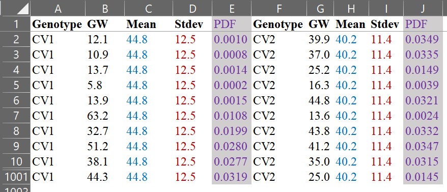
and let’s compare those two graphs.
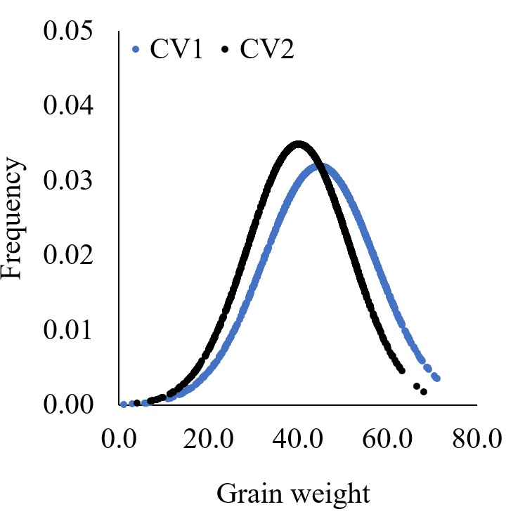
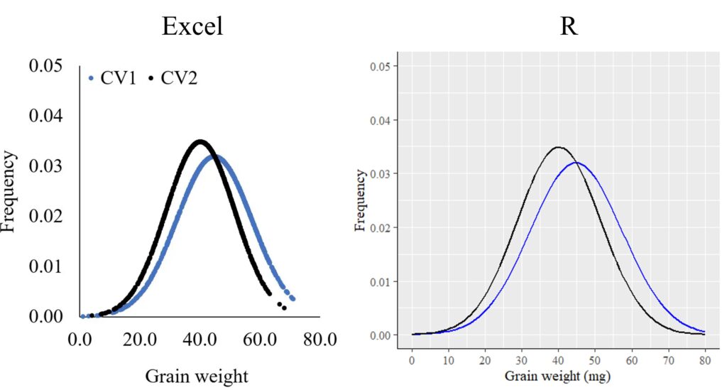
Using the same data, we have drawn two different graphs like below. Both graphs show the mean grain weight, but the distribution graph provides more information. It shows us how the grain weight in CV1 is greater than that in CV2. In CV1, both small and large grains are greater than in CV2.
Furthermore, we can extract values from certain percentiles and analyze and compare them.
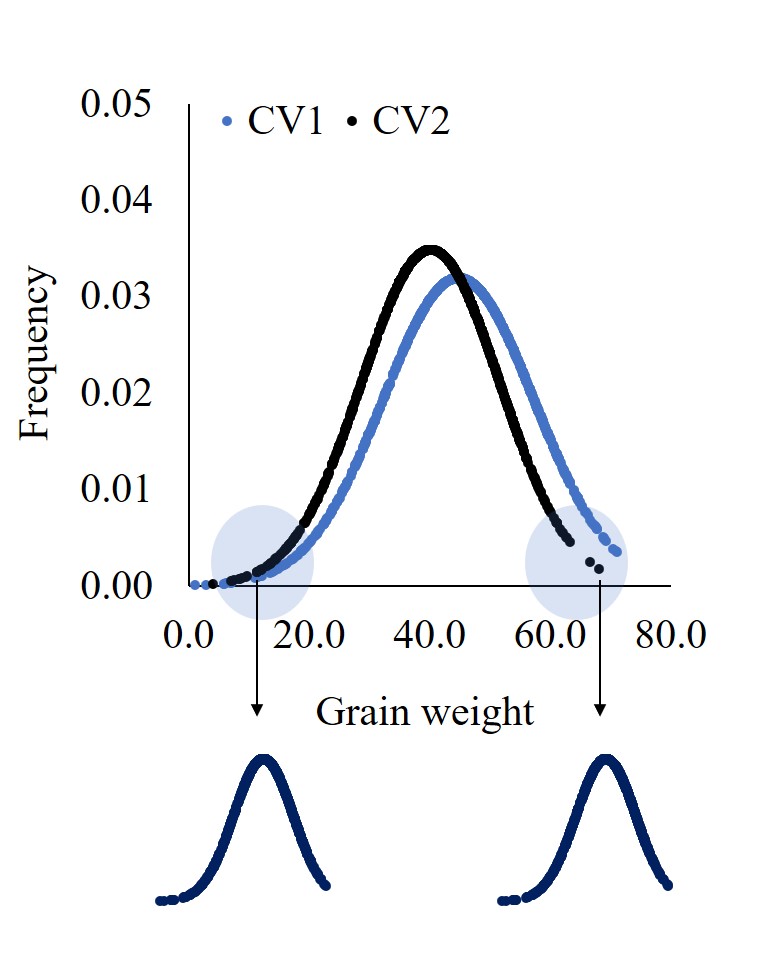
Therefore, if there are more than 30 data points, I recommend calculating the Probability Density Function and observing the normal distribution graph. It can provide additional insights and tell a more complete story about the data.
2. What is Cumulative Distribution Function (CDF)?
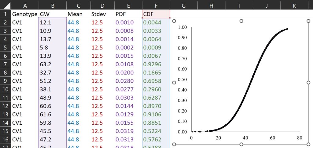
What about the Cumulative Distribution Function (CDF)? In Excel, we can simply change FALSE to TRUE in the formula used for PDF to calculate the CDF.
Cumulative Distribution Function
=NORM.DIST(x, mean, stdev, TRUE)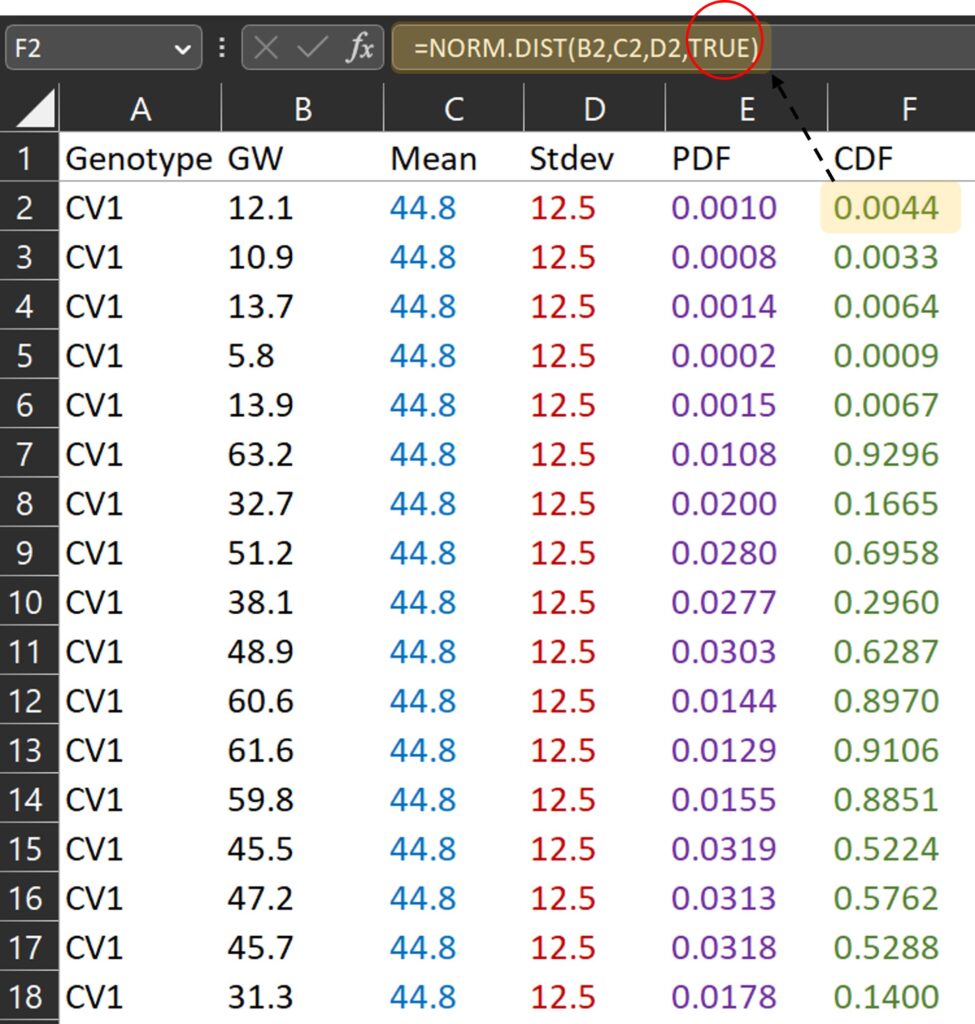
TRUE and FALSE are logical values that determine the form of the function. In NORM.DIST(), If the logical values is TRUE, NORMDIST returns the cumulative distribution function, and if it is FALSE, it returns the probability density function. The cumulative distribution function represents the probability that a random variable is less than or equal to a specific value for a certain probability distribution. If we draw a graph in the same way, it would look like the one below. Since it is a cumulative distribution, the maximum value on the y-axis will be 1.
This concept is same as percentile. Let’s calculate in this way.
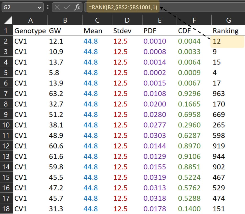
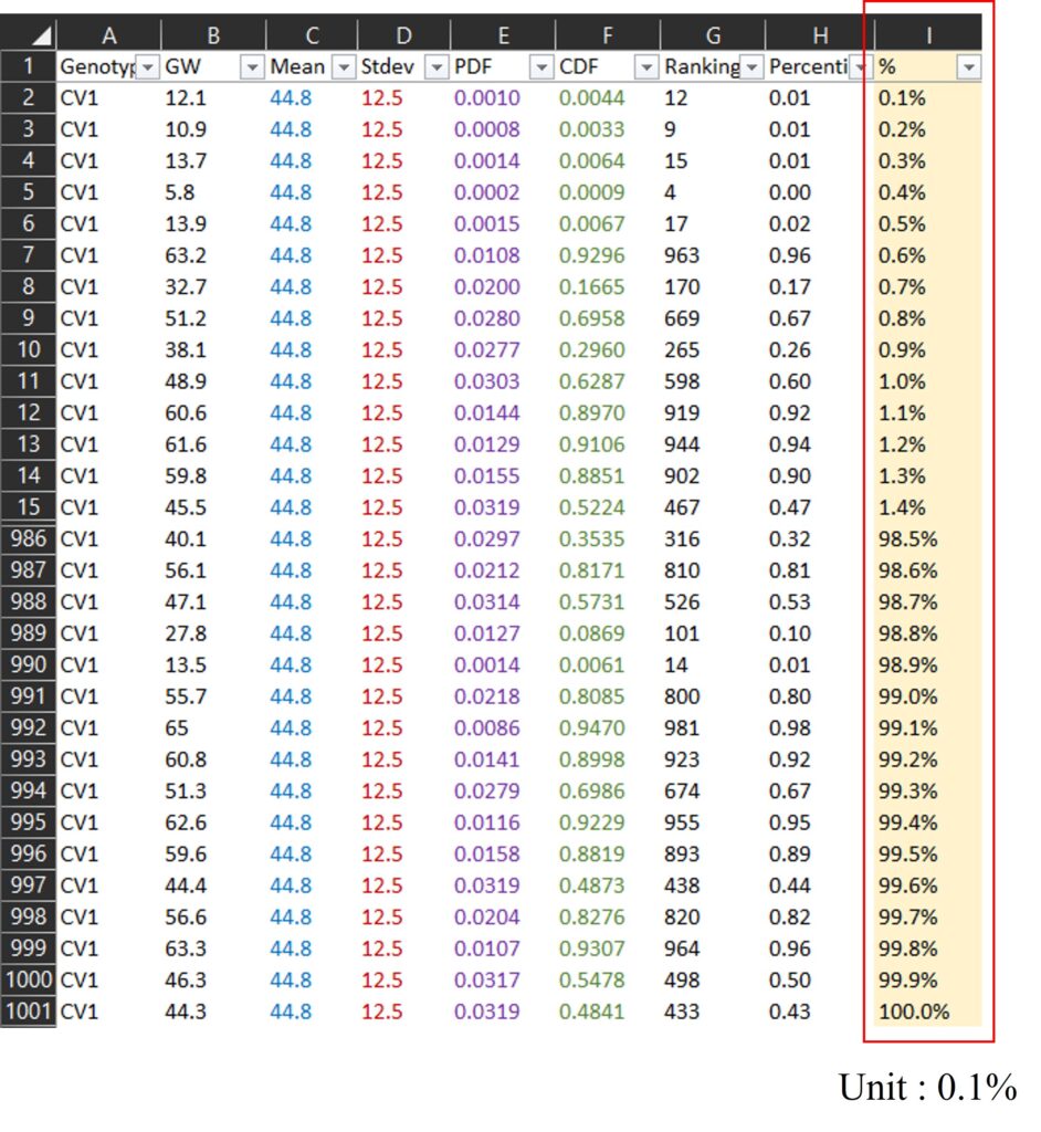
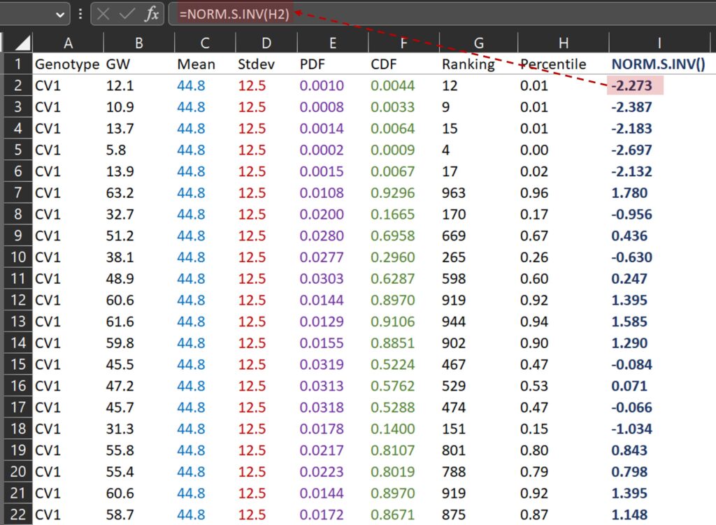
First, I calculated the ranking for grain weight. For example, 12.1 mg is the grain weight which is ranked 12th from the smallest among all grain weights.
RANK(each data, mean of all data, 1)
where 0 is descending, and 1 is ascending
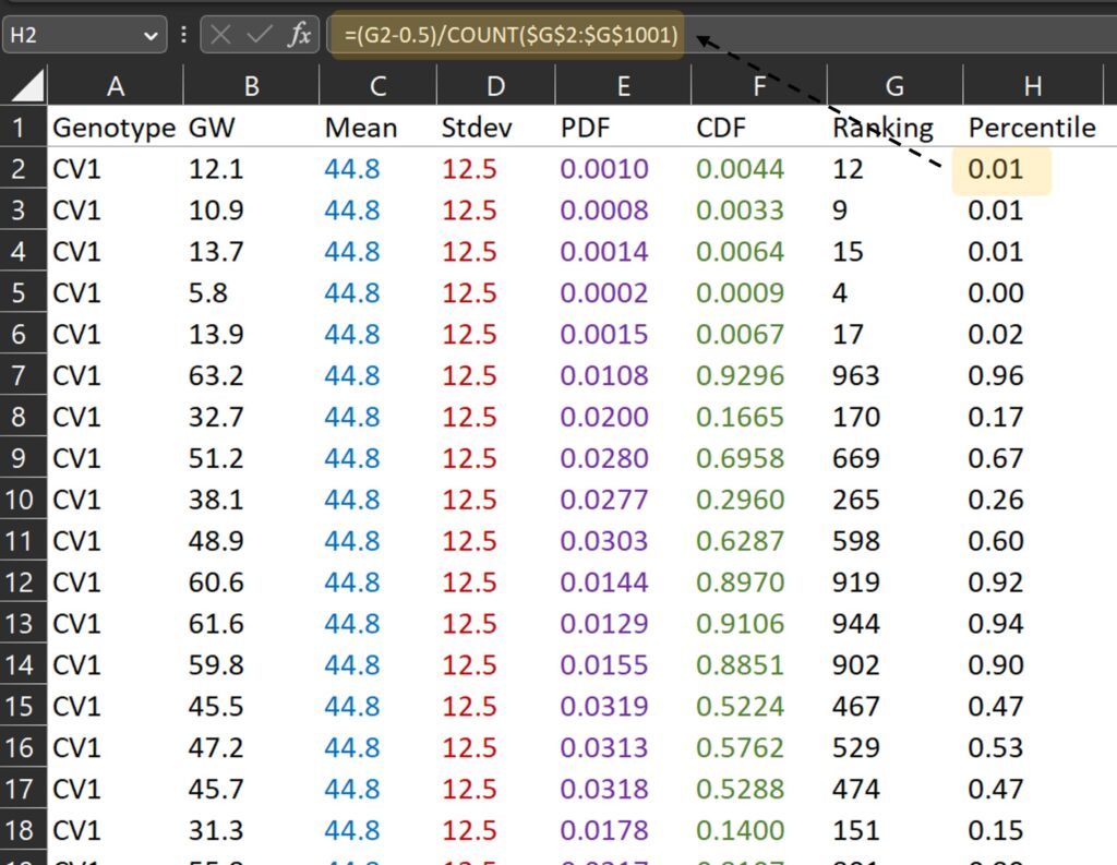
Second, let’s calculate the percentile for each ranking.
Third, let’s draw a graph where the x-axis represents grain weight (B column) and the y-axis represents percentile (H column).
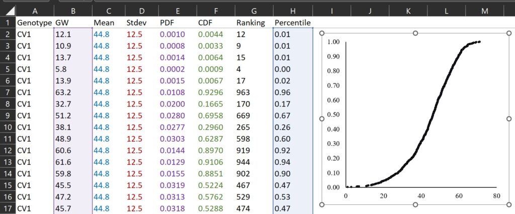
If we compare the two graphs calculated by CDF and percentile for ranking, they are very similar as shown below.
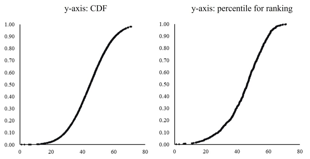
Therefore, the principle of Cumulative Distribution Function (CDF) is based on the percentile ranking of a variable.
Here is another way to show percentile using PERCENTILE.EXE()
First, I added % column (0.1 % to 100.0%; unit is 0.1%), and I calculated percentile for each data among all data using PERCENTILE.EXE() function. Please see the I and J column in below data.
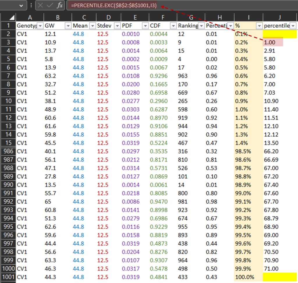
PERCENTILE.EXE() calculates the percentile rank of a certain data point within a set of data. For example, 1 mg is at the 0.2th percentile (or 0.2%) and 71 mg is at the 99.9th percentile (or 99.9%) among all data in the B column. Then, let’s draw a graph where the x-axis represents grain weight (J column) and the y-axis represents percentile (I column).
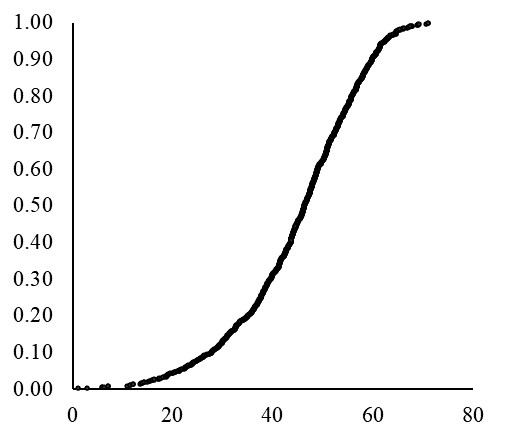
If we use a much smaller unit for %, the resulting curve will appear more finely-grained or detailed, similar to the NORM.DIST() curve. Anyhow, now we can fully understand about Cumulative Distribution Function (CDF).
Tips!! How to make QQ-plot graph?
Because we calculated the percentile for ranking, we can easily obtain a QQ-plot graph using NORM.S.INV() function.
NORM.S.INV() is a function in Excel that returns the inverse of the standard normal cumulative distribution for a specified probability, and I’ll draw a graph where the x-axis represents NORM.S.INV() (I column) and the y-axis represents grai weight (B column).
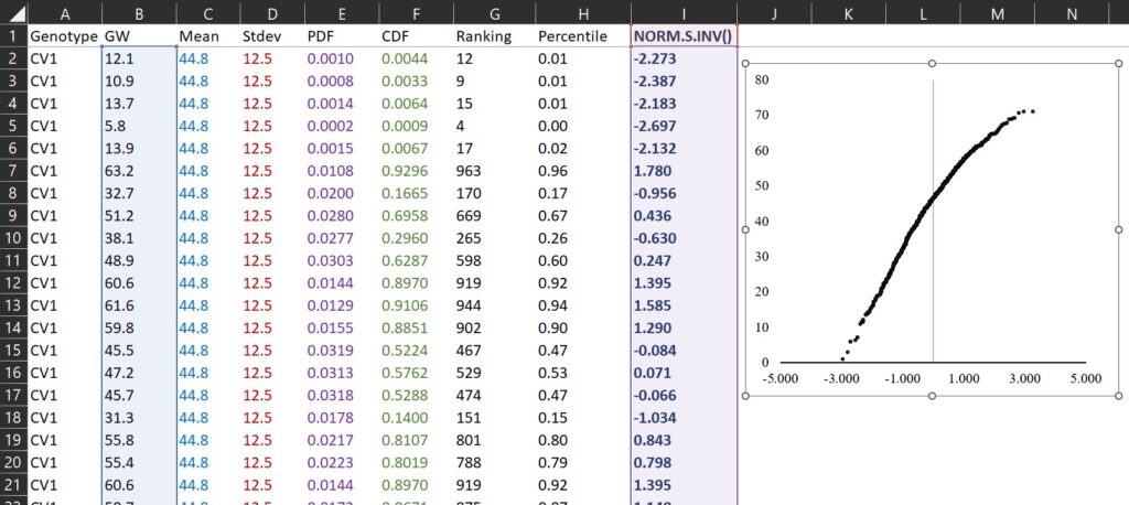
This is QQ-plot. Let’s verify it’s correct using R.
# to upload data
library (readr)
github="https://raw.githubusercontent.com/agronomy4future/raw_data_practice/main/pdf.csv"
dataA=data.frame(read_csv(url(github),show_col_types=FALSE))

# to change column name
colnames(dataA)[1]=c("cv1")
colnames(dataA)[2]=c("gw_cv1")
colnames(dataA)[3]=c("cv2")
colnames(dataA)[4]=c("gw_cv2")

# to draw QQ-plot
par(mar=c(1, 1, 1, 1))
qqnorm(dataA$gw_cv1, pch=1, frame=FALSE)
qqline(dataA$gw_cv1, col="steelblue", lwd=2)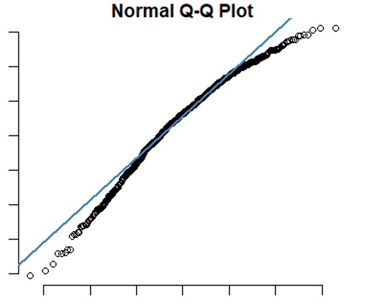
It appears that the graph produced in R is similar to the one we created in Excel, indicating the principle of QQ-plot is what I calculated in excel.
If you well followed this post, we fully understood the principle of Probability Density Function (PDF) and Cumulative Distribution Function (CDF). Now, I’ll introduce how to draw a PDF and CDF graph using R.
How to draw Probability Density Function (PDF) graph using R?
In Excel, sometimes it doesn’t appear to adhere to the main characteristics of a normal distribution.
1. The shape of the bell curve is symmetrical, with the highest probability at the mean.
2. The area under the curve is equal to 1.
3. As the curve moves away from the mean, it gets closer to the x-axis but never intersects it. In other words, the probability never reaches 0.
This happens because Excel’s appearance may vary depending on the sample size. With a larger sample size, like 10,000 instead of 1,000, Excel tends to show a clearer normal distribution. However, in R, we can circumvent this issue using stat_function().
First, I upload the Excel file to R. Before uploading the file.
# to upload data
library (readr)
github="https://raw.githubusercontent.com/agronomy4future/raw_data_practice/main/pdf.csv"
dataA=data.frame(read_csv(url(github),show_col_types = FALSE))
Next, I will use the following code to display normal distribution graphs for two genotypes.
# to change column name
colnames(dataA)[1]=c("cv1")
colnames(dataA)[2]=c("gw_cv1")
colnames(dataA)[3]=c("cv2")
colnames(dataA)[4]=c("gw_cv2")

# data stacking
library(reshape)
dataB=reshape::melt(dataA, id.vars=c("cv1","cv2"))
dataB=subset(dataB, select=c(-1,-2))

# to draw PDF graph
library(ggplot2)
ggplot(data=dataB, aes(x=value)) +
   stat_function(data=subset(dataB,variable=="gw_cv1"),aes(x=value),
                 color="Blue",size=1,fun=dnorm,
                 args=c(mean=mean(subset(dataB, variable=="gw_cv1")$value),
                 sd=sd(subset(dataB,variable=="gw_cv1")$value))) +
   stat_function(data=subset(dataB,variable=="gw_cv2"),aes(x=value),
                 color="Black",size=1,fun=dnorm,
                 args=c(mean=mean(subset(dataB, variable=="gw_cv2")$value),
                 sd=sd(subset(dataB,variable=="gw_cv2")$value))) +
  scale_x_continuous(breaks=seq(0,90,10),limits=c(0,90)) +
  scale_y_continuous(breaks=seq(0,0.05,0.01),limits=c(0,0.05)) +
  labs(x="Grain weight (mg)", y="Frequency") +
  theme_grey(base_size=15, base_family="serif")+
  theme(axis.line=element_line(linewidth=0.5, colour="black")) +
  windows(width=5.5, height=5)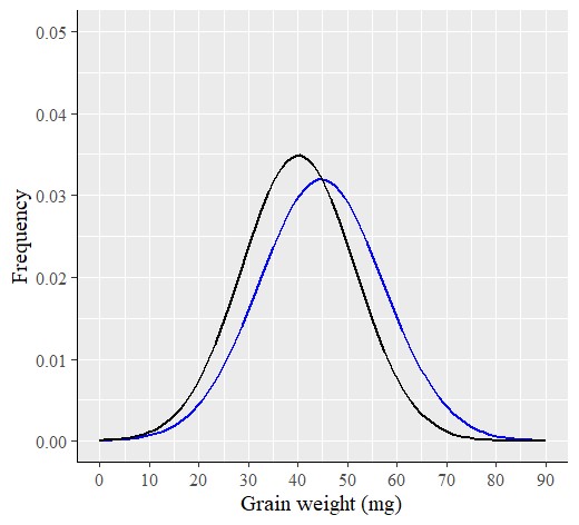
R provides an accurate normal distribution graph, even with a small sample size, unlike Excel. Therefore, I prefer using R to analyze data as a PDF.
Additionally, an advantage of using R is that we can easily add a histogram to the normal distribution graph for a more comprehensive analysis.
# to upload data
library (readr)
github="https://raw.githubusercontent.com/agronomy4future/raw_data_practice/main/pdf.csv"
dataA=data.frame(read_csv(url(github),show_col_types = FALSE))

# to change column name
colnames(dataA)[1]=c("cv1")
colnames(dataA)[2]=c("gw_cv1")
colnames(dataA)[3]=c("cv2")
colnames(dataA)[4]=c("gw_cv2")

# data stacking
library(reshape)
dataB=reshape::melt(dataA, id.vars=c("cv1","cv2"))
dataB=subset(dataB, select=c(-1,-2))

# to draw PDF graph
ggplot (data=dataB, aes(x=value, fill=variable)) +
  geom_histogram(aes(y=0.5*..density..), alpha=0.5,
                 position='identity', binwidth=1.5) +
  scale_fill_manual(values=c("Black","Blue"))+
  stat_function(data=subset(dataB,variable=="gw_cv1"),aes(x=value),
                color="Blue",size=1,fun=dnorm,
                args=c(mean=mean(subset(dataB, variable=="gw_cv1")$value),
                sd=sd(subset(dataB,variable=="gw_cv1")$value))) +
  stat_function(data=subset(dataB,variable=="gw_cv2"),aes(x=value),
                color="Black",size=1,fun=dnorm,
                args=c(mean=mean(subset(dataB, variable=="gw_cv2")$value),
                sd=sd(subset(dataB,variable=="gw_cv2")$value))) +
  scale_x_continuous(breaks=seq(0,90,10),limits=c(0,90)) +
  scale_y_continuous(breaks=seq(0,0.05,0.01),limits=c(0,0.05)) +
  labs(x="Grain weight (mg)", y="Frequency") +
  theme_grey(base_size=15, base_family="serif")+
  theme(legend.position="none",
        axis.line= element_line(linewidth=0.5, colour="black")) +
  windows(width=5.5, height=5)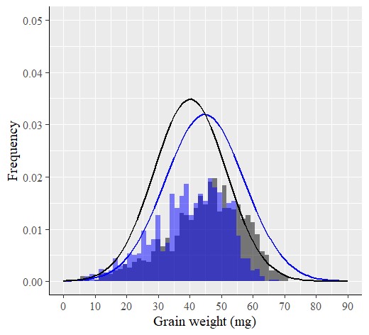
■ Tip!! probdistz() package
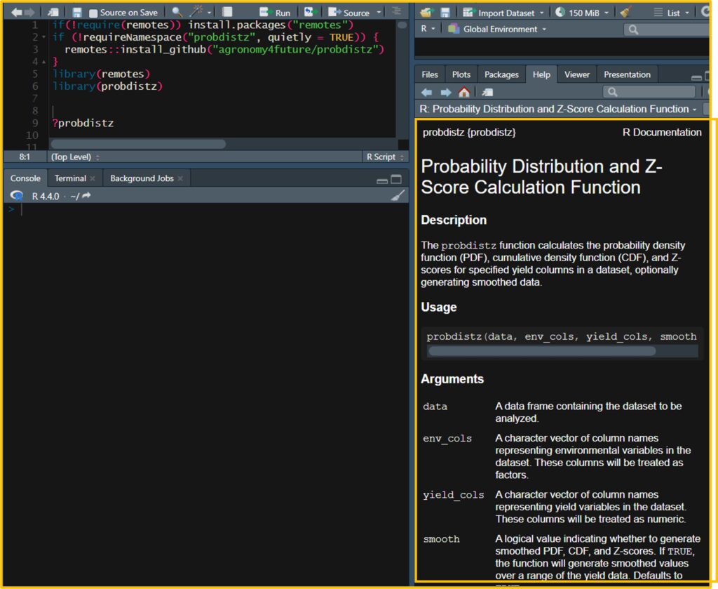
□ [R package] Probability Distribution and Z-Score Calculation Function (feat. probdistz)
Recently I developed probdistz() package to simplify the process.
ggplot(data=dataC, aes(x=value, y=smooth_pdf, color=variable)) +
  geom_line () +
  scale_color_manual(name= "Genotype", values= c("gw_cv1"="black", "gw_cv2"="blue")) +
  scale_x_continuous(breaks=seq(0,90,10),limits=c(0,90)) +
  scale_y_continuous(breaks=seq(0,0.05,0.01),limits=c(0,0.05)) +
  labs(x="Grain weight (mg)", y="Frequency") +
  theme_classic(base_size=15, base_family="serif") +
  theme(legend.position=c(0.85, 0.85),
        legend.title=element_blank(),
        legend.key=element_rect(color="white", fill="white"),
        legend.text=element_text(family="serif", face="plain", size=15, color= "Black"),
        legend.background=element_rect(fill="white"),
        axis.line=element_line(linewidth=0.5, colour="black"))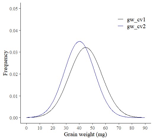
How to draw Cumulative Distribution Function (CDF) graph using R?
If you want to draw Cumulative Distribution Function (CDF) graph in R, simpliy you can change the code stat_function() to stat_ecdf()
# to upload data
library (readr)
github="https://raw.githubusercontent.com/agronomy4future/raw_data_practice/main/pdf.csv"
dataA=data.frame(read_csv(url(github),show_col_types = FALSE))

# to change column name
colnames(dataA)[1]=c("cv1")
colnames(dataA)[2]=c("gw_cv1")
colnames(dataA)[3]=c("cv2")
colnames(dataA)[4]=c("gw_cv2")

# data stacking
library(reshape)
dataB=reshape::melt(dataA, id.vars=c("cv1","cv2"))
dataB=subset(dataB, select=c(-1,-2))

# to draw PDF graph
ggplot(data=dataB, aes(x=value, fill=variable)) +
  stat_ecdf(data=subset(dataB,variable=="gw_cv1"),aes(x=value),
            color="Blue",size=1,geom="step") +
  stat_ecdf(data=subset(dataB,variable=="gw_cv2"),aes(x=value),
            color="Black",size=1,geom="step") +
  scale_x_continuous(breaks=seq(0,90,10),limits=c(0,90)) +
  scale_y_continuous(breaks=seq(0,1,0.2),limits=c(0,1)) +
  labs(x="Grain weight (mg)", y="Frequency") +
  theme_grey(base_size=15, base_family="serif")+
  theme(legend.position="none",
        axis.line= element_line(linewidth=0.5, colour="black")) +
  windows(width=5.5, height=5)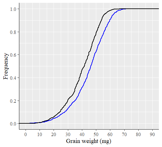
Extra tip!! Probability Density Function (PDF) graph using Python
This code is to generate the same graph using Python.
# to open library
import numpy as np
import pandas as pd
import scipy.stats as stats
import matplotlib.pyplot as plt
from pylab import rcParams
import seaborn as sns

# to upload data
Url="https://raw.githubusercontent.com/agronomy4future/raw_data_practice/main/pdf.csv"
df=pd.read_csv(Url)

# to rename columns
df.rename(columns = {'Genotype':'Genotype1'}, inplace = True)
df.rename(columns = {'GW':'GW1'}, inplace = True)
df.rename(columns = {'Genotype.1':'Genotype2'}, inplace = True)
df.rename(columns = {'GW.1':'GW2'}, inplace = True)

# to stack data
df = pd.concat(
    [df[["Genotype1", "GW1"]],
     df[["Genotype2", "GW2"]].rename(lambda c: f"{c[:-1]}1", axis=1)],
    ignore_index=True
)

# to divide genotypes
cv1 = df.loc[df['Genotype1']== 'CV1']
cv2 = df.loc[df['Genotype1']== 'CV2']

# to calculate mean and standard deviation
cv1_mean = np.mean(cv1["GW1"])
cv1_std = np.std(cv1["GW1"])
cv2_mean = np.mean(cv2["GW1"])
cv2_std = np.std(cv2["GW1"])

# to calculate PDF
cv1_pdf = stats.norm.pdf(cv1["GW1"].sort_values(), cv1_mean, cv1_std)
cv2_pdf = stats.norm.pdf(cv2["GW1"].sort_values(), cv2_mean, cv2_std)

# to draw PDF graph
plt.plot(cv1["GW1"].sort_values(), cv1_pdf, color="Black", label="Cultivar_A")
plt.plot(cv2["GW1"].sort_values(), cv2_pdf, color="Blue", label="Cultivar_B")
sns.histplot(data = cv1["GW1"], bins=150, color="Black", stat = "probability",alpha=0.3)
sns.histplot(data = cv2["GW1"], bins=150, color="Blue", stat = "probability",alpha=0.3)
plt.xlim([0,90])
plt.ylim([0,0.05])
plt.legend()
plt.xlabel("Grain area (mm2)", size=15)
plt.ylabel("Frequency", size=15)
plt.grid(True, alpha=0.3, linestyle="--")
plt.rcParams["figure.figsize"] = [7,5]
plt.rcParams["figure.dpi"] = 500
plt.show()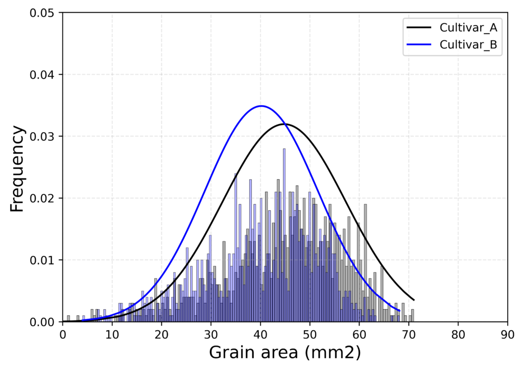
We aim to develop open-source code for agronomy (kimjk@agronomy4future.com)