How to Convert Time to Numeric for Line Graphs in R?
Here is one dataset.
library(readr)
github="https://raw.githubusercontent.com/agronomy4future/raw_data_practice/main/day_length_data.csv"
dataA= data.frame(read_csv(url(github), show_col_types=FALSE))

head (dataA, 10)
   Day      Jan      Feb      Mar      Apr      May     June     July      Aug      Sep      Oct      Nov      Dec
1    1 09:23:00 10:10:00 11:18:00 12:40:00 13:55:00 14:50:00 14:59:00 14:16:00 13:04:00 11:46:00 10:28:00 09:32:00
2    2 09:24:00 10:12:00 11:21:00 12:43:00 13:57:00 14:51:00 14:58:00 14:14:00 13:02:00 11:44:00 10:26:00 09:31:00
3    3 09:24:00 10:14:00 11:23:00 12:45:00 13:59:00 14:52:00 14:57:00 14:12:00 12:59:00 11:41:00 10:24:00 09:30:00
4    4 09:25:00 10:16:00 11:26:00 12:48:00 14:01:00 14:53:00 14:57:00 14:10:00 12:57:00 11:39:00 10:22:00 09:29:00
5    5 09:26:00 10:19:00 11:28:00 12:50:00 14:04:00 14:54:00 14:56:00 14:08:00 12:54:00 11:36:00 10:19:00 09:28:00
6    6 09:27:00 10:21:00 11:31:00 12:53:00 14:06:00 14:55:00 14:55:00 14:06:00 12:52:00 11:33:00 10:17:00 09:27:00
7    7 09:28:00 10:23:00 11:34:00 12:56:00 14:08:00 14:56:00 14:54:00 14:04:00 12:49:00 11:31:00 10:15:00 09:26:00
8    8 09:29:00 10:26:00 11:36:00 12:58:00 14:10:00 14:57:00 14:53:00 14:02:00 12:46:00 11:28:00 10:13:00 09:25:00
9    9 09:30:00 10:28:00 11:39:00 13:01:00 14:12:00 14:57:00 14:52:00 13:59:00 12:44:00 11:26:00 10:11:00 09:24:00
10  10 09:32:00 10:30:00 11:42:00 13:03:00 14:14:00 14:58:00 14:51:00 13:57:00 12:41:00 11:23:00 10:08:00 09:23:00
.
.
.
With this data, I’ll create a line graph to show the change in day length over time. First, let’s transpose the columns to rows using pivot_longer().
library(tidyr)
dataB= data.frame(dataA %>%
                  pivot_longer(
                  cols= c(Jan,Feb,Mar,Apr,May,June,July,Aug,Sep,Oct,Nov,Dec),
                  names_to="month",
                  values_to="day_length"))

head (dataB, 10)
   Day month day_length
1    1   Jan   09:23:00
2    1   Feb   10:10:00
3    1   Mar   11:18:00
4    1   Apr   12:40:00
5    1   May   13:55:00
6    1  June   14:50:00
7    1  July   14:59:00
8    1   Aug   14:16:00
9    1   Sep   13:04:00
10   1   Oct   11:46:00
.
.
.
I’ll sort the data by Day and Month, but since the month column is in text format, sorting it from January to December directly isn’t feasible. Therefore, I’ll add a number corresponding to each month for sorting purposes.
dataB$month1= ifelse(dataB$month=="Jan", 1,
               ifelse(dataB$month=="Feb", 2,
                ifelse(dataB$month=="Mar", 3,
                 ifelse(dataB$month=="Apr", 4,
                  ifelse(dataB$month=="May", 5,
                   ifelse(dataB$month=="June", 6,
                    ifelse(dataB$month=="July", 7,
                     ifelse(dataB$month=="Aug", 8,
                      ifelse(dataB$month=="Sep", 9,
                       ifelse(dataB$month=="Oct", 10,
                        ifelse(dataB$month=="Nov", 11,
                          ifelse(dataB$month=="Dec", 12, NA))))))))))))

head (dataB, 10)
   Day month day_length month1
1    1   Jan   09:23:00      1
2    1   Feb   10:10:00      2
3    1   Mar   11:18:00      3
4    1   Apr   12:40:00      4
5    1   May   13:55:00      5
6    1  June   14:50:00      6
7    1  July   14:59:00      7
8    1   Aug   14:16:00      8
9    1   Sep   13:04:00      9
10   1   Oct   11:46:00     10
Now, I can sort by ‘month1’ and ‘Day’ from January 1 to December 31. Next, let’s remove any missing values.
dataB= dataB[complete.cases(dataB$day_length),]Now, there will be 365 data points. First, let’s sort the data by the ‘month1’ and ‘Day’ columns, ordering it from January 1st to December 31st.
library(dplyr)
dataB_sorted= dataB %>%
              arrange(month1, Day)

head (dataB_sorted, 10)
     Day month day_length    month1
1    1   Jan   09:23:00      1
2    2   Jan   09:24:00      1
3    3   Jan   09:24:00      1
4    4   Jan   09:25:00      1
5    5   Jan   09:26:00      1
6    6   Jan   09:27:00      1
7    7   Jan   09:28:00      1
8    8   Jan   09:29:00      1
9    9   Jan   09:30:00      1
10  10   Jan   09:32:00      1
.
.
.
Then, I’ll add a new column with numbers from 1 to 365.
dataB_sorted= dataB_sorted %>%
              mutate(Sequence= 1:n())

head(dataB_sorted, 10)
   Day month day_length month1 Sequence
1    1   Jan   09:23:00      1        1
2    2   Jan   09:24:00      1        2
3    3   Jan   09:24:00      1        3
4    4   Jan   09:25:00      1        4
5    5   Jan   09:26:00      1        5
6    6   Jan   09:27:00      1        6
7    7   Jan   09:28:00      1        7
8    8   Jan   09:29:00      1        8
9    9   Jan   09:30:00      1        9
10  10   Jan   09:32:00      1       10
.
.
.
I’ll create a line graph, but using the current ‘hms’ format in the ‘day_length’ column complicates adjusting the data range. Therefore, I want to convert the time format to numeric to easily set up the y-axis.
library(tidyverse)
library(lubridate)

dataB_sorted |>
  dplyr::mutate(light=hour(day_length)+minute(day_length)/60) |>
  ggplot(aes(x=Sequence, y=light)) +
  geom_line () +
  scale_y_continuous(breaks=seq(8,18,2), limits= c(8,18)) +
  scale_x_continuous(breaks=seq(0,365,73), limits= c(0,365)) +

  geom_vline(xintercept=91, linetype="dashed", color="black") +
  annotate("text", label=paste("April"),
           x=91, y=17, angle=90, hjust=0, vjust=1.5)+

  geom_vline(xintercept=121, linetype="dashed", color="black") +
  annotate("text", label=paste("May"),
           x=121, y=17, angle=90, hjust=0, vjust=1.5)+

  geom_vline(xintercept=152, linetype="dashed", color="black") +
  annotate("text", label=paste("June"),
           x=152, y=17, angle=90, hjust=0, vjust=1.5)+

  geom_vline(xintercept=182, linetype="dashed", color="black") +
  annotate("text", label=paste("July"),
           x=182, y=17, angle=90, hjust=0, vjust=1.5)+

  labs(x="Julian day", y="Day length (hours)") +
  theme_classic(base_size=18, base_family="serif")+
  theme(axis.line=element_line(linewidth=0.5, colour="black"))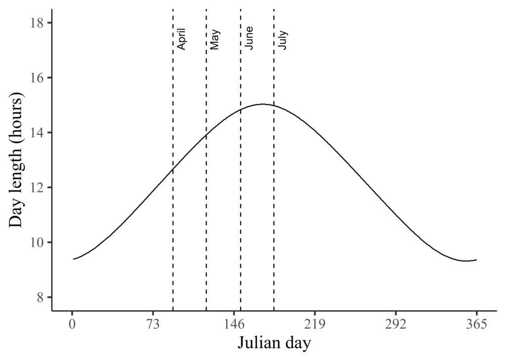
After converting the time format to numeric, I can easily adjust the y-axis range using scale_y_continuous(). Instead of showing day length, I want to display night length. With the ‘day_length’ column now in numeric format, we can calculate the night length by subtracting the day length from 24.
library (ggplot2)

dataB_sorted |>
  dplyr::mutate(light=hour(day_length)+minute(day_length)/60) |>
  dplyr::mutate(night=24-light) |>
  ggplot(aes(x=Sequence, y=night)) +
  geom_line () +
  scale_y_continuous(breaks=seq(8,18,2), limits = c(8,18)) +
  scale_x_continuous(breaks=seq(0,365,73), limits = c(0,365)) +

  geom_vline(xintercept=91, linetype="dashed", color="black") +
  annotate("text", label=paste("April"),
           x=91, y=17, angle=90, hjust=0, vjust=1.5)+

  geom_vline(xintercept=121, linetype="dashed", color="black") +
  annotate("text", label=paste("May"),
           x=121, y=17, angle=90, hjust=0, vjust=1.5)+

  geom_vline(xintercept=152, linetype="dashed", color="black") +
  annotate("text", label=paste("June"),
           x=152, y=17, angle=90, hjust=0, vjust=1.5)+

  geom_vline(xintercept=182, linetype="dashed", color="black") +
  annotate("text", label=paste("July"),
           x=182, y=17, angle=90, hjust=0, vjust=1.5)+

  labs(x="Julian day", y="Day length (hours)") +
  theme_classic(base_size=18, base_family="serif")+
  theme(axis.line=element_line(linewidth=0.5, colour="black"))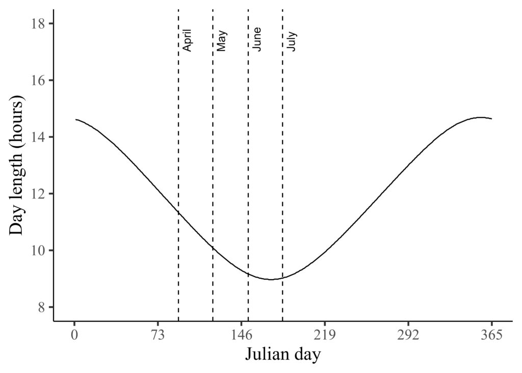
full code: https://github.com/agronomy4future/r_code/blob/main/How_to_Convert_Time_to_Numeric_for_Line_Graphs_in_R.ipynb