[Data article] Data Normalization Techniques: Excel and R as the Initial Steps in Machine Learning
In my previous post, I introduced the necessity of data normalization in visualizing data. By following that post, you may gain an understanding of how we can organize data according to our preferences.
□ Why is data normalization necessary when visualizing data?
Today, I’ll introduce various methods for data normalization, utilizing the biomass with N and P uptake data available on my GitHub.
R coding
library(readr)
github="https://raw.githubusercontent.com/agronomy4future/raw_data_practice/main/biomass_N_P.csv"
df= data.frame(read_csv(url(github), show_col_types=FALSE))
head(df, 5)
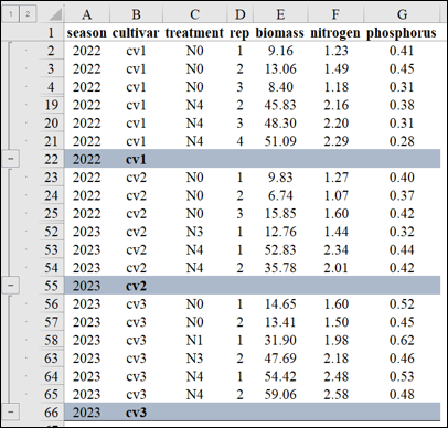
season cultivar treatment rep biomass nitrogen phosphorus
1 2022 cv1 N0 1 9.16 1.23 0.41
2 2022 cv1 N0 2 13.06 1.49 0.45
3 2022 cv1 N0 3 8.40 1.18 0.31
4 2022 cv1 N0 4 11.97 1.42 0.48
5 2022 cv1 N1 1 24.90 1.77 0.49
.
.
.Python coding
import pandas as pd
import requests
from io import StringIO

github="https://raw.githubusercontent.com/agronomy4future/raw_data_practice/main/biomass_N_P.csv"
response=requests.get(github)
df=pd.read_csv(StringIO(response.text))
df.head(5)
I also aim to create regression graphs illustrating the relationship between biomass and either nitrogen or phosphorus. First, I’ll generate a regression graph for biomass with either nitrogen or phosphorus to observe the data patterns.
R coding
library(dplyr)
library(tidyr)
df1= data.frame(df %>%
                   pivot_longer(
                                cols= c(nitrogen, phosphorus),
                                names_to= "nutrient",
                                values_to= "uptake")
                                )

library(ggplot2)
ggplot(data=df1, aes(x=biomass, y=uptake))+
       geom_point(aes(fill=as.factor(nutrient), shape=as.factor(nutrient)),
       color="black", size=5) +
       scale_fill_manual(values= c("darkred","orange")) +
       scale_shape_manual(values= c(21,21)) +
       scale_x_continuous(breaks=seq(0,80,10),limits=c(0,80)) +
       scale_y_continuous(breaks=seq(0,5,1),limits=c(0,5)) +
       labs(x="Biomass", y="Plant N or P uptake (%)") +
       theme_classic(base_size=18, base_family="serif") +
       theme(legend.position=c(0.85,0.80),
             legend.title=element_blank(),
             legend.key=element_rect(color="white", fill="white"),
             legend.text=element_text(family="serif", face="plain",
                         size=15, color="black"),
             legend.background= element_rect(fill="white"),
             strip.background=element_rect(color="white", linewidth=0.5,
                              linetype="solid"),
             axis.line = element_line(linewidth = 0.5, colour="black")) +
windows(width=5.5, height=5)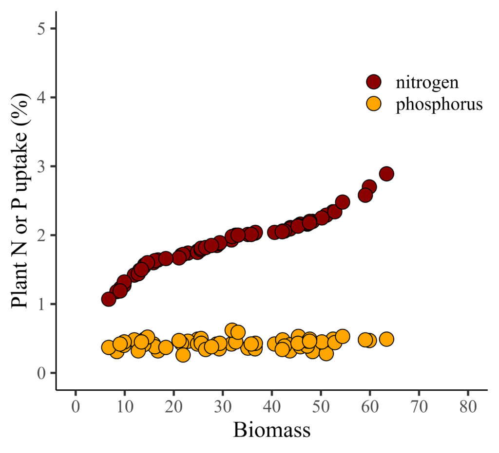
Python coding
df1 = df.melt(id_vars=['season', 'cultivar', 'treatment', 'rep', 'biomass'],
              var_name='nutrient',
              value_name='uptake',
              value_vars=['nitrogen', 'phosphorus'])

import matplotlib.pyplot as plt
import seaborn as sns

# Set the style without grid
sns.set_style("white")

# Plot
plt.figure(figsize=(5.5, 5))
sns.scatterplot(data=df1, x='biomass', y='uptake', hue='nutrient',
style='nutrient', palette=["darkred", "orange"], markers=["o", "o"],
edgecolor='black', s=100)

# Set axis limits and ticks
plt.xlim(0, 80)
plt.ylim(0, 5)
plt.xticks(range(0, 81, 10))
plt.yticks(range(0, 6, 1))

# Set axis labels
plt.xlabel('Biomass', fontsize=18)
plt.ylabel('Plant N or P uptake (%)', fontsize=18)

# Set legend
legend = plt.legend(title=None, loc='upper right', fontsize=15,
frameon=False)

# Set font properties
plt.rcParams["font.family"]="serif"
plt.rcParams["font.size"]= 15

# Show plot
plt.show()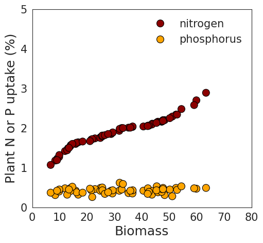
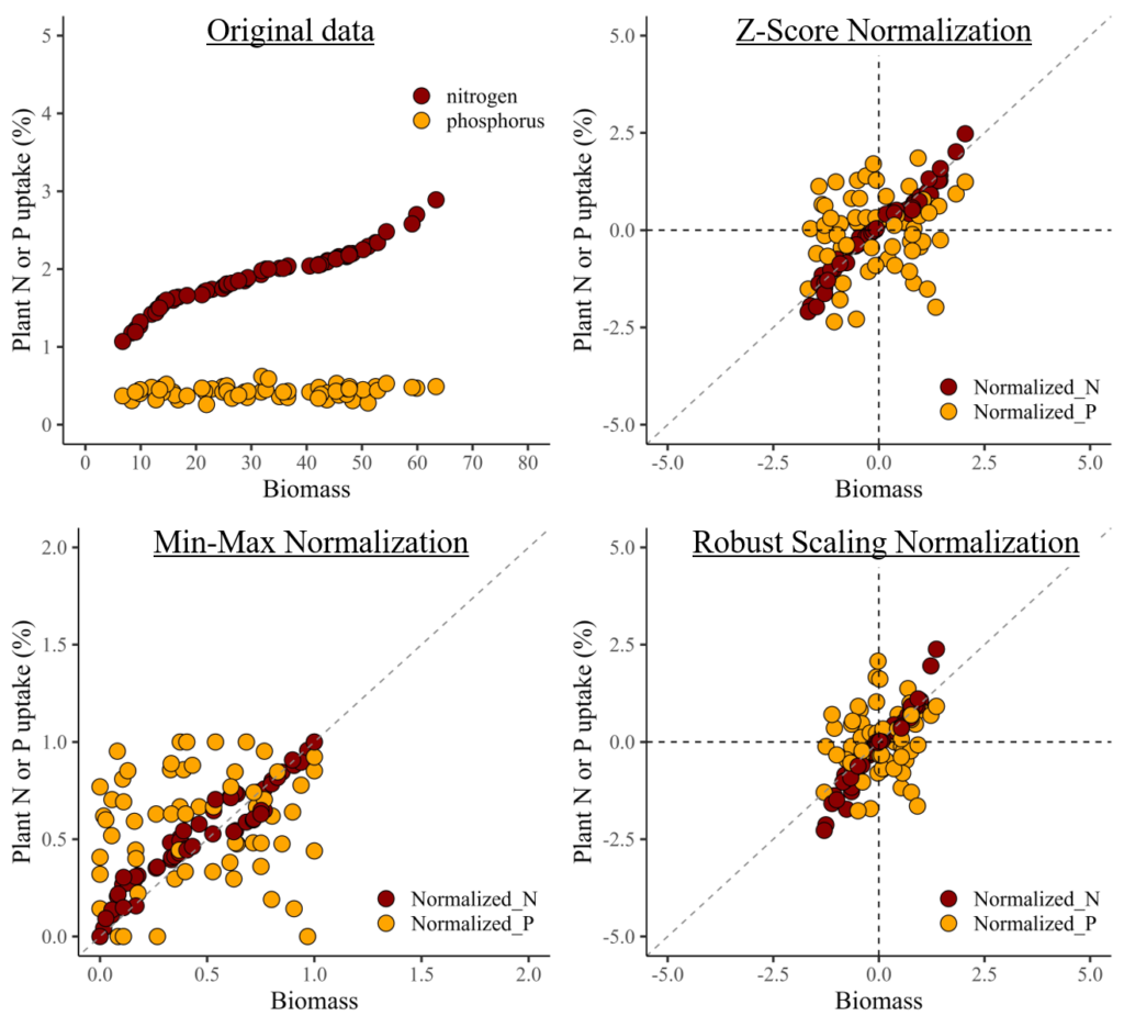
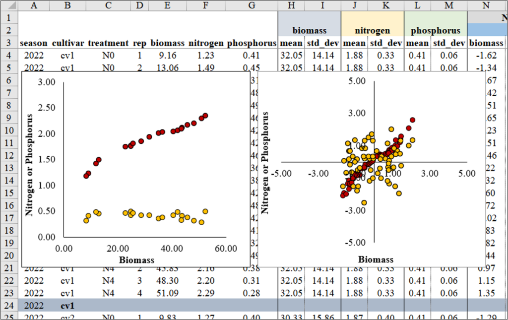
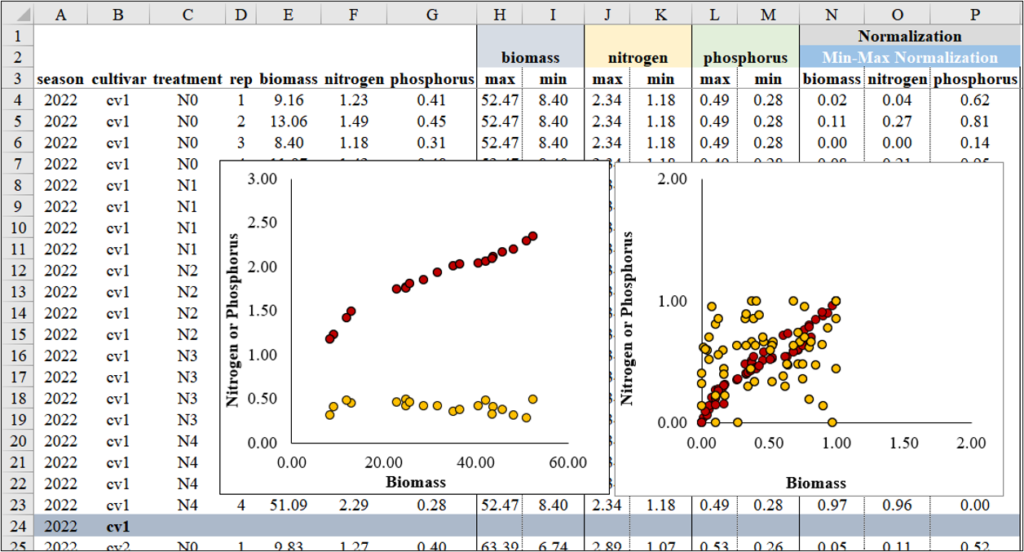
I notice a clear pattern between biomass and nitrogen. However, when combining nitrogen and phosphorus in the same panel due to their different data ranges, the trend between biomass and phosphorus becomes less distinct.
In this situation, data normalization would solve this problem.
1) Z-Score Normalization
This method is also known as standardization, it scales the data to have a mean of 0 and a standard deviation of 1.

where 𝜇 is the mean and 𝜎 is the standard deviation of the data. This method is suitable when the data follows a Gaussian distribution.
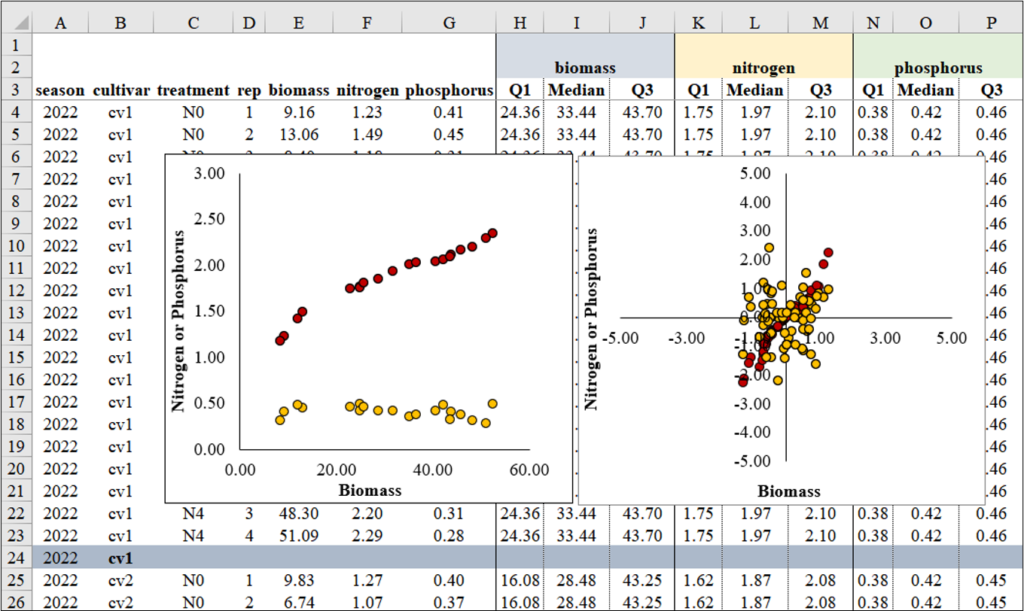
For normalization, I plan to group the data by ‘season’ and ‘cultivar’. In Excel, I’ll utilize the Subtotal function to create these groups. Once grouped according to different ‘season’ and ‘cultivar’, I’ll proceed to normalize the data within each group. This will allow me to observe the data patterns across different nitrogen levels (N0 to N4).
I will calculate each Z value using the aforementioned Z-test equation in Excel. Below, I will outline the process for calculating these Z values.
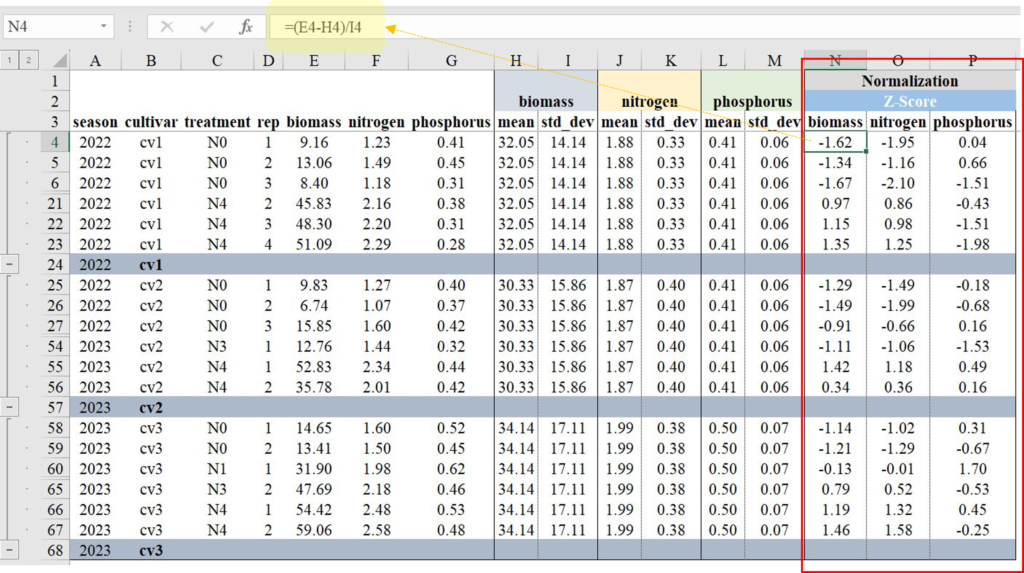
Next, I’ll create two regression graphs—one using the original data and the other using the normalized data. Due to the differing data ranges, comparing the relationship between biomass and either nitrogen or phosphorus uptake might not reveal a clear trend (left figure). However, once the data is normalized, the ranges become similar, enabling a clearer comparison (right figure).
Z-Score Normalization using R code?
Now, let’s do the same process using R.
library(readr)
github="https://raw.githubusercontent.com/agronomy4future/raw_data_practice/main/biomass_N_P.csv"
df= data.frame(read_csv(url(github), show_col_types=FALSE))

library(dplyr)
dataA= data.frame(df %>%
                  group_by(season, cultivar) %>%
                  dplyr::mutate(
                     Normalized_biomass=(biomass-mean(biomass))/sd(biomass),
                     Normalized_N=(nitrogen-mean(nitrogen))/sd(nitrogen),
                     Normalized_P=(phosphorus-mean(phosphorus))/sd(phosphorus)
                  ))
Z_Score_Normalization=dataA[,c(-5,-6,-7)]

head(Z_Score_Normalization, 5)
  season cultivar treatment rep Normalized_biomass Normalized_N Normalized_P
1 2022   cv1      N0        1   -1.61875888        -1.94591234  0.0388260
2 2022   cv1      N0        2   -1.34291846        -1.16151357  0.6600419
3 2022   cv1      N0        3   -1.67251239        -2.09675826  -1.5142138
4 2022   cv1      N0        4   -1.42001232        -1.37269786  1.1259539
5 2022   cv1      N1        1   -0.50549525        -0.31677643  1.2812579
.
.
.
Then, to place nitrogen and phosphorus at the same panel, I’ll transpose data from column to row using pivot_longer().
library(dplyr)
library(tidyr)
Z_Score_Normalization1= data.frame(Z_Score_Normalization %>%
                        pivot_longer(
                                     cols= c(Normalized_N, Normalized_P),
                                     names_to= "nutrient",
                                     values_to= "uptake")
                                     )

head(Z_Score_Normalization1, 5)
   season cultivar treatment rep Normalized_biomass nutrient      uptake
1  2022   cv1      N0        1   -1.61875888        Normalized_N  -1.946
2  2022   cv1      N0        1   -1.61875888        Normalized_P   0.0389
3  2022   cv1      N0        2   -1.34291846        Normalized_N  -1.162
4  2022   cv1      N0        2   -1.34291846        Normalized_P   0.660
5  2022   cv1      N0        3   -1.67251239        Normalized_N  -2.0968
.
.
.
Z-Score Normalization using Python code?
import pandas as pd

# Compute normalized values grouped by 'season' and 'cultivar'
grouped = df.groupby(['season', 'cultivar'])
df['Normalized_biomass']= grouped['biomass'].transform(lambda x:(x-x.mean()) / x.std())
df['Normalized_N']= grouped['nitrogen'].transform(lambda x:(x-x.mean()) / x.std())
df['Normalized_P']= grouped['phosphorus'].transform(lambda x:(x-x.mean()) / x.std())

Z_Score_Normalization = df.drop(df.columns[[4,5,6]], axis=1)
Z_Score_Normalization.head(5)
season cultivar treatment rep Normalized_biomass Normalized_N	Normalized_P
2022	cv1	N0	  1   -1.618759	         -1.945912      0.038826
2022	cv1	N0	  2   -1.342918	         -1.161514      0.660042
2022	cv1	N0	  3   -1.672512	         -2.096758      -1.514214
2022	cv1	N0	  4   -1.420012	         -1.372698      1.125954
2022	cv1	N1	  1   -0.505495	         -0.316776      1.281258
.
.
.

Z_Score_Normalization1 = df.melt(id_vars=['season', 'cultivar', 'treatment', 'rep', 'biomass'],
              var_name='nutrient',
              value_name='uptake',
              value_vars=["Normalized_N", "Normalized_P"])

Z_Score_Normalization1.head(5)
season	cultivar treatment rep	biomass	nutrient      uptake
2022	cv1	 N0	   1	9.16	Normalized_N  -1.945912
2022	cv1	 N0	   2	13.06	Normalized_N  -1.161514
2022	cv1	 N0	   3	8.40	Normalized_N  -2.096758
2022	cv1	 N0	   4	11.97	Normalized_N  -1.372698
2022	cv1	 N1	   1	24.90	Normalized_N  -0.316776
.
.
.
I’ll create a regression graph between biomass and either nitrogen or phosphorus.
R code
library(ggplot2)
ggplot(data=Z_Score_Normalization1, aes(x=Normalized_biomass, y=uptake)) +
       geom_point(aes(fill=as.factor(nutrient), shape=as.factor(nutrient)),
                  color="black", size=5) +
       scale_fill_manual(values= c("darkred","orange")) +
       scale_shape_manual(values= c(21,21)) +
       scale_x_continuous(breaks=seq(-5,5,2.5),limits=c(-5,5)) +
       scale_y_continuous(breaks=seq(-5,5,2.5),limits=c(-5,5)) +
       geom_vline(xintercept=0, linetype="dashed", color="black") +
       geom_hline(yintercept=0, linetype="dashed", color= "black") +
       geom_abline(slope=1, linetype= "dashed", color="grey55",
                   linewidth=0.5) +
       labs(x="Biomass", y="Plant N or P uptake (%)") +
       theme_classic(base_size=18, base_family="serif") +
       theme(legend.position=c(0.80,0.12),
             legend.title=element_blank(),
             legend.key=element_rect(color="white", fill="white"),
             legend.text=element_text(family="serif", face="plain",
                         size=15, color="black"),
             legend.background= element_rect(fill="white"),
             axis.line = element_line(linewidth = 0.5, colour="black")) +
windows(width=5.5, height=5)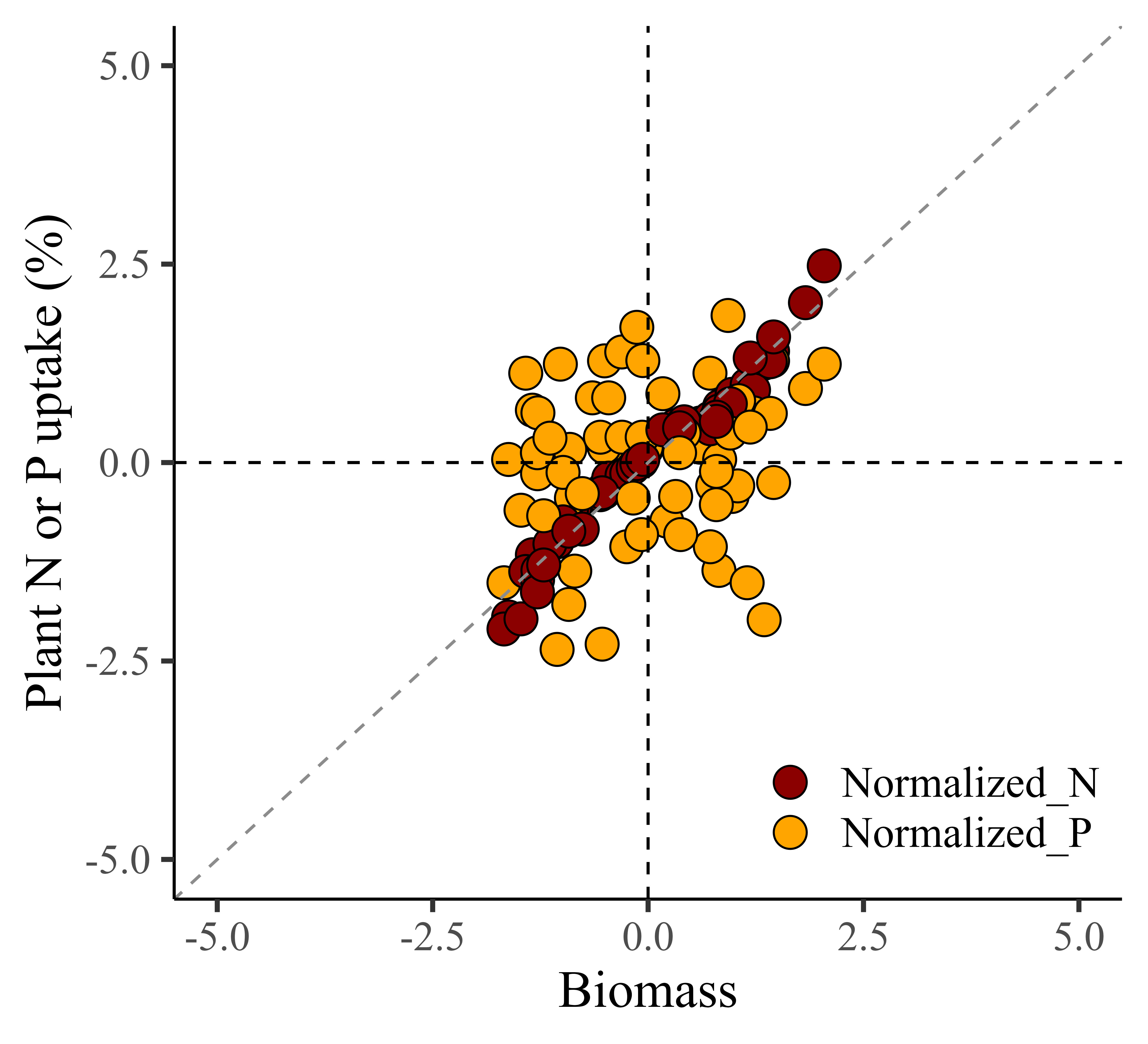
To calculate normalization, I utilized the following codes.
Normalized_biomass=(biomass-mean(biomass))/sd(biomass),
Normalized_N=(nitrogen-mean(nitrogen))/sd(nitrogen),
Normalized_P=(phosphorus-mean(phosphorus))/sd(phosphorus)
This calculation is based on Z= (x- 𝜇)/𝜎. If you understand the principle well, you might prefer to use the following code.
dataA = data.frame(df %>%
  group_by(season, cultivar) %>%
  dplyr::mutate(
    Normalized_biomass= scale(biomass, center= TRUE, scale= TRUE),
    Normalized_N= scale(nitrogen, center= TRUE, scale= TRUE),
    Normalized_P= scale(phosphorus, center= TRUE, scale= TRUE)
  ))
Z_Score_Normalization=dataA[,c(-5,-6,-7)]

head(Z_Score_Normalization, 5)
  season cultivar treatment rep Normalized_biomass Normalized_N Normalized_P
1 2022   cv1      N0        1   -1.61875888        -1.94591234  0.0388260
2 2022   cv1      N0        2   -1.34291846        -1.16151357  0.6600419
3 2022   cv1      N0        3   -1.67251239        -2.09675826 -1.5142138
4 2022   cv1      N0        4   -1.42001232        -1.37269786  1.1259539
5 2022   cv1      N1        1   -0.50549525        -0.31677643  1.2812579
.
.
.
In this code, setting center=TRUE means that the data is centered by subtracting the mean, and scale=TRUE means that the data is scaled by dividing by the standard deviation, effectively implementing the equation of the Z-test.
Python code
import pandas as pd
import numpy as np
import matplotlib.pyplot as plt
import seaborn as sns

# Create the plot
plt.figure(figsize=(5.5, 5))
sns.set(style="white")

# Create scatterplot
scatter = sns.scatterplot(
    data=Z_Score_Normalization1,
    x='Normalized_biomass',
    y='uptake',
    hue='nutrient',
    style='nutrient',
    palette={'Normalized_N': 'darkred', 'Normalized_P': 'orange'},
    markers={'Normalized_N': 'o', 'Normalized_P': 'o'},
    s=100,
    edgecolor="black"
)

# Add lines
plt.axhline(0, linestyle='--', color='black', linewidth=0.5)
plt.axvline(0, linestyle='--', color='black', linewidth=0.5)
plt.plot(np.linspace(-5, 5, 100), np.linspace(-5, 5, 100), linestyle='--', color='grey', linewidth=0.5)  # y=x line

# Set limits and ticks
plt.xlim(-5, 5)
plt.ylim(-5, 5)
plt.xticks(np.arange(-5, 5.1, 2.5))
plt.yticks(np.arange(-5, 5.1, 2.5))

# Set labels and title
plt.xlabel('Biomass')
plt.ylabel('Plant N or P uptake (%)')

# Customize legend
legend = plt.legend(title=None, loc='lower right', fontsize=15, frameon=False)

# Apply classic theme with specific font
sns.set_theme(style="white", rc={"font.family": "serif", "font.serif": ["Times", "Palatino", "serif"]})

plt.show()
2) Min-Max Normalization
Another method to normalize data is Min-Max Normalization. Both Min-Max Normalization and Z-Score Normalization are techniques used to scale and normalize data in the field of statistics and machine learning. However, they differ in their methods and the resulting distribution of the normalized data. While Z-Score normalization centers the data around the mean and adjusts it by the standard deviation, resulting in a distribution with a mean of 0 and a standard deviation of 1, Min-Max normalization preserves the original distribution shape but scales it to fit within the specified range.
Let’s calculate Min-Max Normalization using the following equation in Excel.

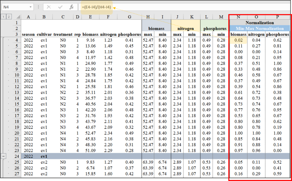
When creating a graph, it also provides better comparison between biomass and either nitrogen or phosphorus. However, unlike Z-Score Normalization, the data range is always positive.
How to do Min-Max Normalization in R?
Now, let’s do the same process using R.
library(dplyr)
dataB= data.frame(df %>%
       group_by(season, cultivar) %>%
       dplyr::mutate(
       Normalized_biomass=(biomass-min(biomass))/(max(biomass)-min(biomass)),
       Normalized_N=(nitrogen-min(nitrogen))/(max(nitrogen)-min(nitrogen)),
       Normalized_P=(phosphorus-min(phosphorus))/(max(phosphorus)-min(phosphorus))
                     ))
Min_Max_Normalization=dataB[,c(-5,-6,-7)]

library(dplyr)
library(tidyr)
Min_Max_Normalization1= data.frame(Min_Max_Normalization %>%
                          pivot_longer(
                                       cols= c(Normalized_N, Normalized_P),
                                       names_to= "nutrient",
                                       values_to= "uptake")
                                       )

library(ggplot2)
ggplot(data=Min_Max_Normalization1, aes(x=Normalized_biomass, y=uptake))+
       geom_point(aes(fill=as.factor(nutrient),
       shape=as.factor(nutrient)), color="black", size=5) +
       scale_fill_manual(values=c("darkred","orange")) +
       scale_shape_manual(values=c(21,21)) +
       scale_x_continuous(breaks=seq(0,2,0.5), limits=c(0,2)) +
       scale_y_continuous(breaks=seq(0,2,0.5), limits=c(0,2)) +
       geom_abline(slope=1, linetype= "dashed", color="grey55",
                   linewidth=0.5) +
       labs(x="Biomass", y="Plant N or P uptake (%)") +
       theme_classic(base_size=18, base_family="serif") +
       theme(legend.position=c(0.80,0.12),
             legend.title=element_blank(),
             legend.key=element_rect(color="white", fill="white"),
             legend.text=element_text(family="serif", face="plain",size=15,
                                      color="black"),
             legend.background=element_rect(fill="white"),
             axis.line=element_line(linewidth=0.5, colour="black")) +
windows(width=5.5, height=5)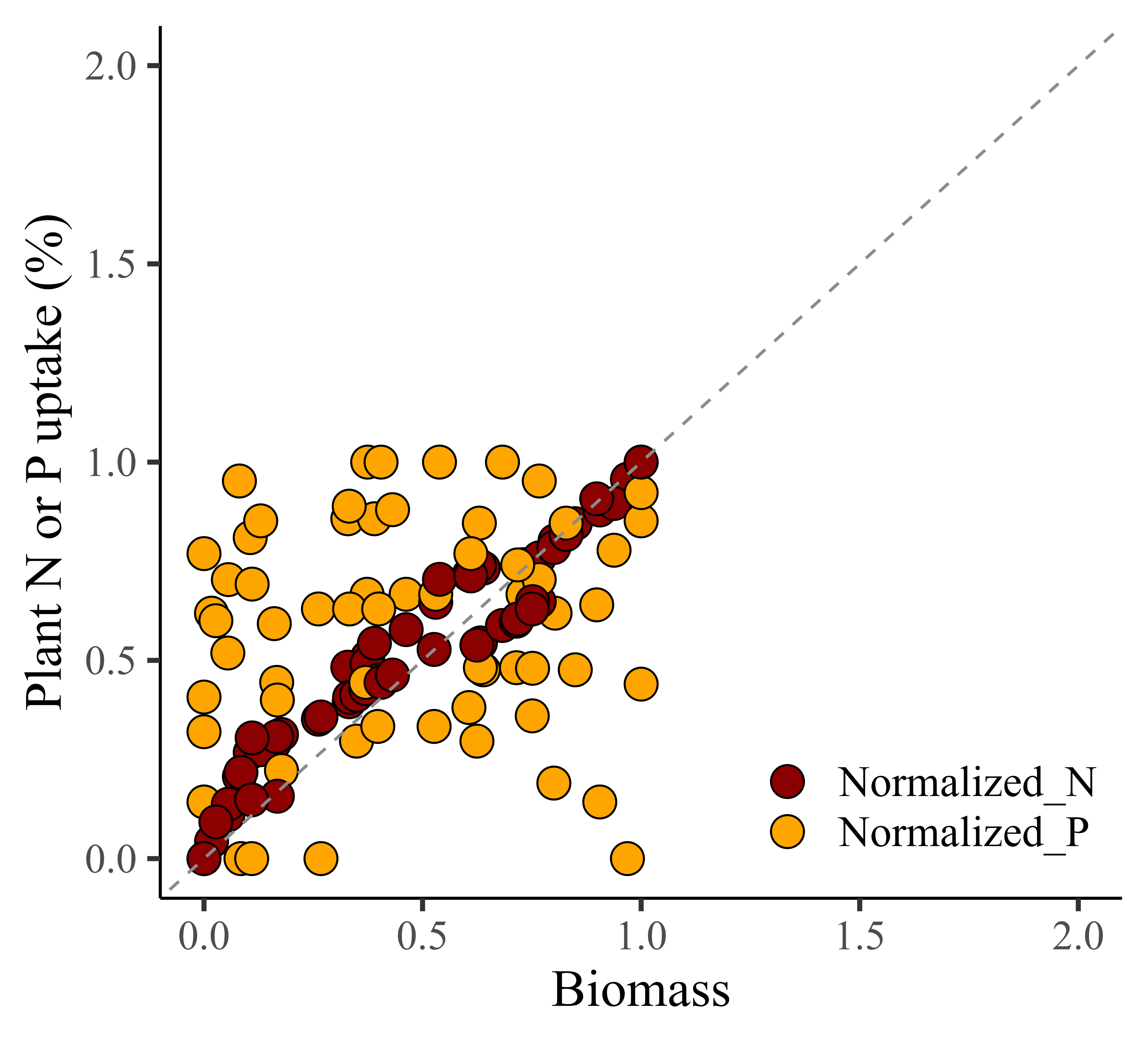
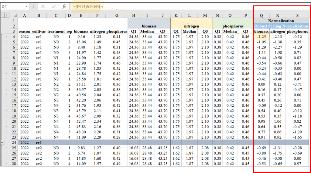
3) Robust Scaling Normalization
Robust Scaling Normalization, also known as robust scaling or feature scaling by median and interquartile range (IQR), is a normalization technique that scales the data based on the median and the interquartile range (IQR) rather than the mean and standard deviation, or min/max values. Robust Scaling Normalization is preferred when dealing with data containing outliers, while Min-Max normalization and Z-Score normalization are suitable for datasets with a relatively normal distribution and no significant outliers.
Let’s calculate Robust Scaling Normalization using the following equation in Excel.

How to do Robust Scaling Normalization in R?
Now, let’s do the same process using R.
library(dplyr)
dataC = data.frame(df %>%
        group_by(season, cultivar) %>%
        dplyr::mutate(
        Normalized_biomass=(biomass-median(biomass)) /
                   (quantile(biomass, 0.75)-quantile(biomass,0.25)),
        Normalized_N=(nitrogen-median(nitrogen)) /
                   (quantile(nitrogen, 0.75)-quantile(nitrogen,0.25)),
        Normalized_P=(phosphorus-median(phosphorus)) /
                   (quantile(phosphorus, 0.75)-quantile(phosphorus,0.25))
                       ))
Robust_Scaling_Normalization=dataC[,c(-5,-6,-7)]

head(Robust_Scaling_Normalization, 5)
   season cultivar treatment rep Normalized_biomass Normalized_N  Normalized_P
1  2022   cv1      N0        1    -1.25484621      -2.12949640    -0.11764706
2  2022   cv1      N0        2    -1.05324373      -1.38129496     0.35294118
3  2022   cv1      N0        3    -1.29413285      -2.27338129    -1.29411765
4  2022   cv1      N0        4    -1.10958904      -1.58273381     0.70588235
5  2022   cv1      N1        1    -0.44119928      -0.57553957     0.82352941
.
.
.

library(dplyr)
library(tidyr)
Robust_Scaling_Normalization1= data.frame(Robust_Scaling_Normalization %>%
                        pivot_longer(
                                     cols= c(Normalized_N, Normalized_P),
                                     names_to= "nutrient",
                                     values_to= "uptake")
                                     )

library(ggplot2)
ggplot(data=Robust_Scaling_Normalization1, aes(x=Normalized_biomass, y=uptake))+
       geom_point(aes(fill=as.factor(nutrient), shape=as.factor(nutrient)),
                  color="black", size=5) +
       scale_fill_manual(values=c("darkred","orange")) +
       scale_shape_manual(values=c(21,21)) +
       scale_x_continuous(breaks=seq(-5,5,2.5), limits=c(-5,5)) +
       scale_y_continuous(breaks=seq(-5,5,2.5),limits=c(-5,5)) +
       geom_vline(xintercept=0, linetype="dashed", color="black") +
       geom_hline(yintercept=0, linetype="dashed", color= "black") +
       geom_abline(slope=1, linetype= "dashed", color="grey55",
                   linewidth=0.5) +
       labs(x="Biomass", y="Plant N or P uptake (%)") +
       theme_classic(base_size=18, base_family="serif") +
       theme(legend.position=c(0.80,0.12),
             legend.title=element_blank(),
             legend.key=element_rect(color="white", fill="white"),
             legend.text=element_text(family="serif", face="plain",size=15,
                                      color="black"),
             legend.background=element_rect(fill="white"),
             axis.line=element_line(linewidth=0.5, colour="black")) +
windows(width=5.5, height=5)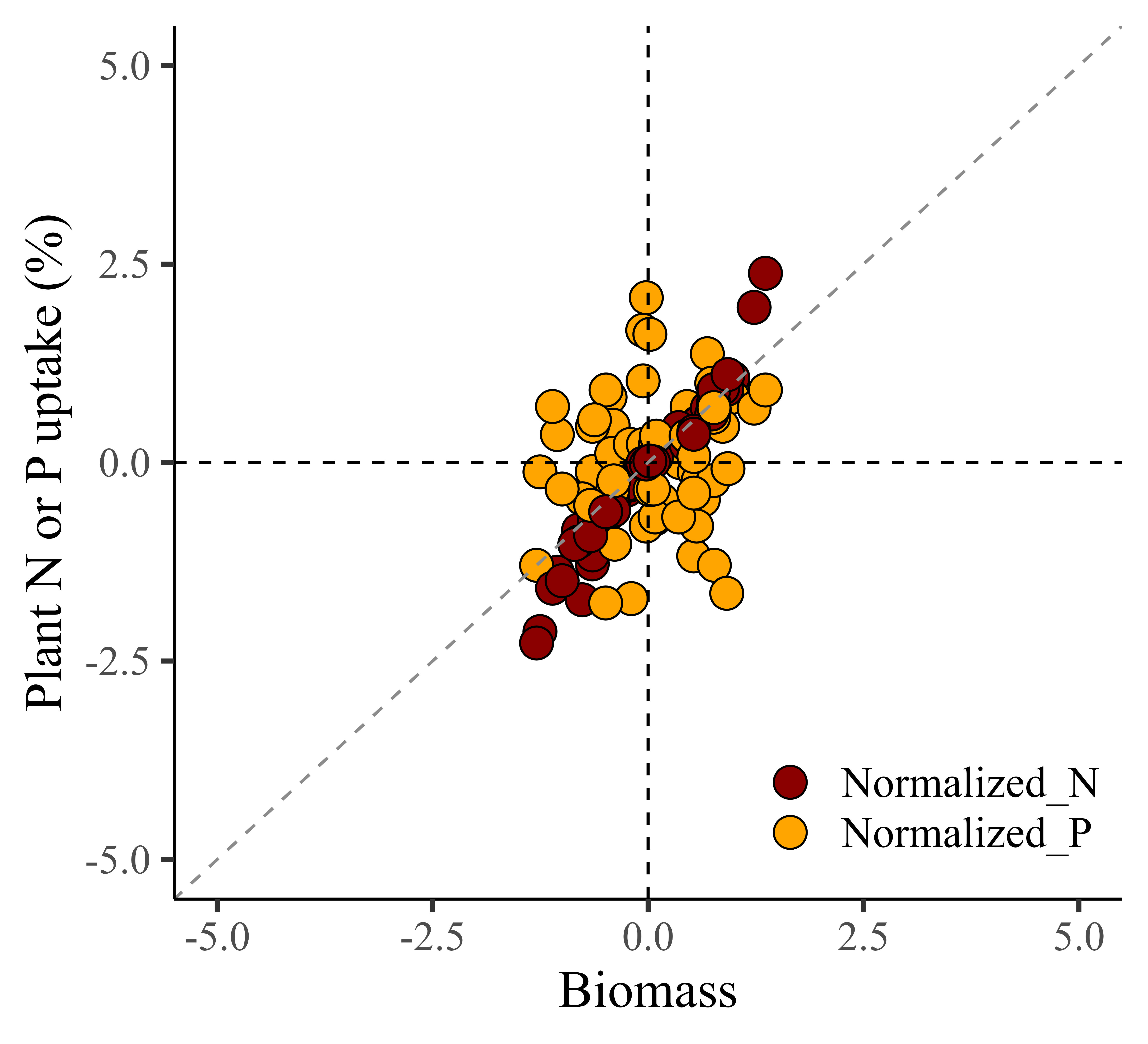
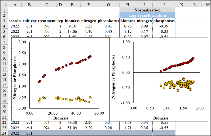
4) Log Transformation
We can simply transform the data by taking the logarithm.
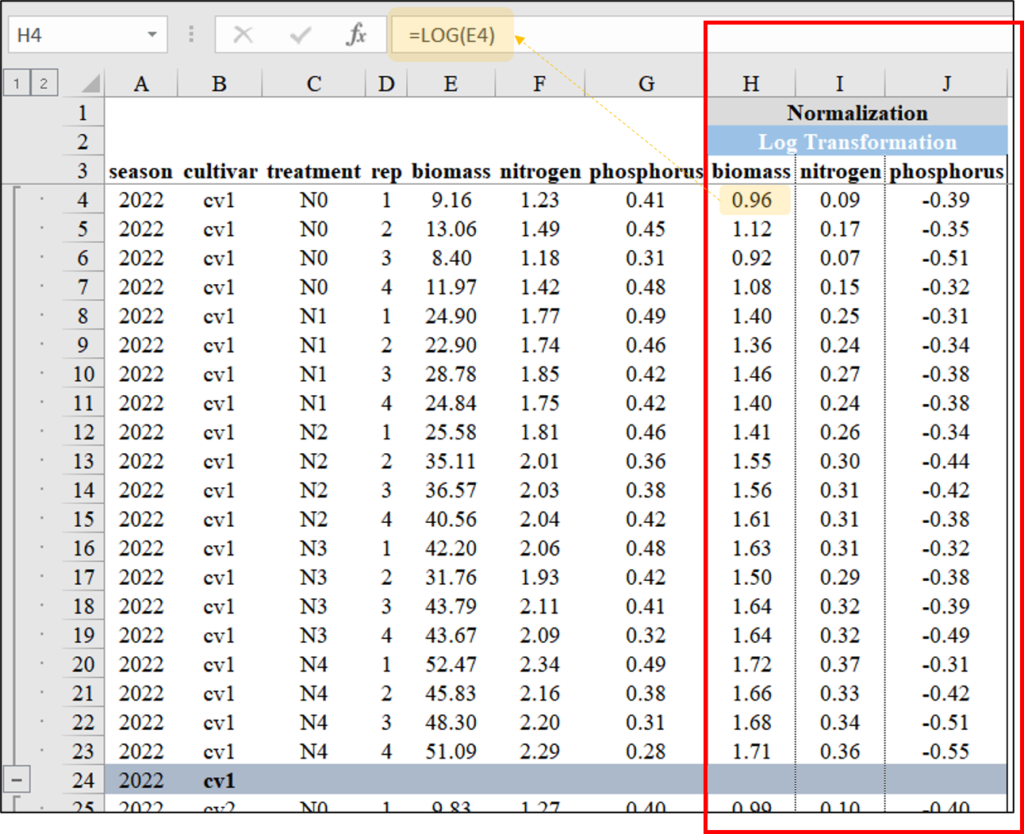
library(dplyr)
dataD = data.frame(df %>%
                     group_by(season, cultivar) %>%
                     dplyr::mutate(
                       Normalized_biomass= log10(biomass),
                       Normalized_N= log10(nitrogen),
                       Normalized_P= log10(phosphorus)
                     ))
Log_Transformation= dataD[,c(-5,-6,-7)]

library(dplyr)
library(tidyr)
Log_Transformation1= data.frame(Log_Transformation %>%
                            pivot_longer(
                            cols= c(Normalized_N, Normalized_P),
                            names_to= "nutrient",
                            values_to= "uptake"))

library(ggplot2)
ggplot(data=Log_Transformation1, aes(x=Normalized_biomass, y=uptake)) +
       geom_point(aes(fill=as.factor(nutrient), shape=as.factor(nutrient)),
                  color="black", size=5) +
       scale_fill_manual(values= c("darkred","orange")) +
       scale_shape_manual(values= c(21,21)) +
       scale_x_continuous(breaks=seq(0,2,0.5),limits=c(0,2)) +
       scale_y_continuous(breaks=seq(-1,1,0.5),limits=c(-1,1)) +
       geom_hline(yintercept=0, linetype="dashed", color="black") +
       labs(x="Biomass", y="Plant N or P uptake (%)") +
       theme_classic(base_size=18, base_family="serif") +
       theme(legend.position=c(0.2,0.15),
             legend.title=element_blank(),
             legend.key=element_rect(color="white", fill="white"),
             legend.text=element_text(family="serif", face="plain", size=13,
                         color="black"),
             legend.background= element_rect(fill="white"),
             axis.line = element_line(linewidth = 0.5, colour="black")) +
windows(width=5.5, height=5)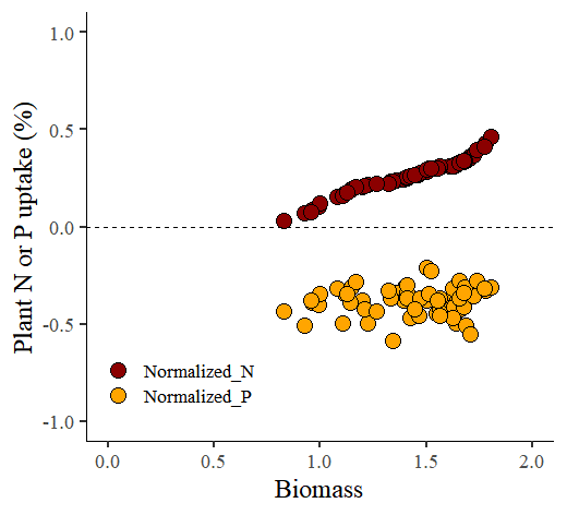
code summary: https://github.com/agronomy4future/r_code/blob/main/Data_Normalization_Techniques_Excel_and_R_as_the_Initial_Steps_in_Machine_Learning.ipynb